
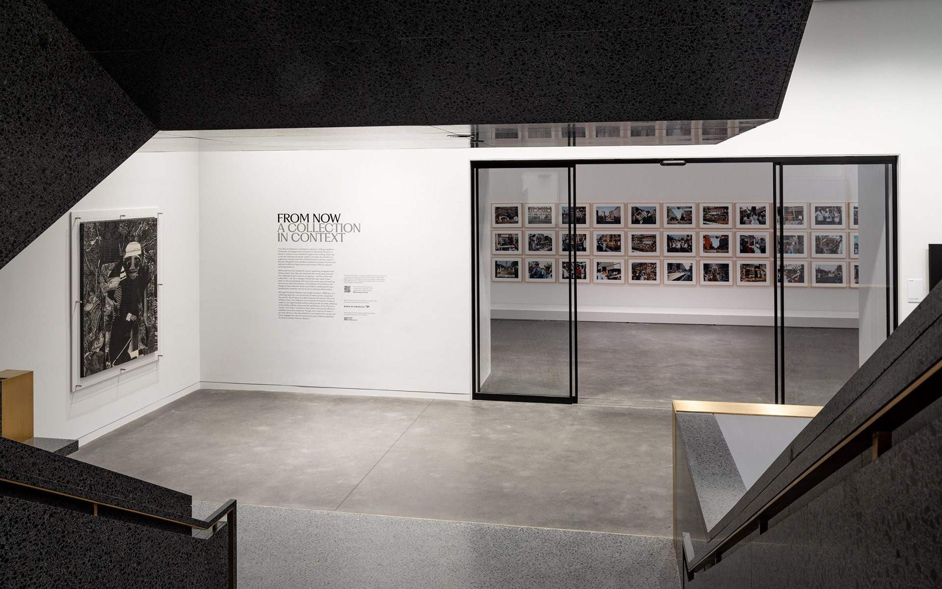
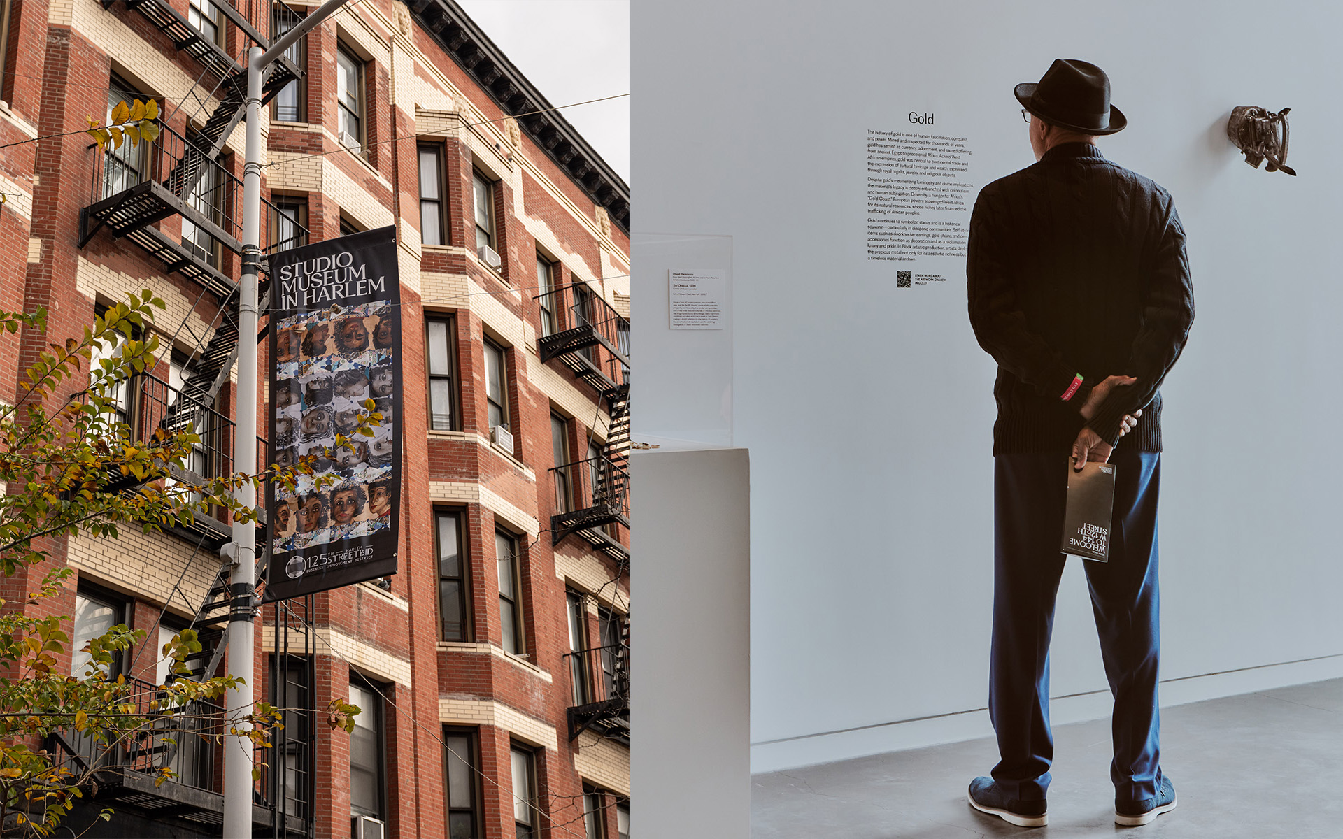

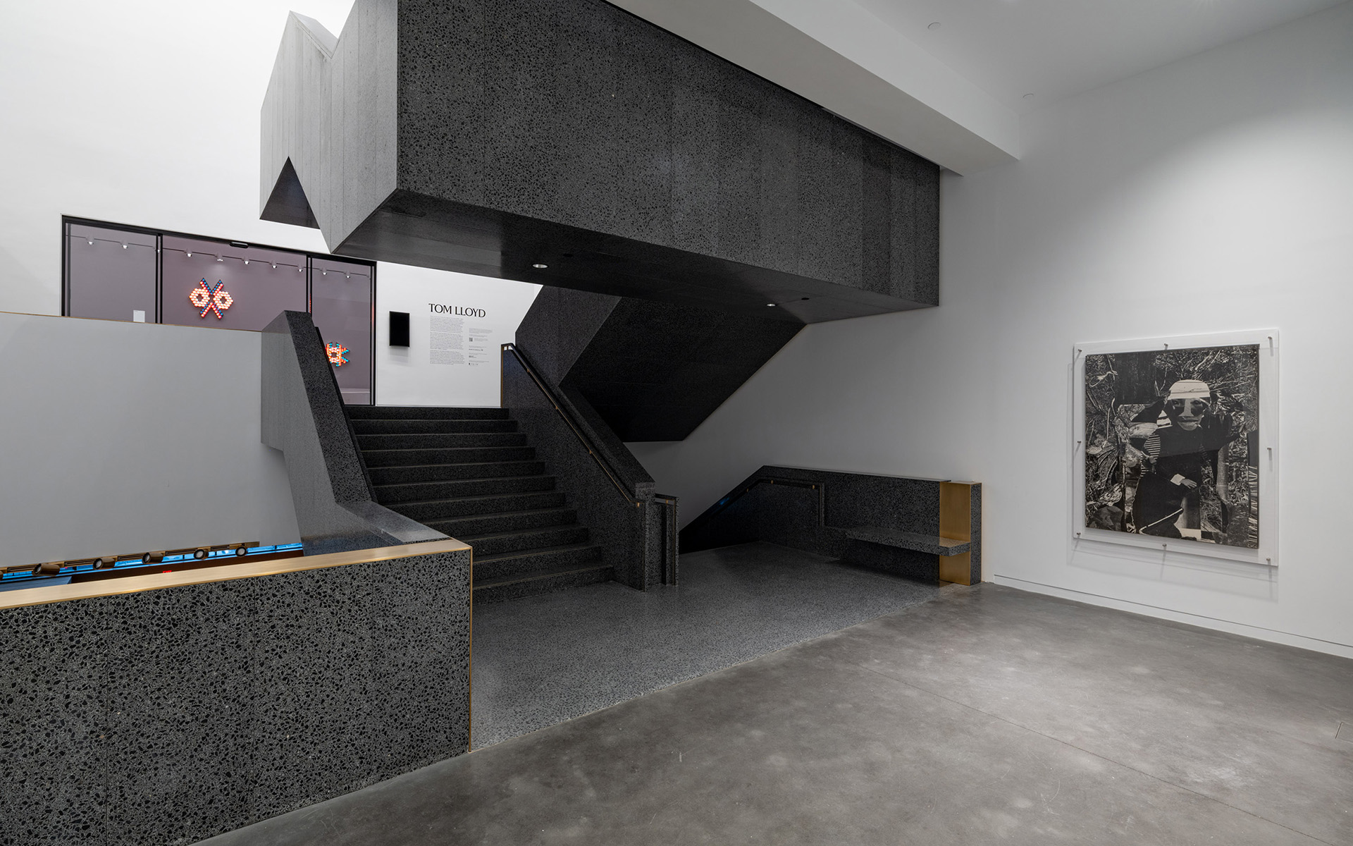

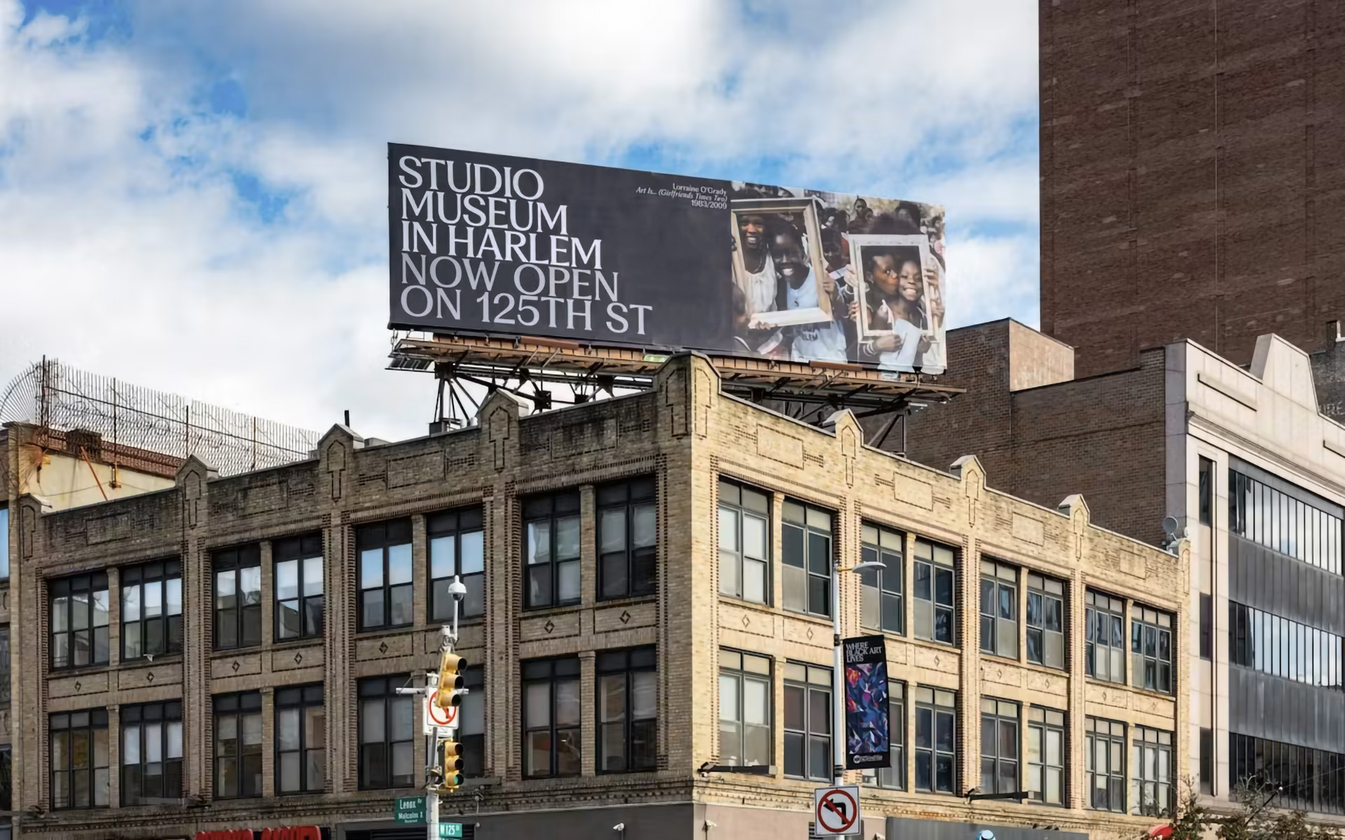
The Studio Museum in Harlem is the nexus for artists of African descent locally, nationally, and internationally and for work that has been inspired and influenced by Black culture.
Maintaining and expanding the Museum's award-winning visual identity into its grand reopening and beyond.
Work is available upon request.
Work is available upon request.
Listened to:
02 Brooklyn Museum

A new identity for the Brooklyn Museum that brings together its layers of history into one visual language.
Designed in-house and in collaboration with Other Means.
Type Directors Club - TDC 71, Typographic Excellence + 2x Judge’s Choice.
Work is available upon request.
Type Directors Club - TDC 71, Typographic Excellence + 2x Judge’s Choice.
Work is available upon request.
Listened to:
03 Giants: Art from the Dean Collection of Swizz Beatz and Alicia Keys
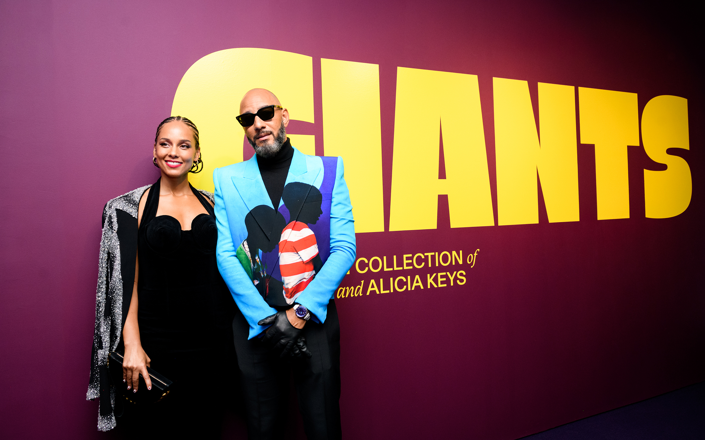


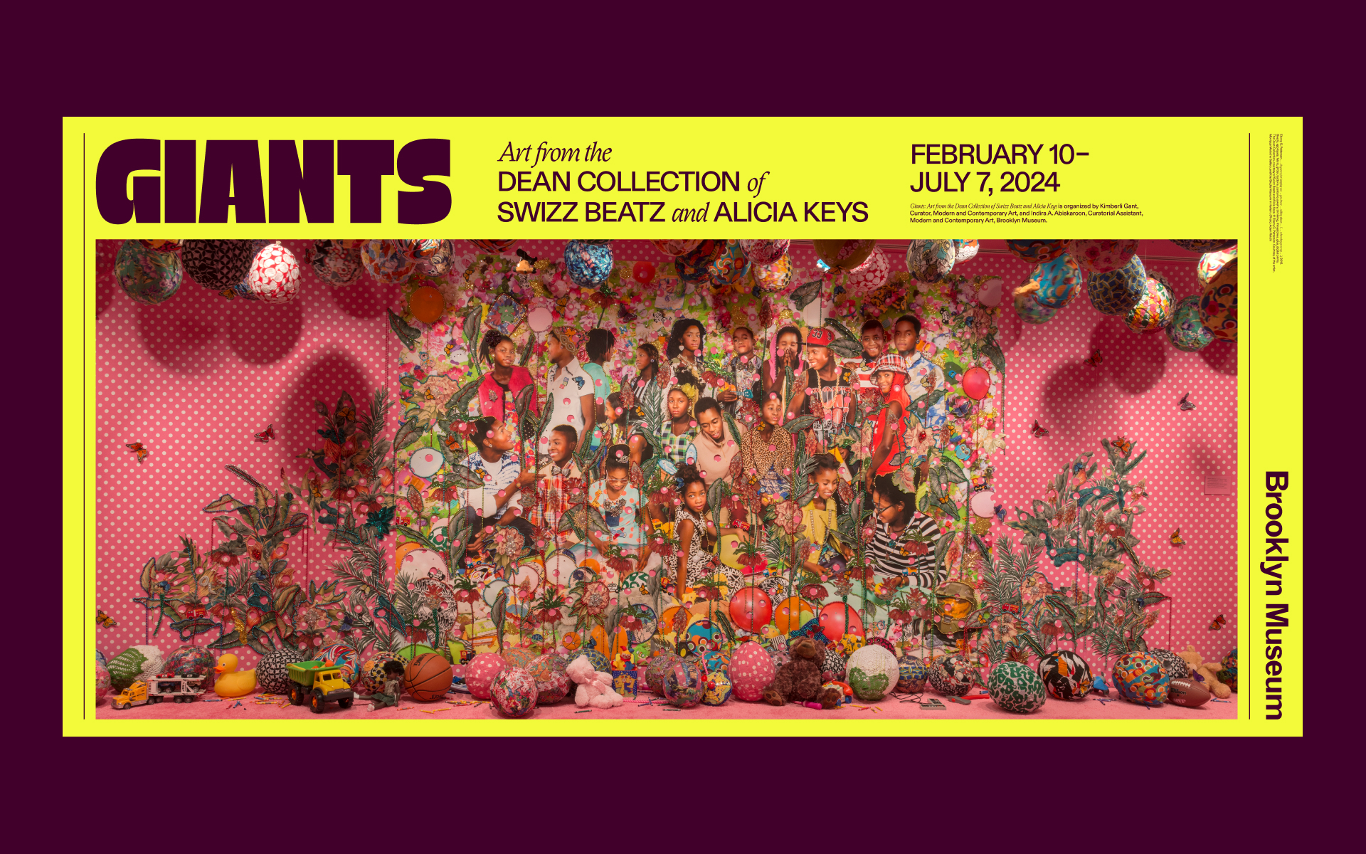

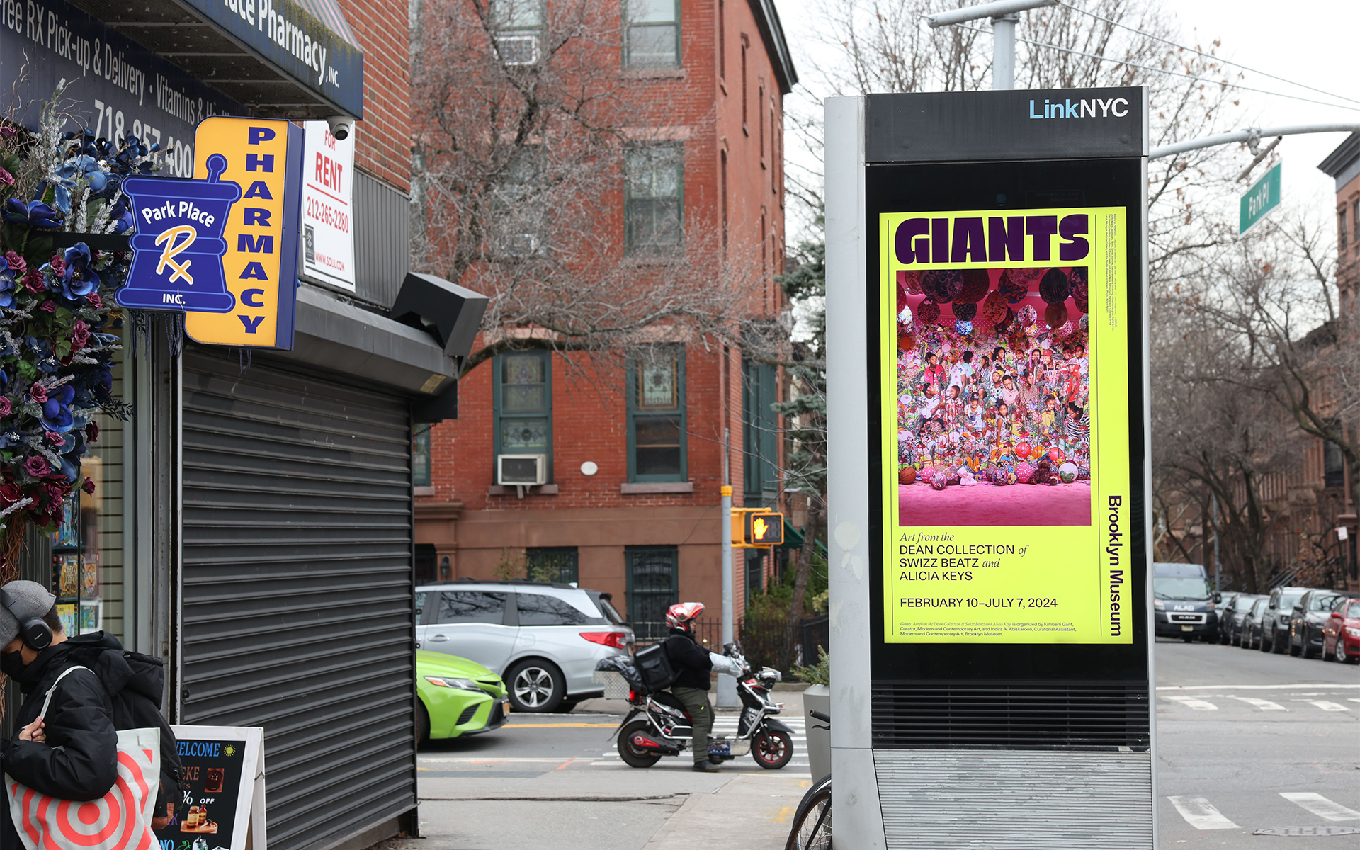
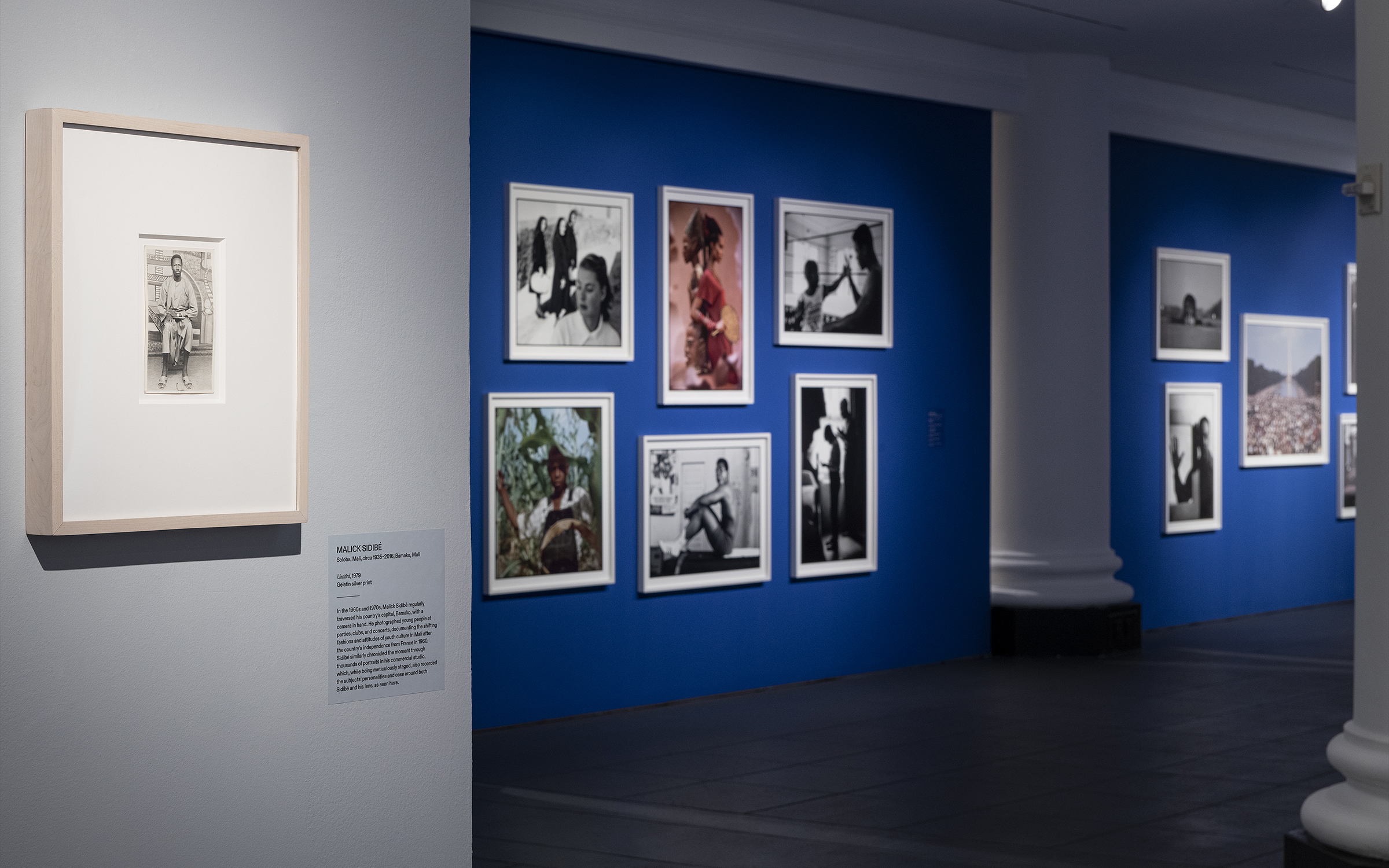
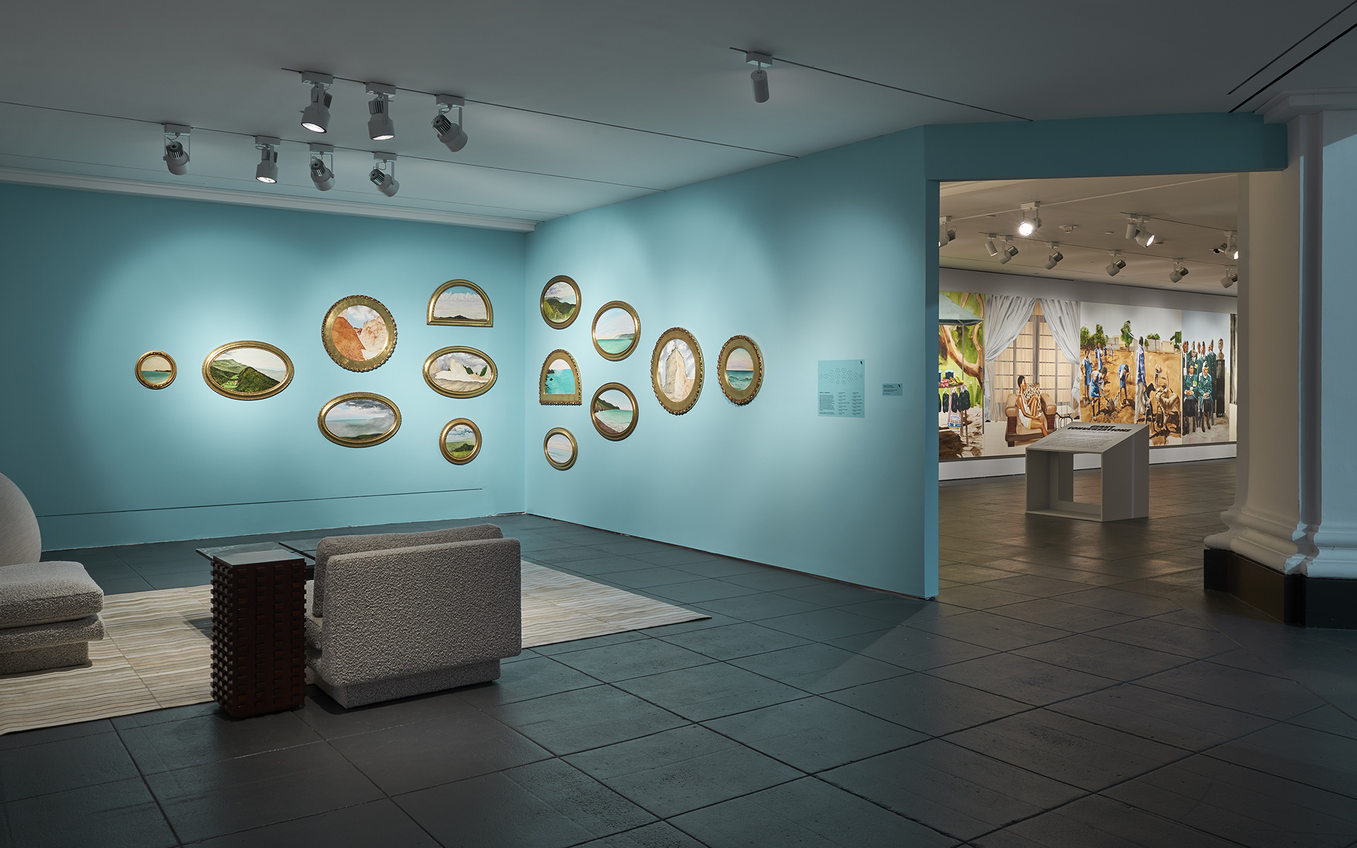

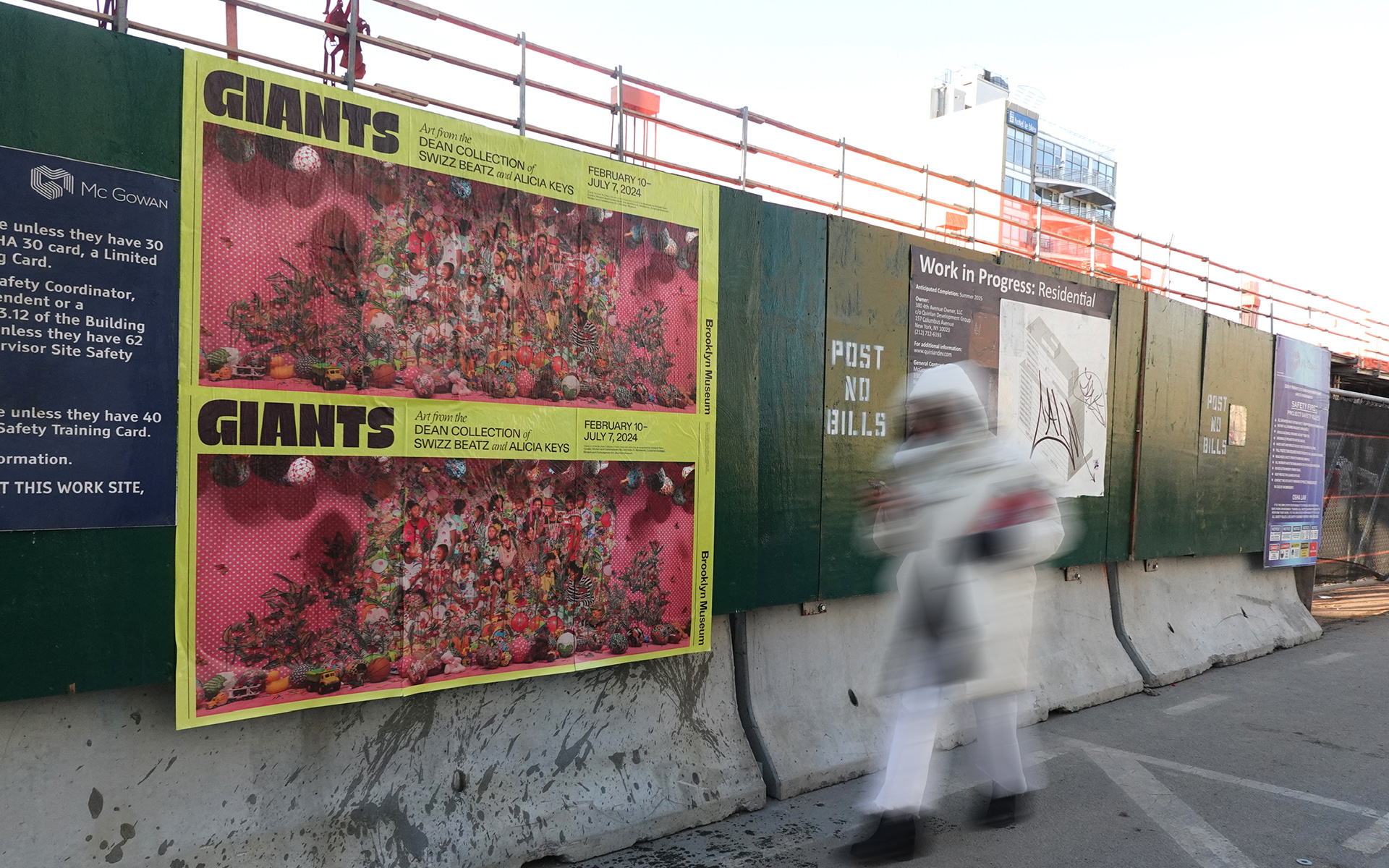
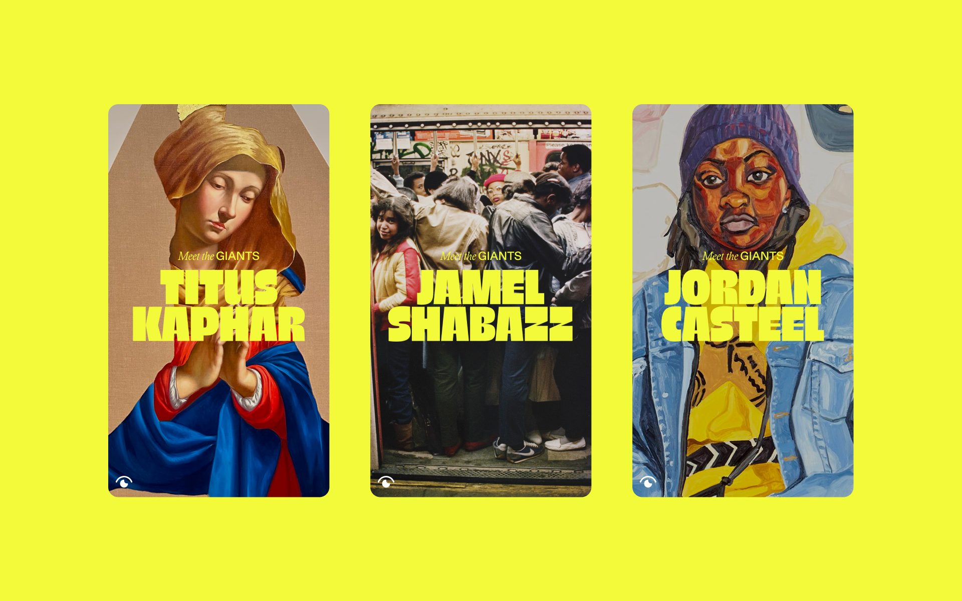
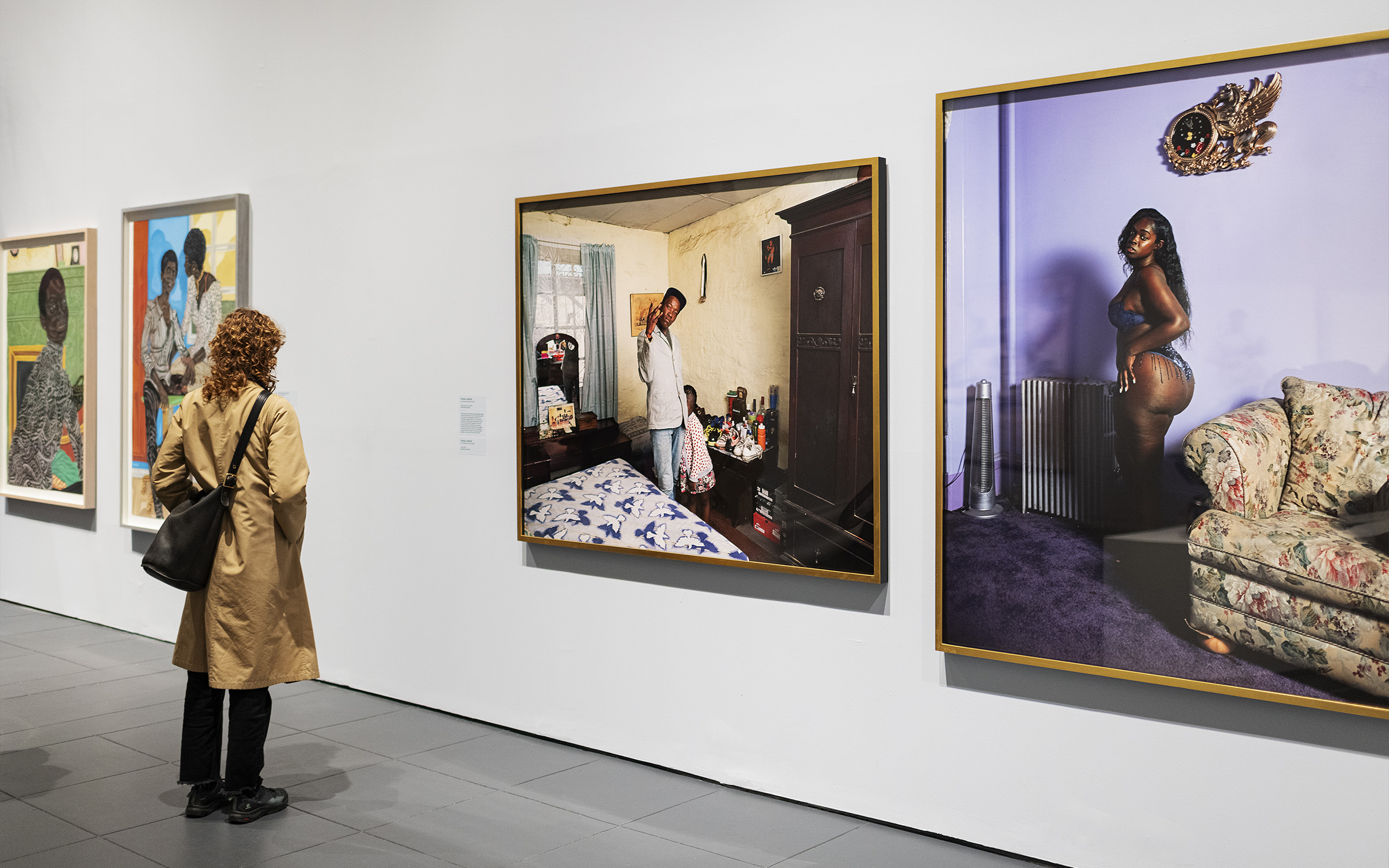
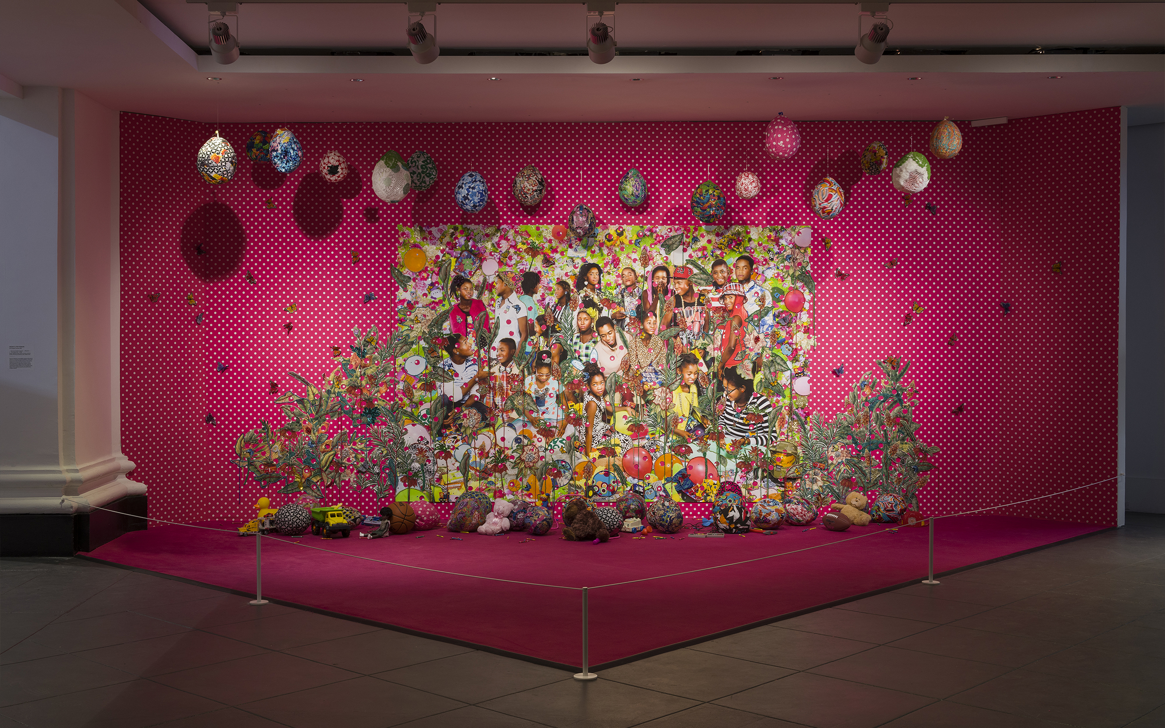
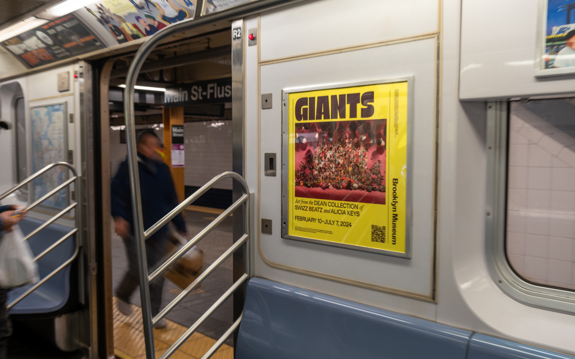
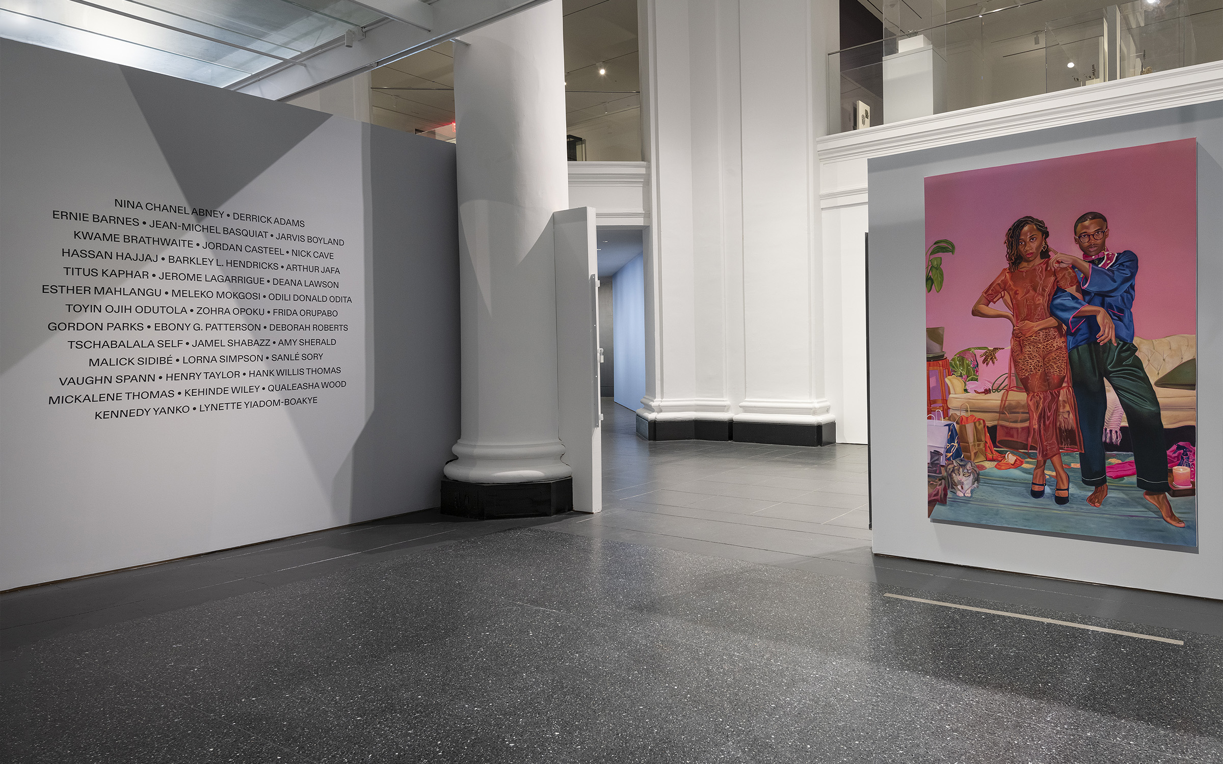
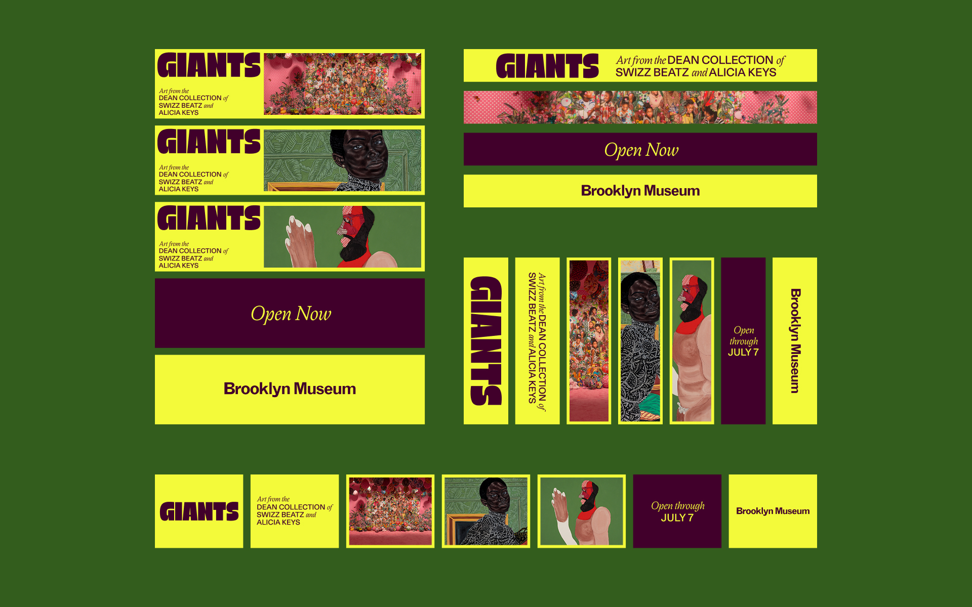

The first major exhibition of the Dean Collection, Giants showcases a focused selection from the couple’s world-class holdings while championing a philosophy of “artists supporting artists.”
Additional exhibition and marketing work is available upon request.
Listened to:
04 Spike Lee: Creative Sources
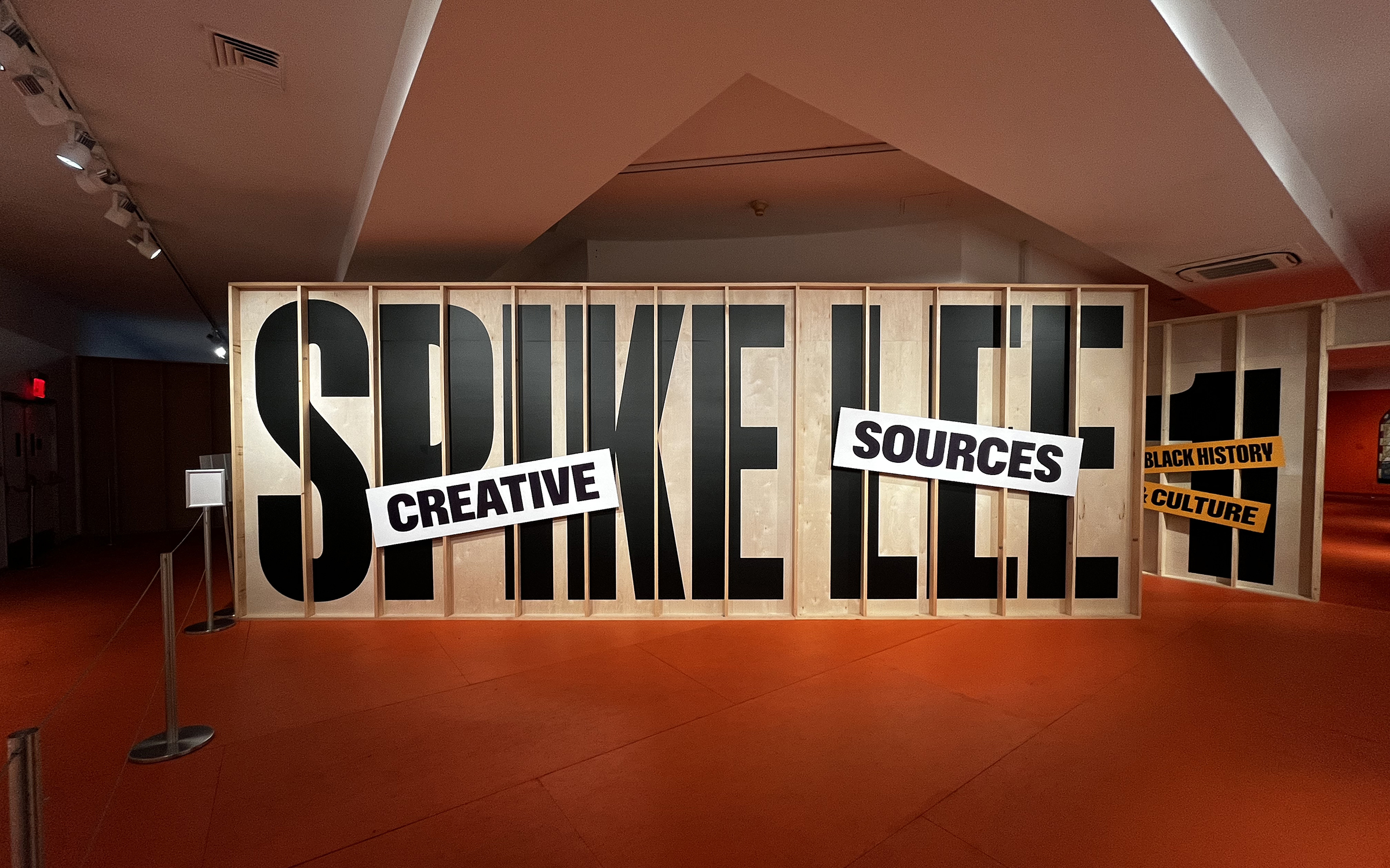
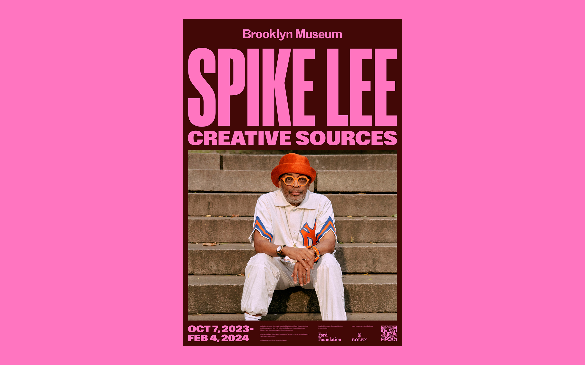
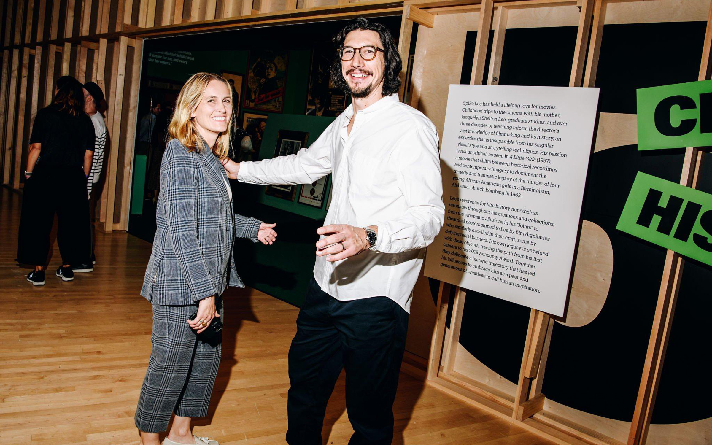
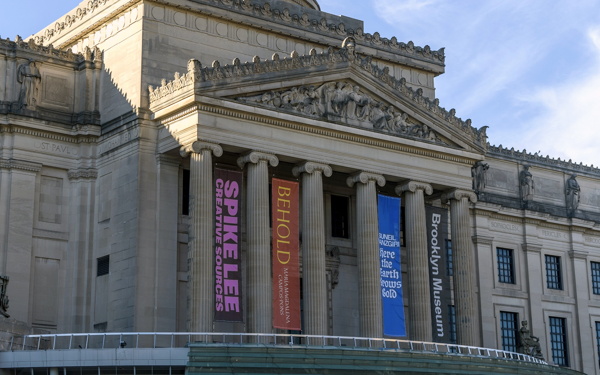
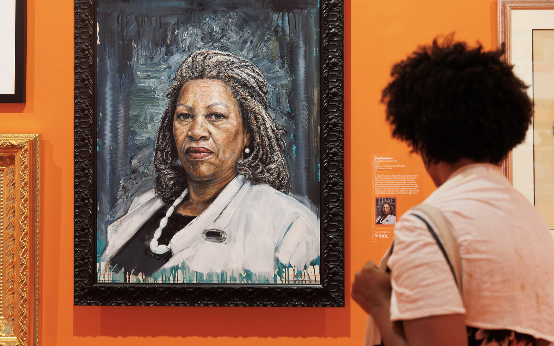

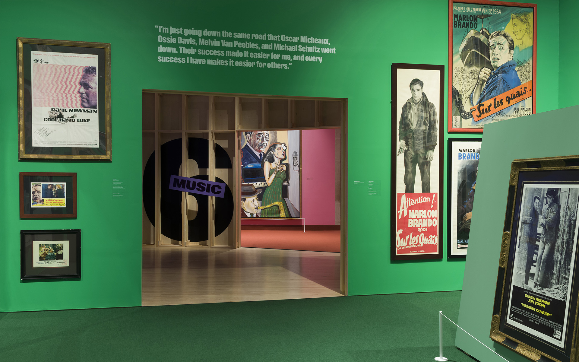


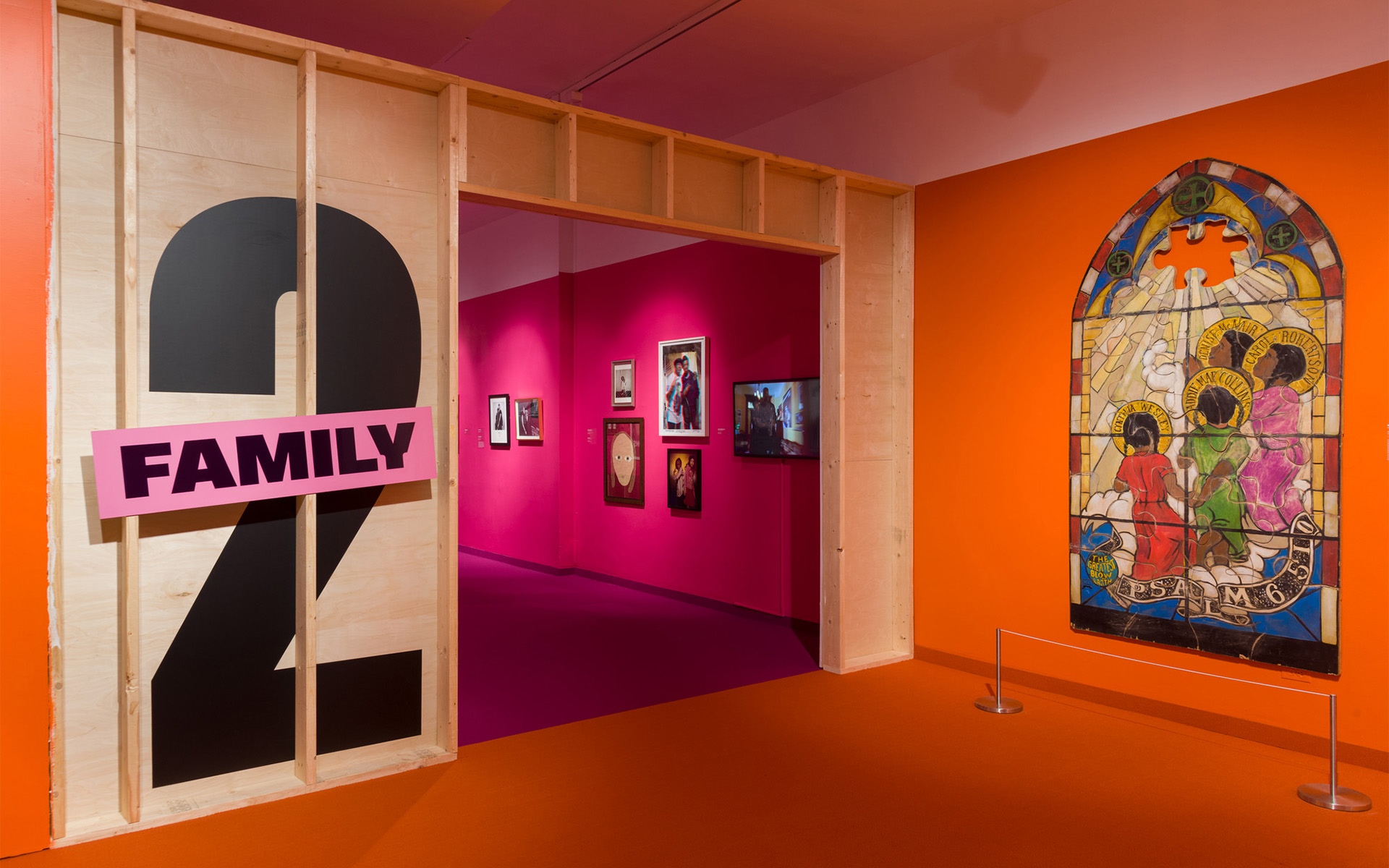
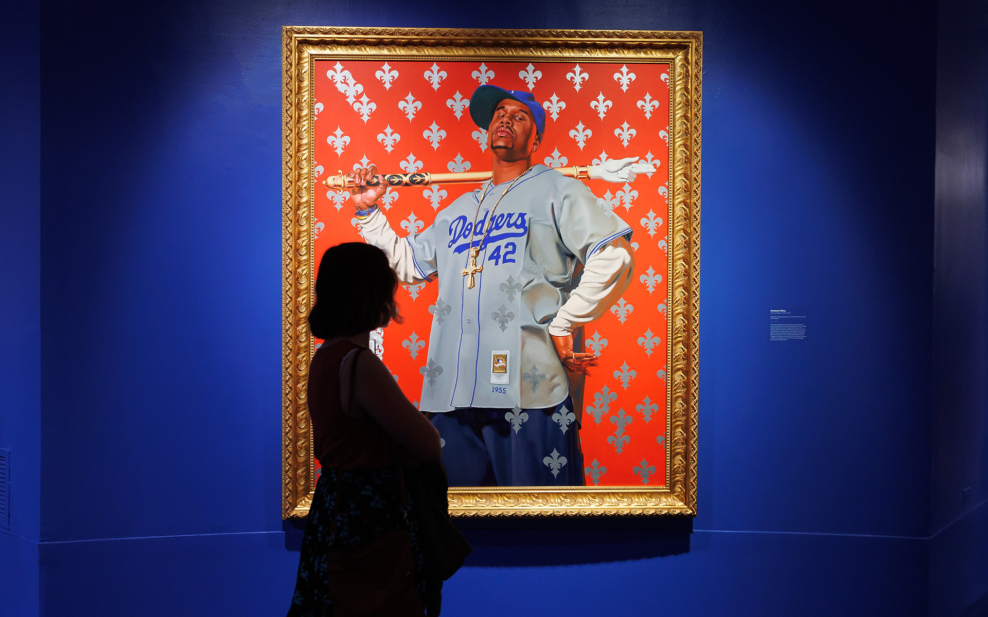

Providing a rare glimpse into the world of Spike Lee, one of the most influential and prolific American filmmakers and directors, at the Brooklyn Museum.
An immersive installation of objects drawn from Lee’s personal collection, visitors discovered the sources of inspiration that have fueled his creative output.
Additional exhibition and marketing work is available upon request.
Additional exhibition and marketing work is available upon request.
Listened to:
05 Converse
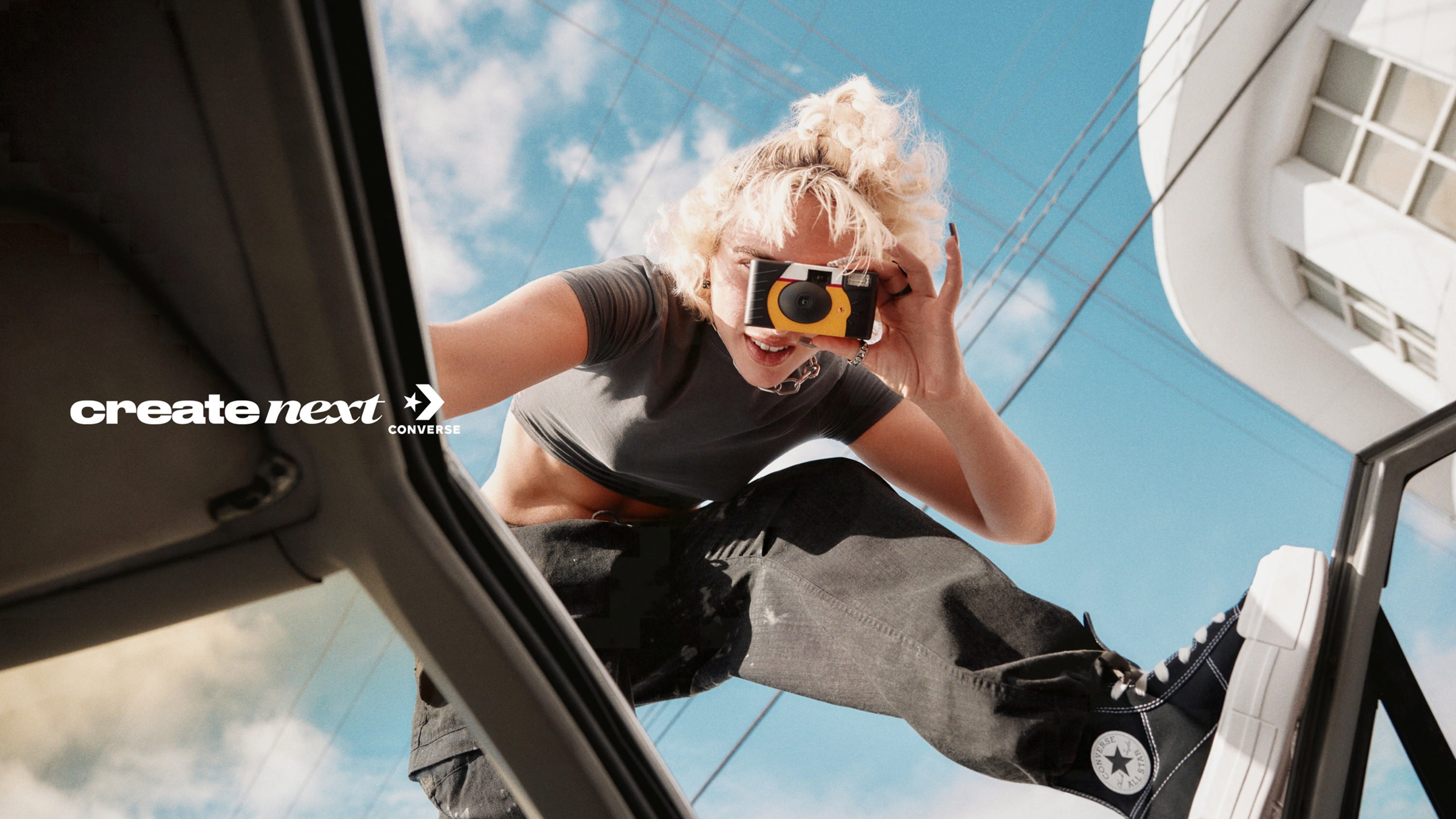


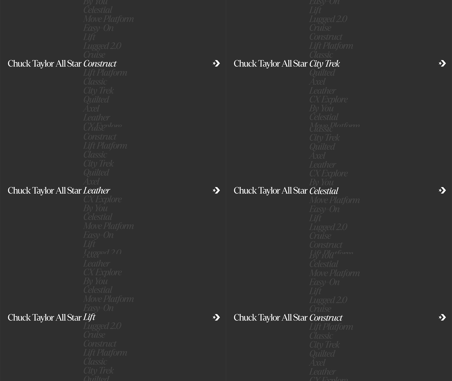
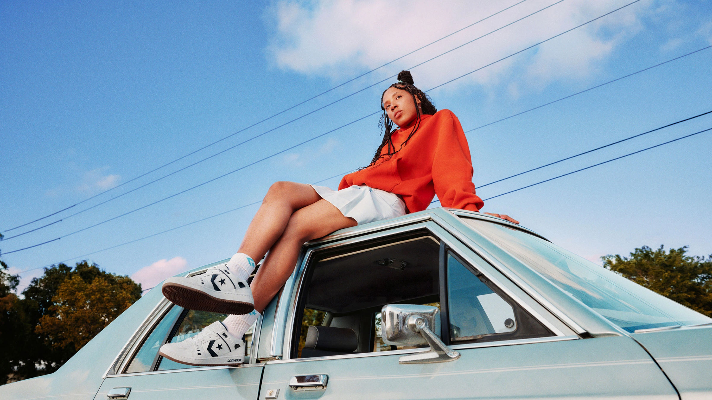
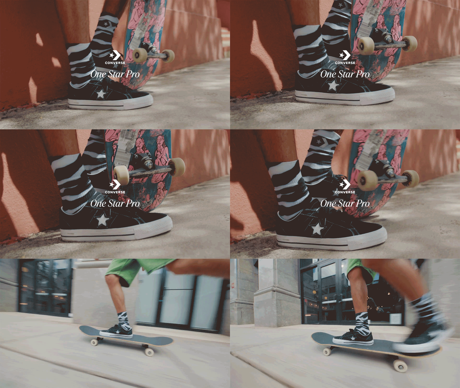

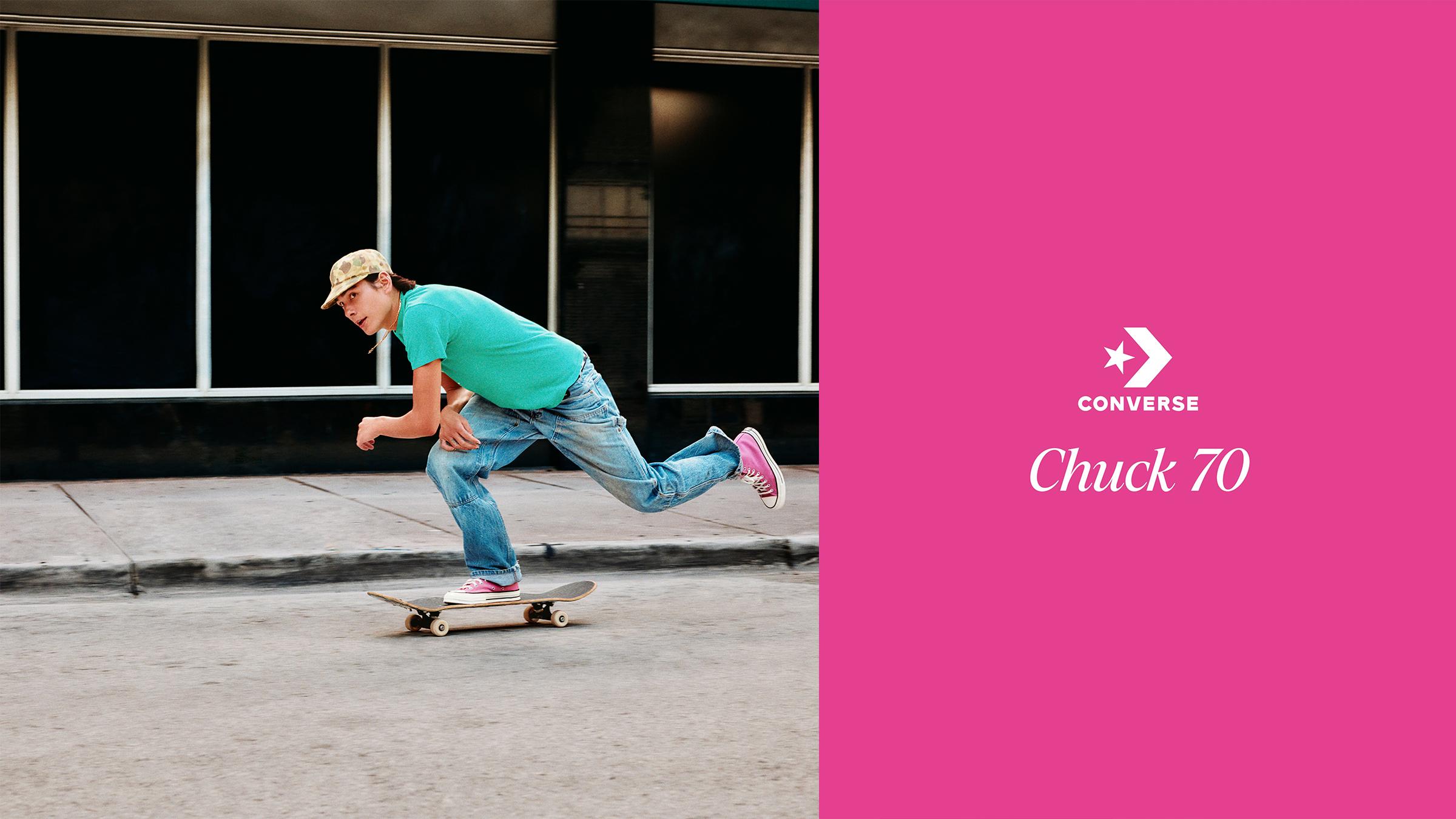
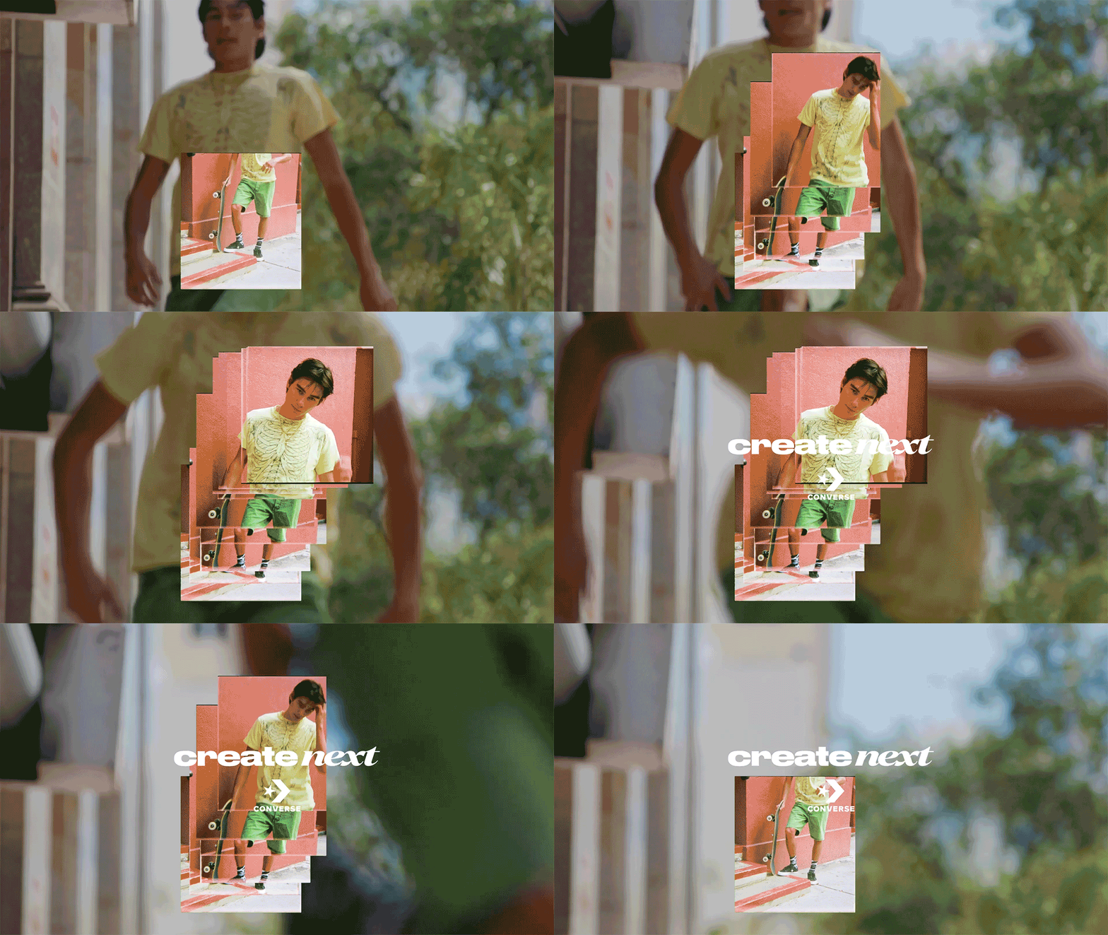

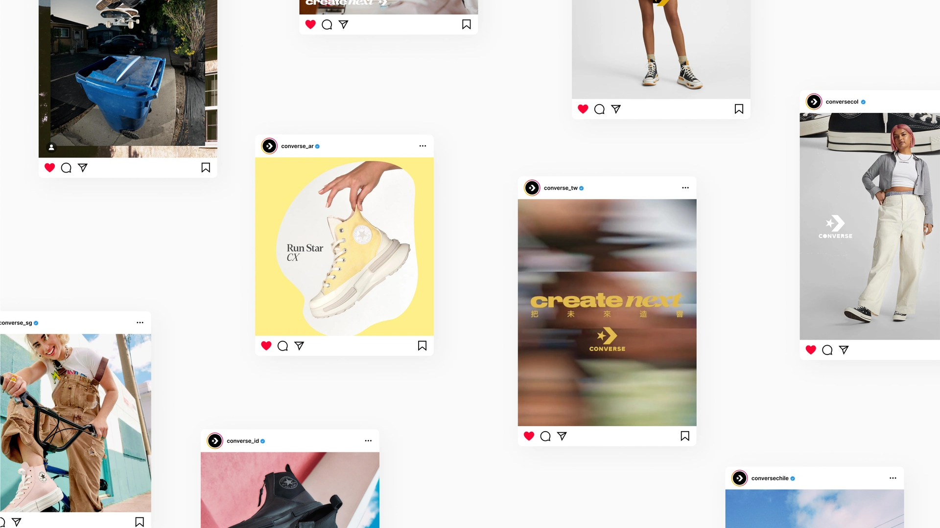
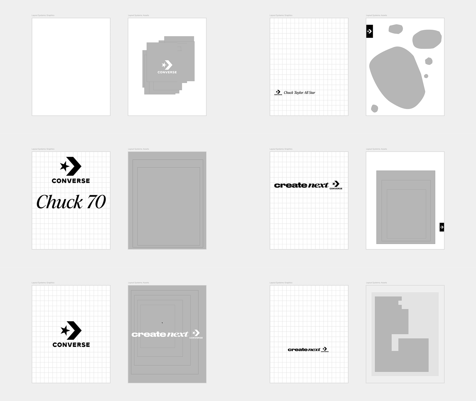
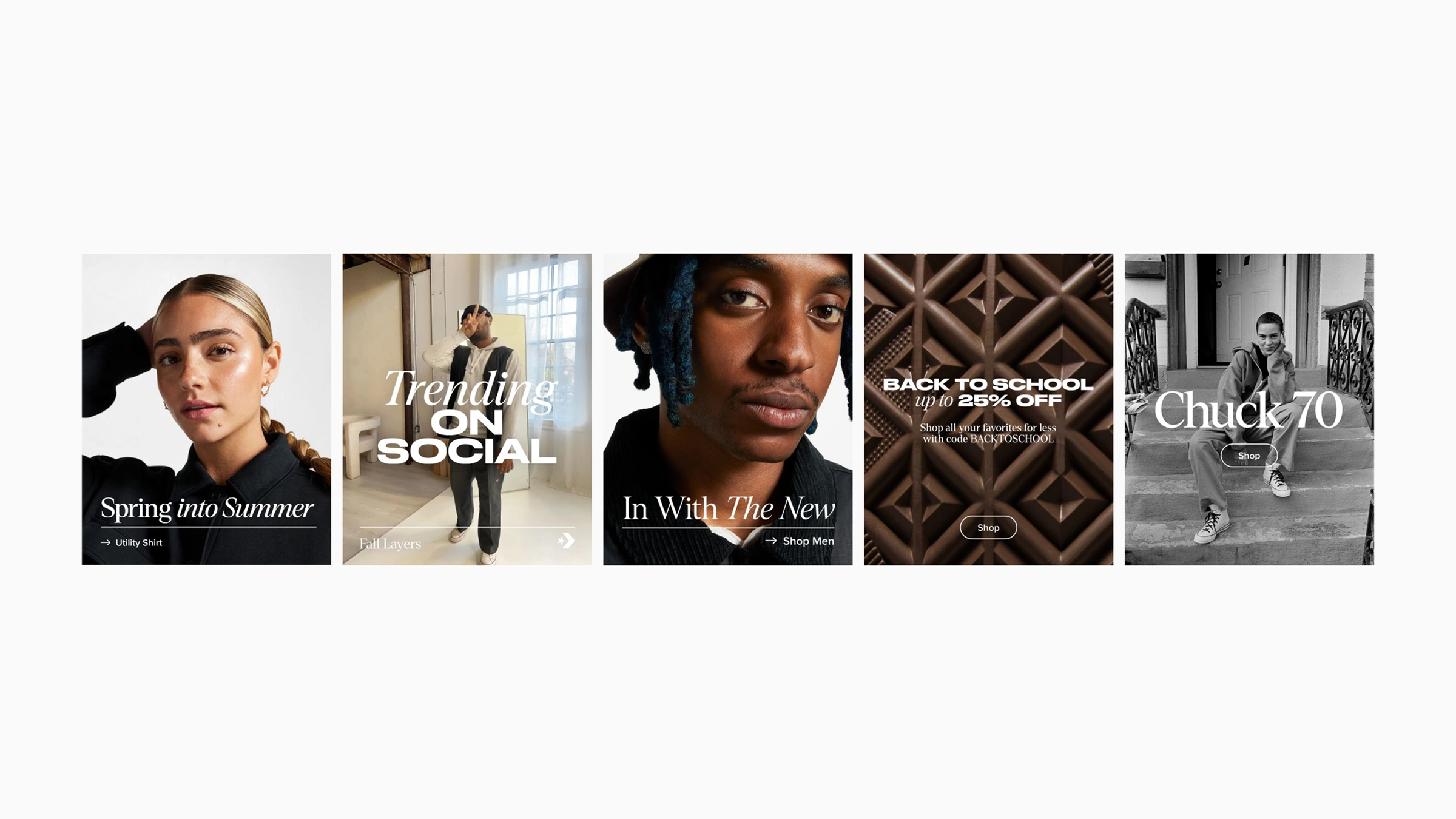

Bringing the “Skate Mindset” to every facet of Converse through audacity and irreverence — defining their Fall ‘23 strategy and campaign.
Full case study available on WØRKS.
Listened to:
06 Boldly
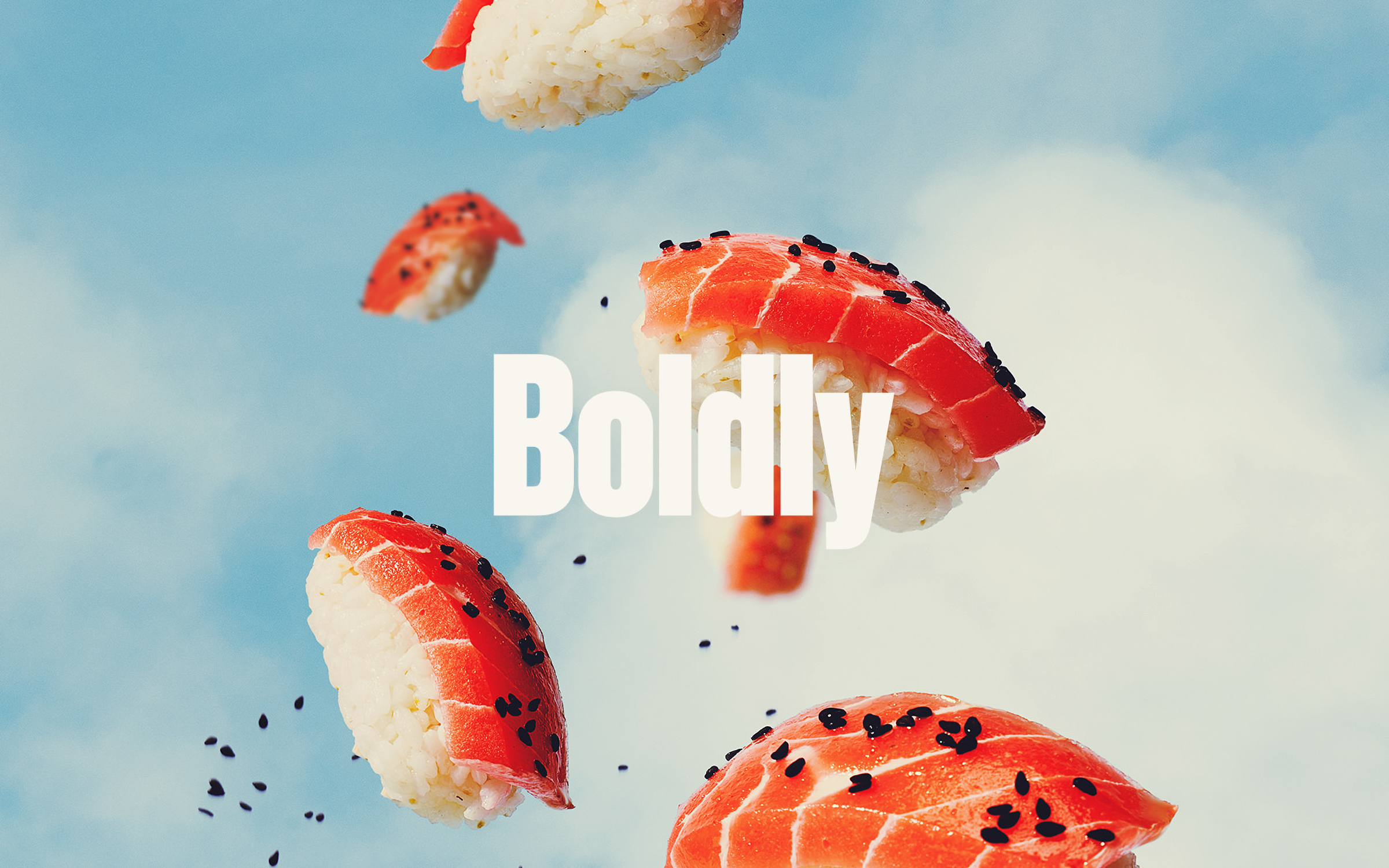
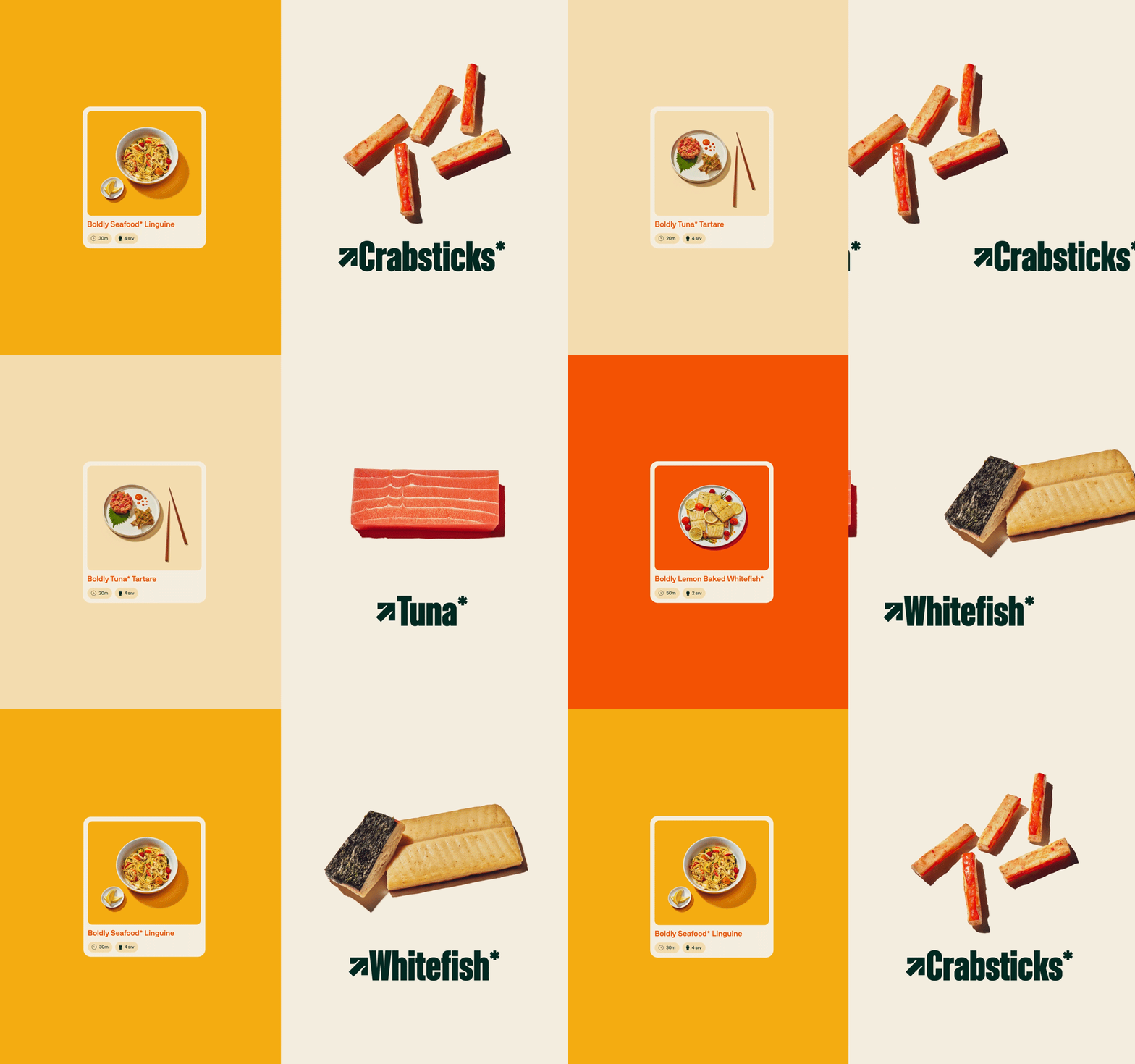
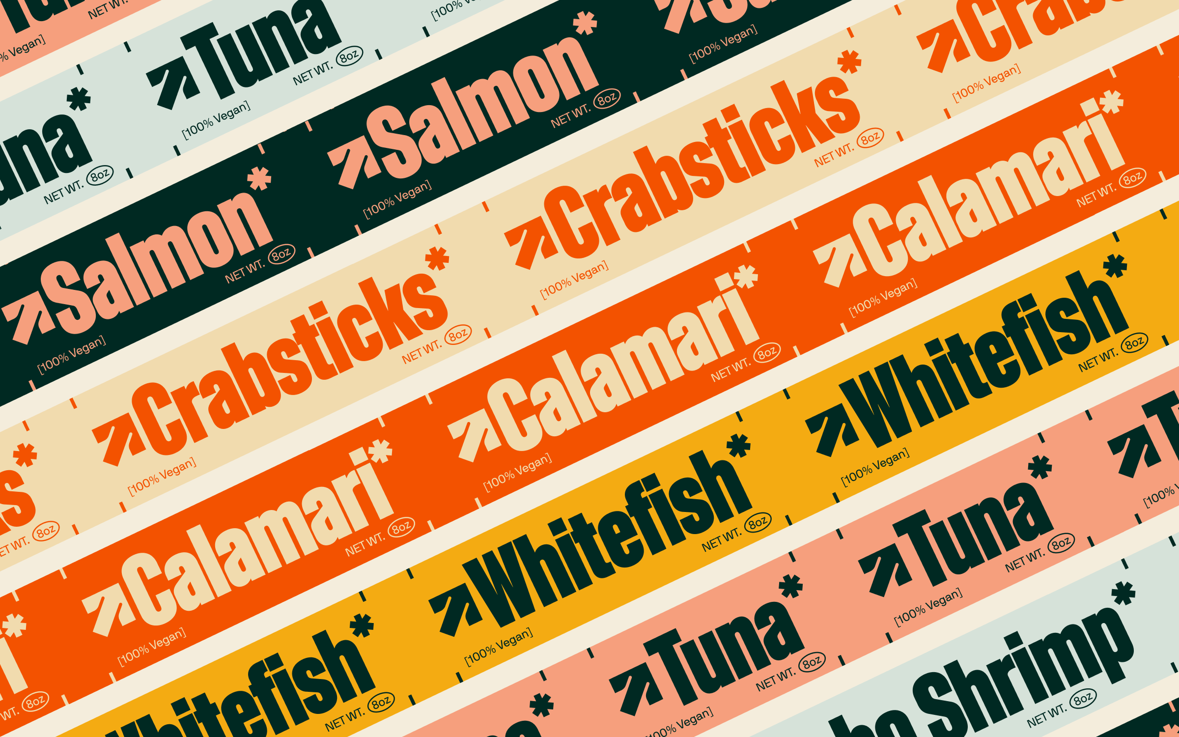
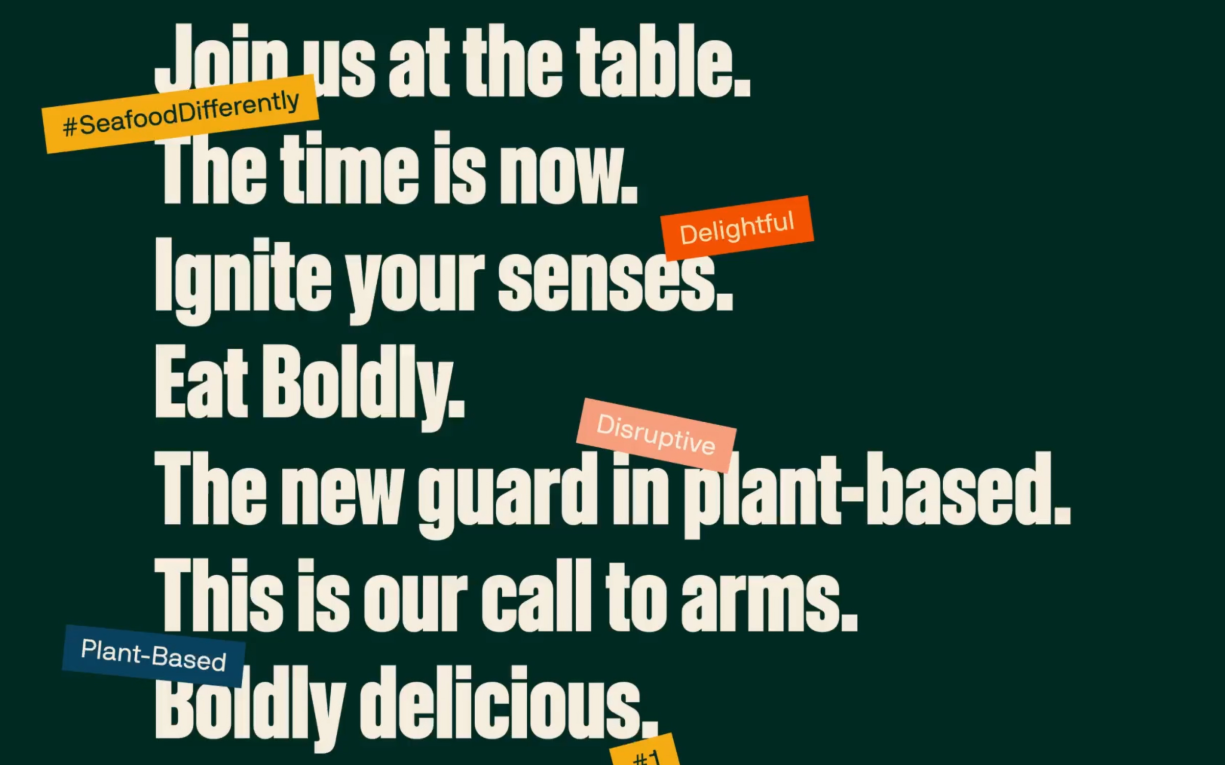
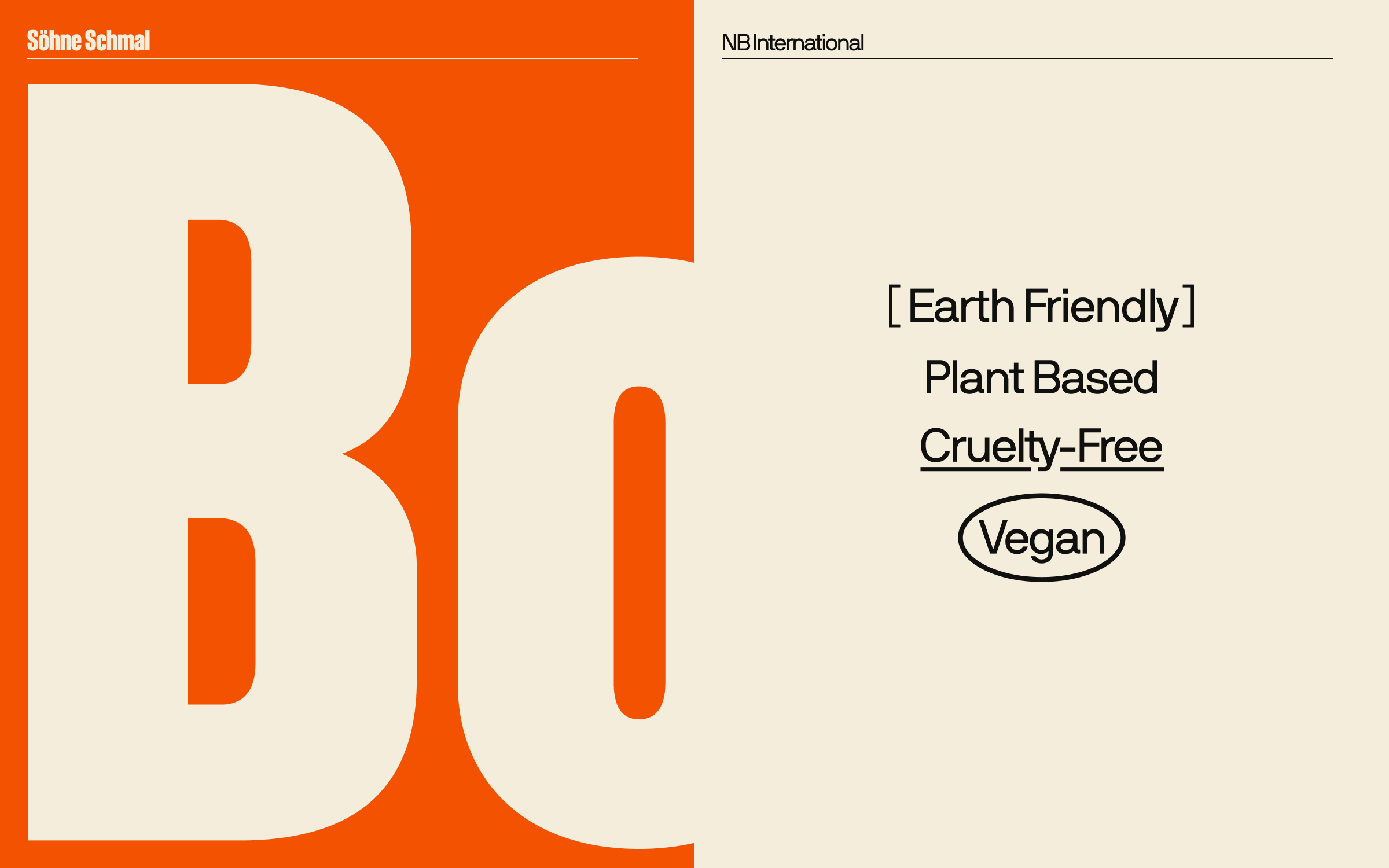
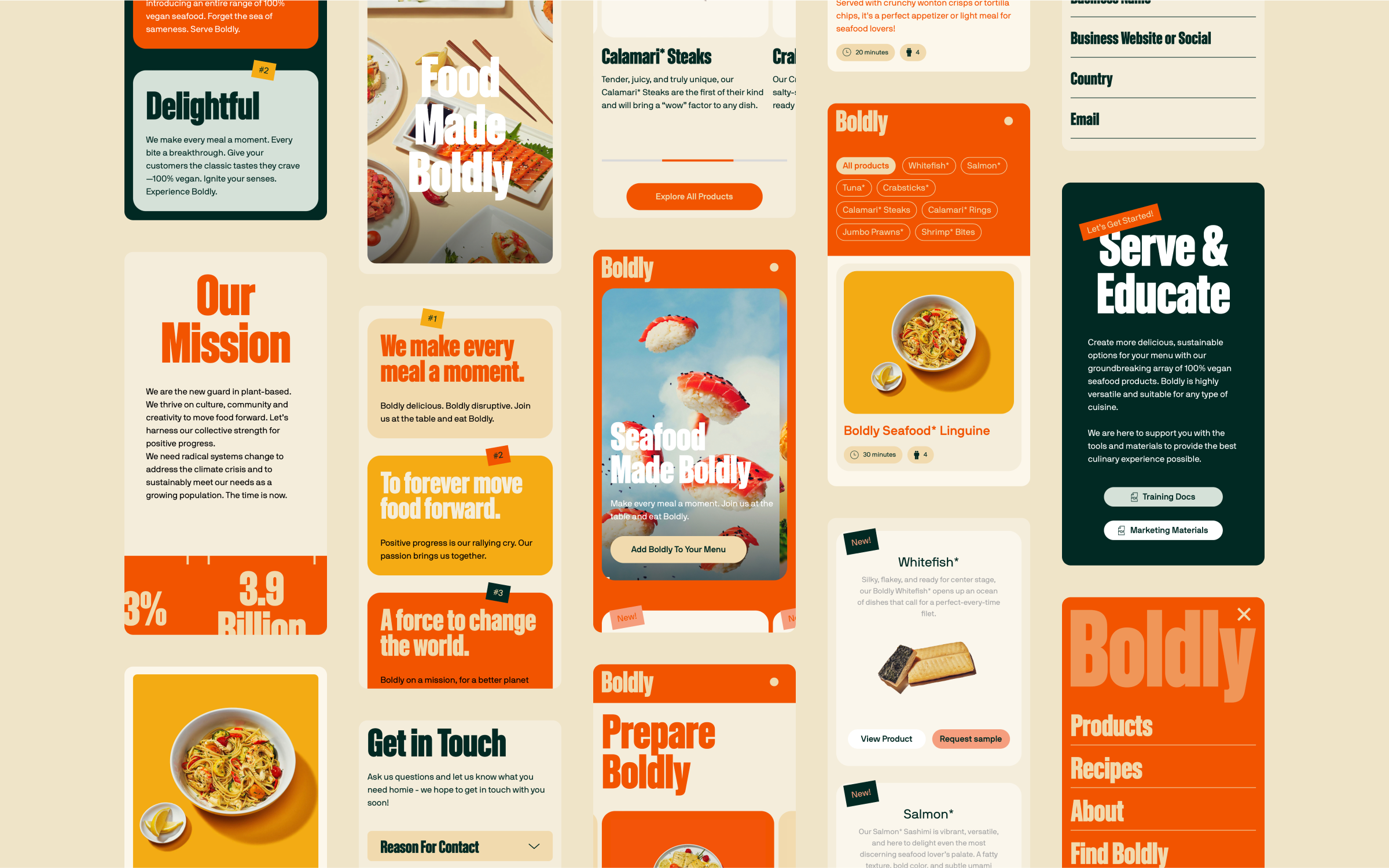
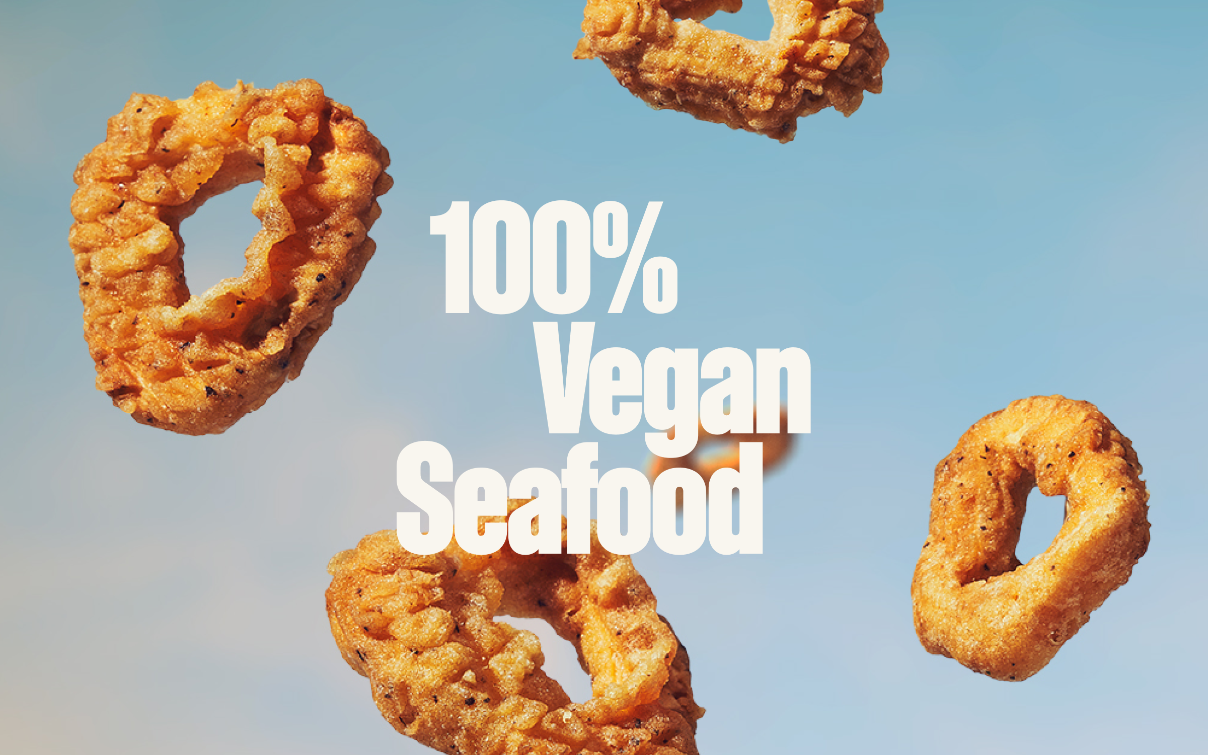
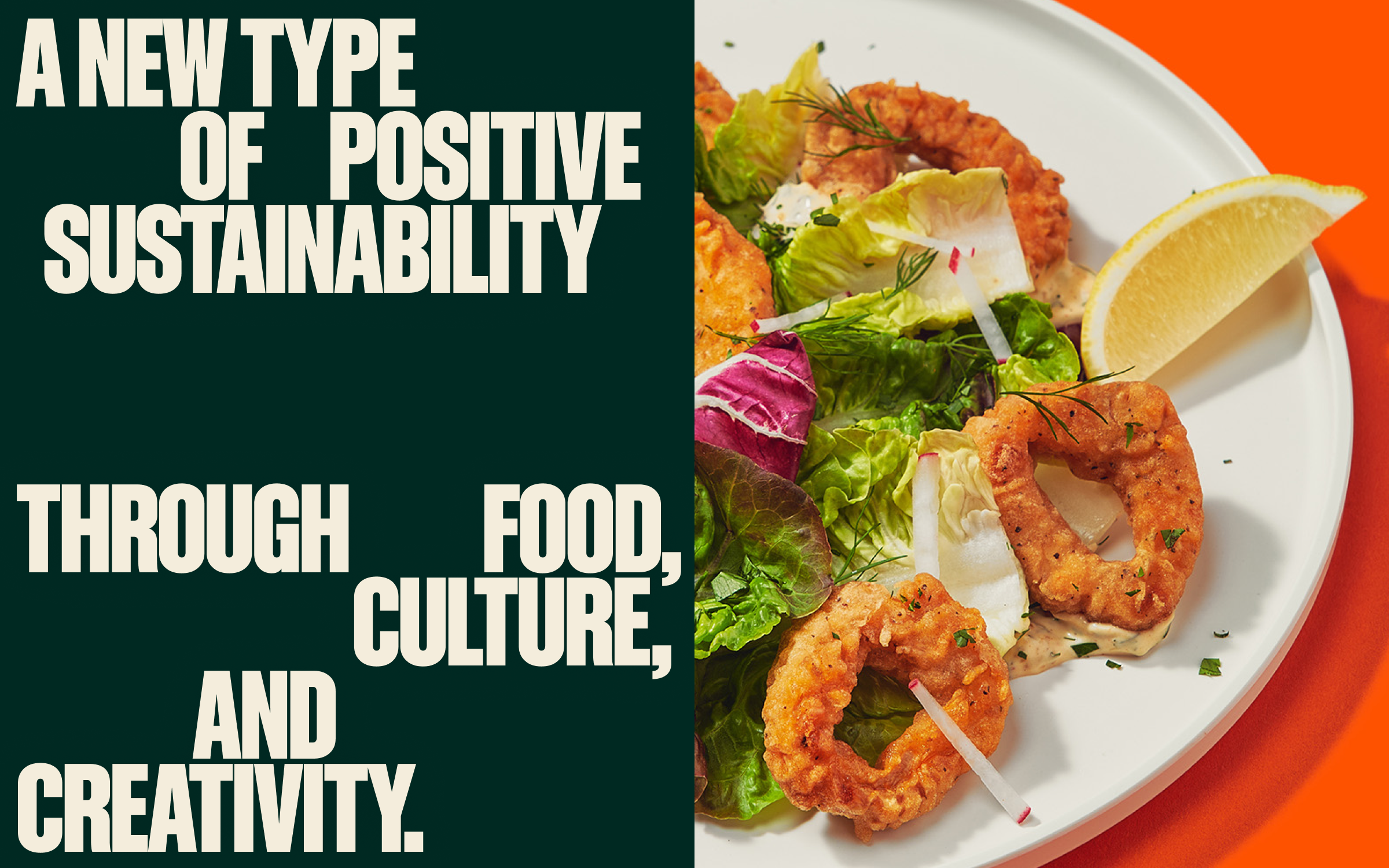
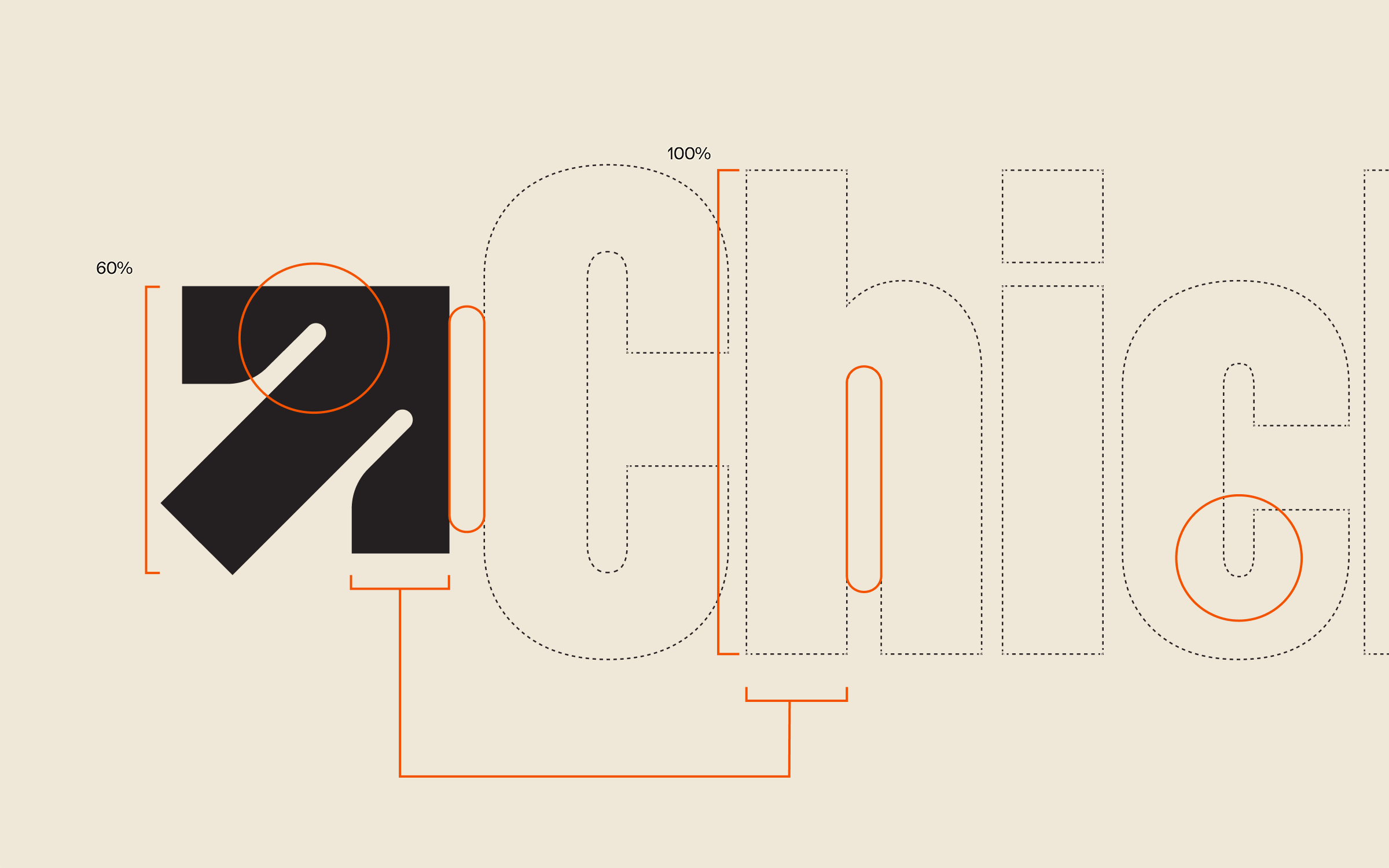
Boldly is a new wave in plant-based alternatives, channeling optimism for a future empowered by sustainable food choices, beginning with reimagining seafood: the world’s largest traded food commodity.
Full case study available on WØRKS.
Listened to:
07 Nike NFL
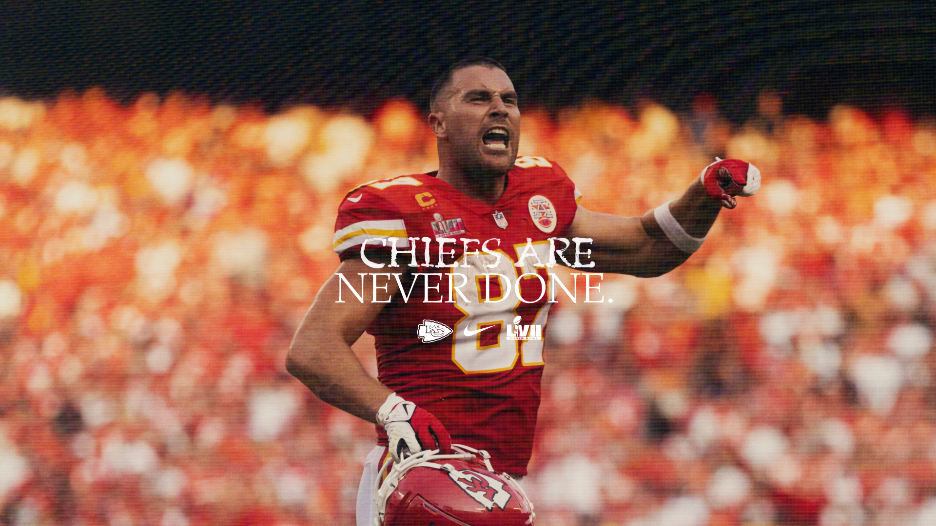
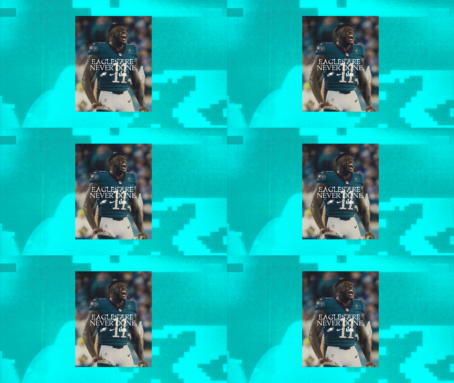
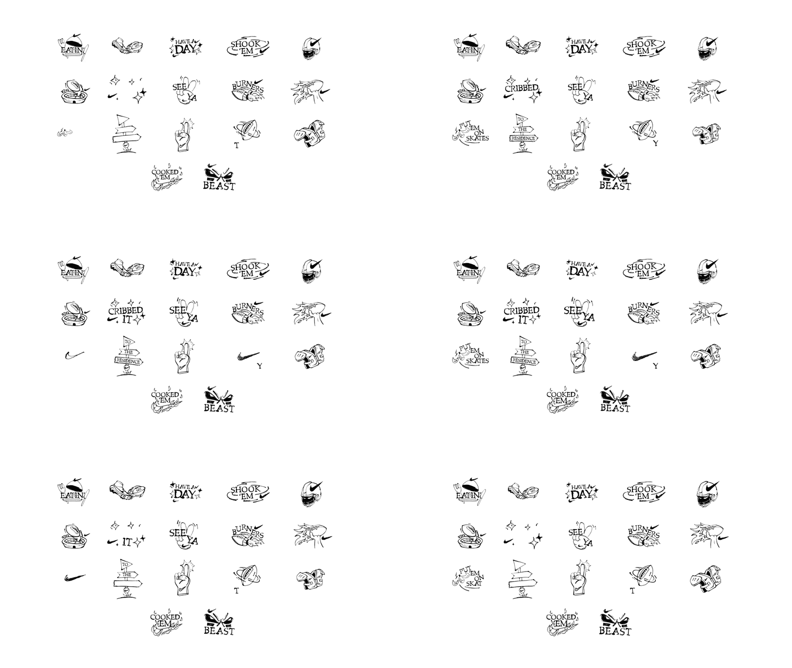
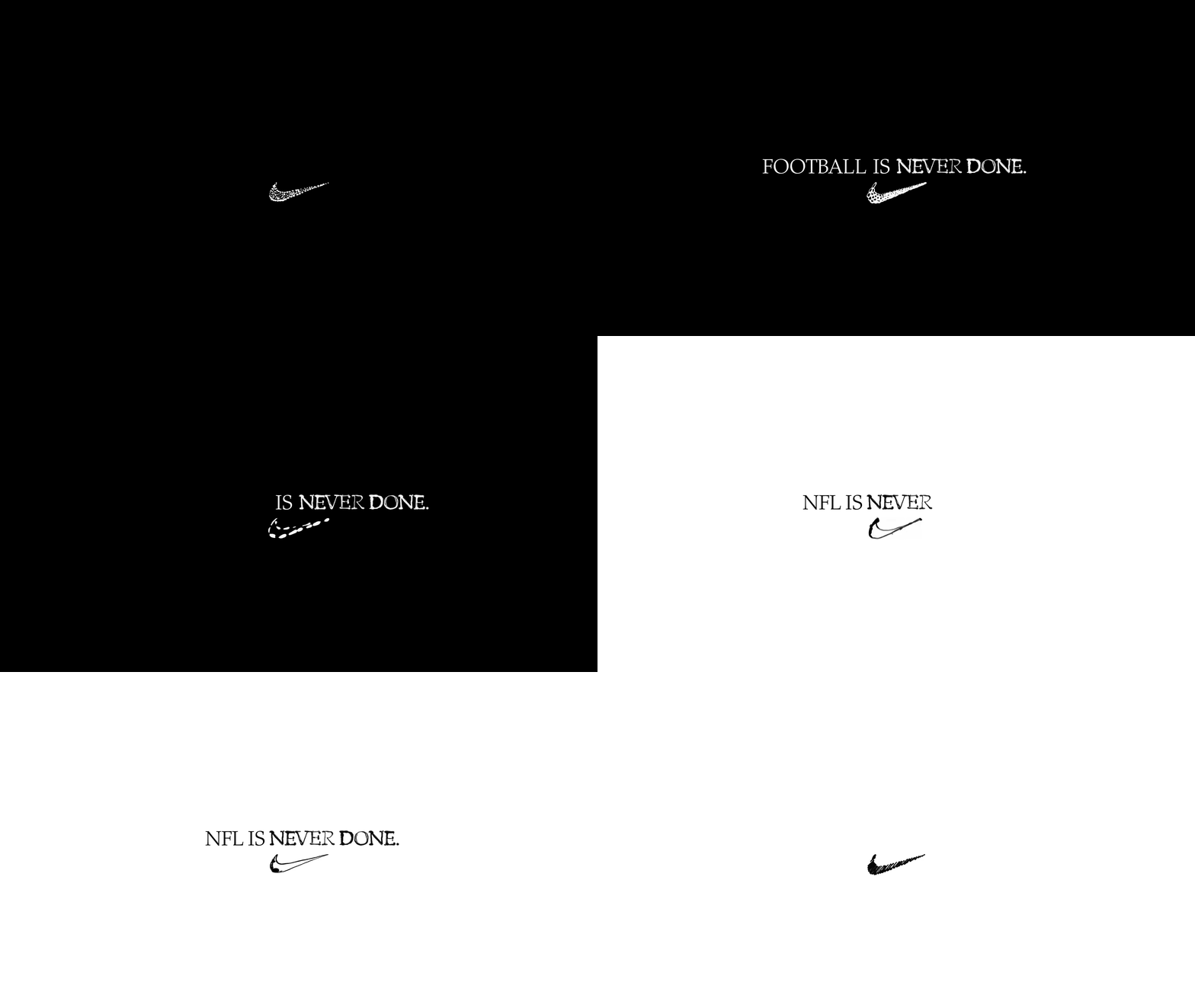
Creating Nike’s US Football 365 NFL Campaign and further building on it with Super Bowl LVII.
WØRKS collaborated with Nike to push further into the “Never Done” language, highlighting the spirit and celebrating the journey of progress. Pairing elevated typographic lock-ups with expressive hero shots and immersive action photography.
Full case study available on WØRKS.
Full case study available on WØRKS.
Listened to:
08 Virgin Music
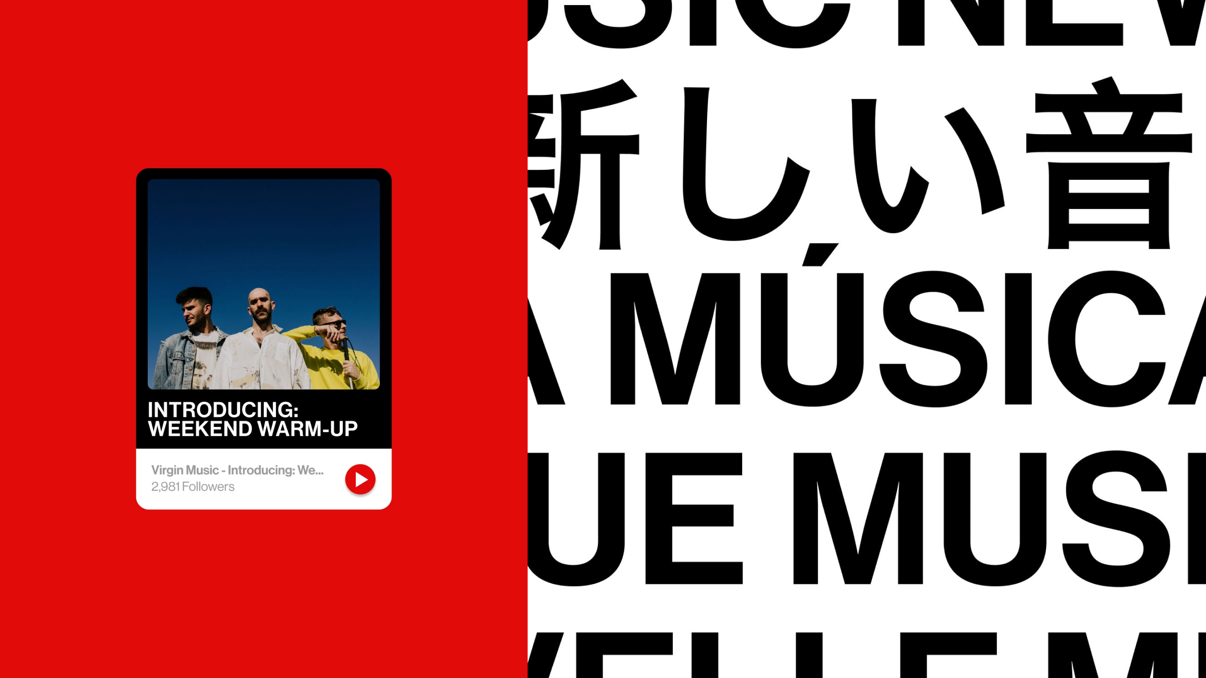

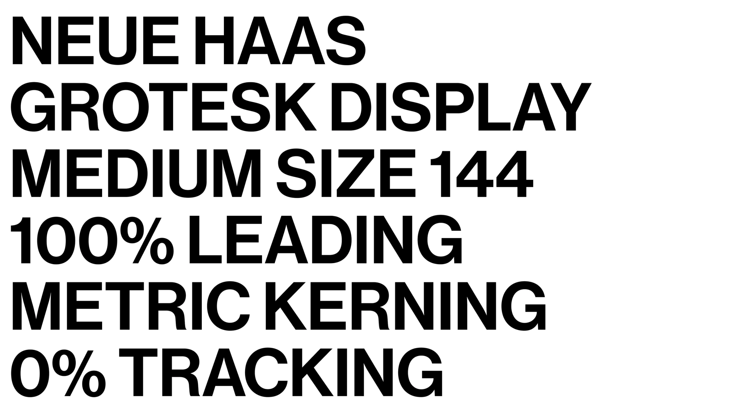
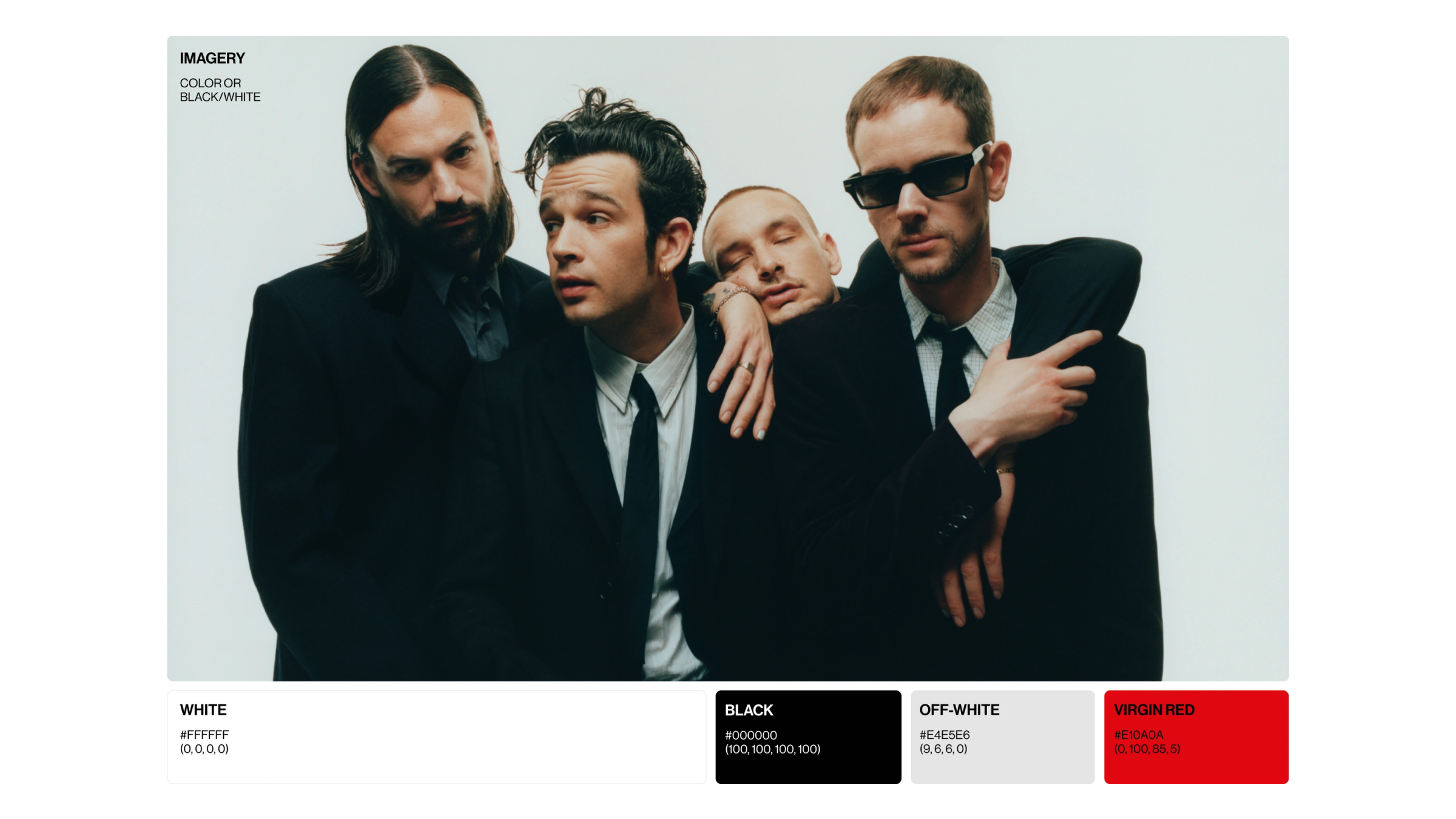
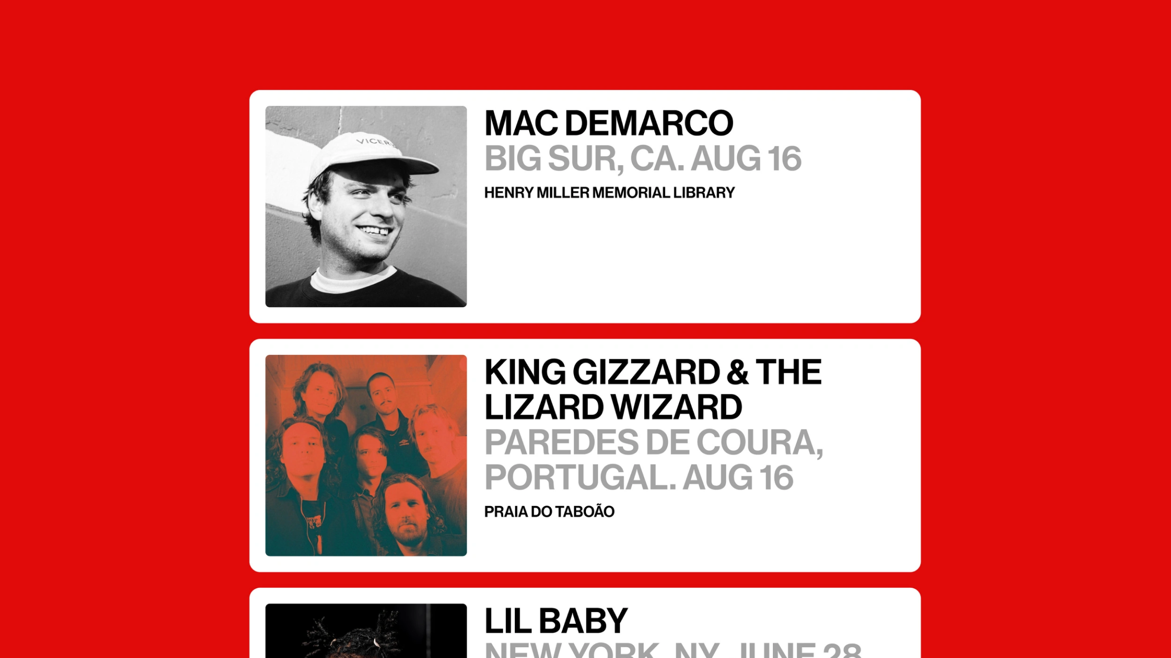
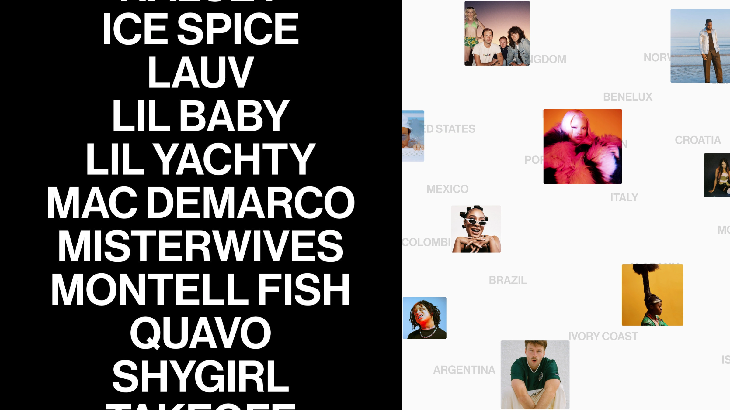
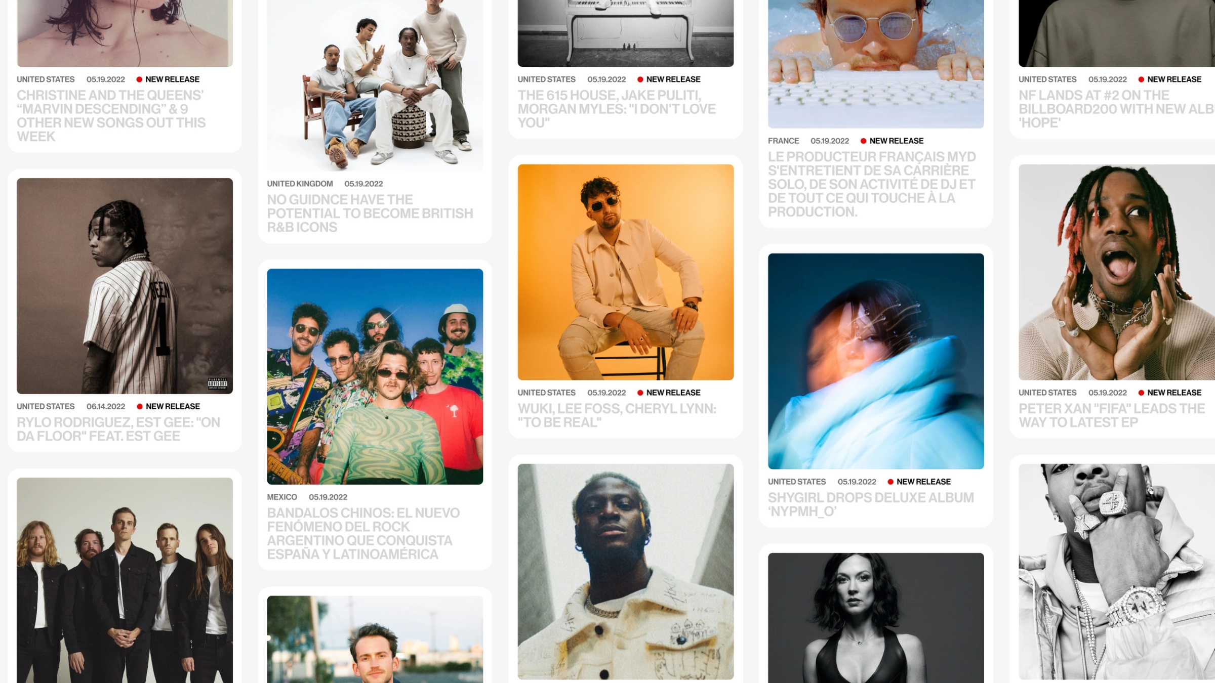
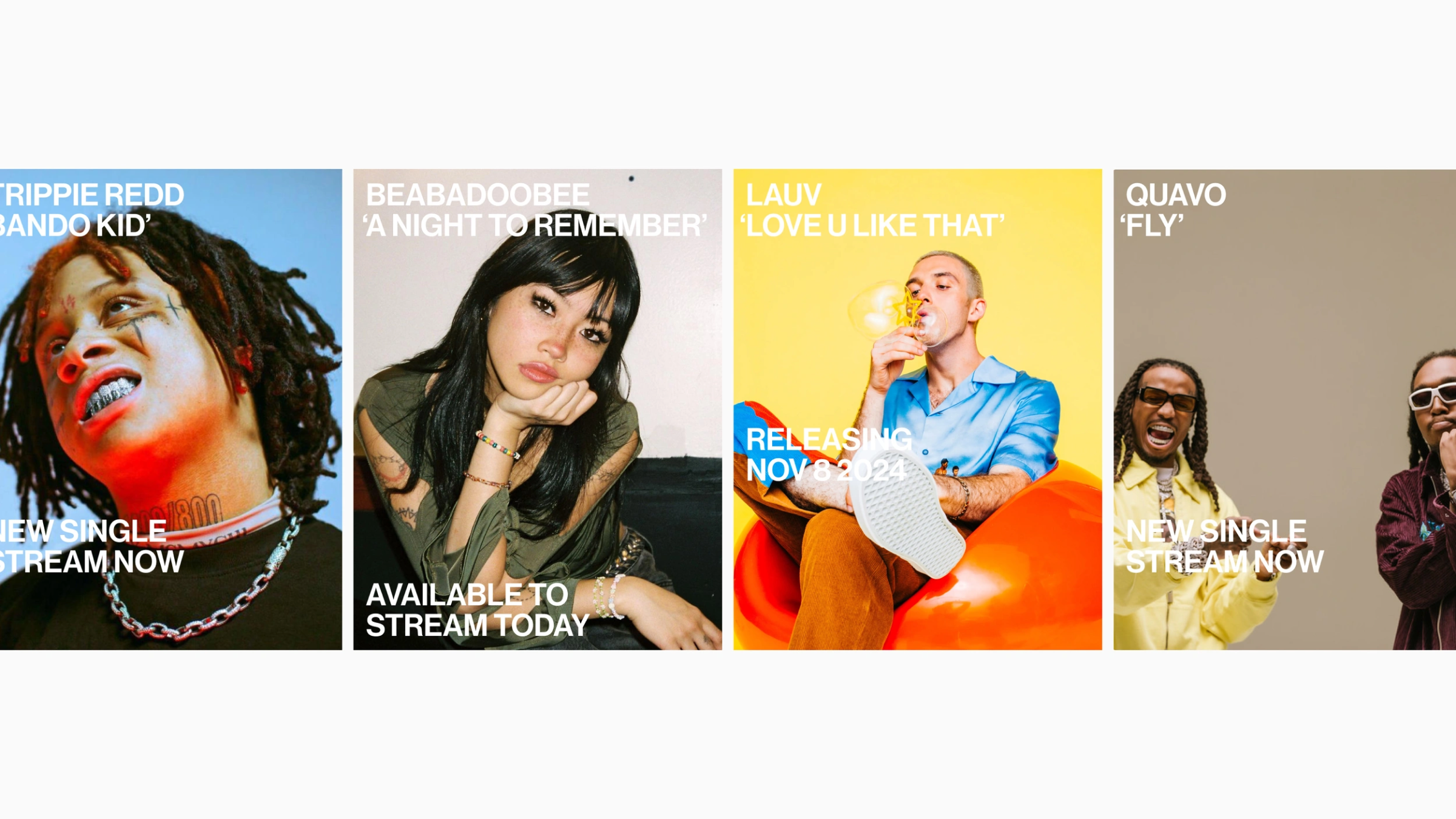
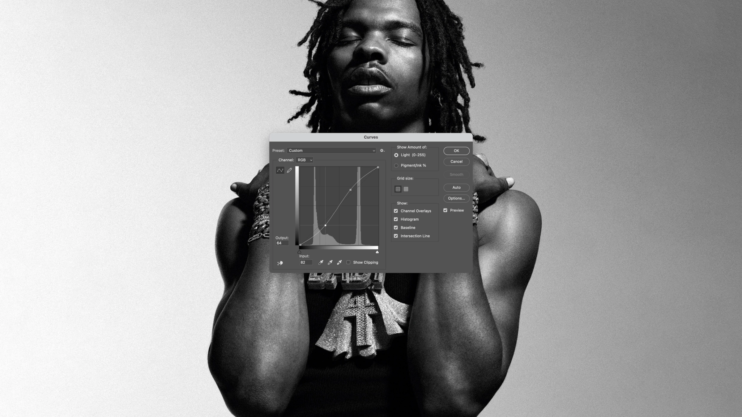
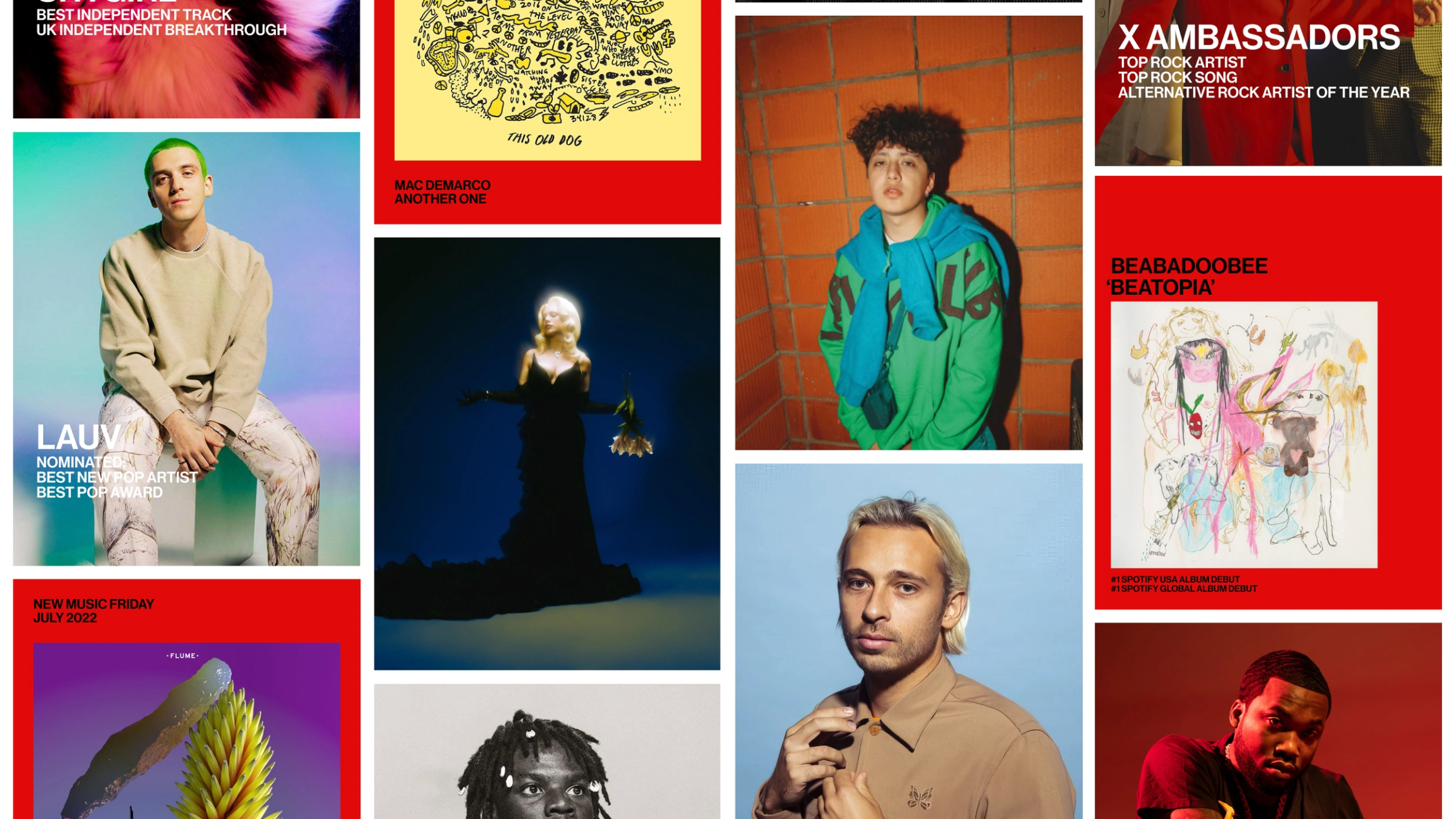
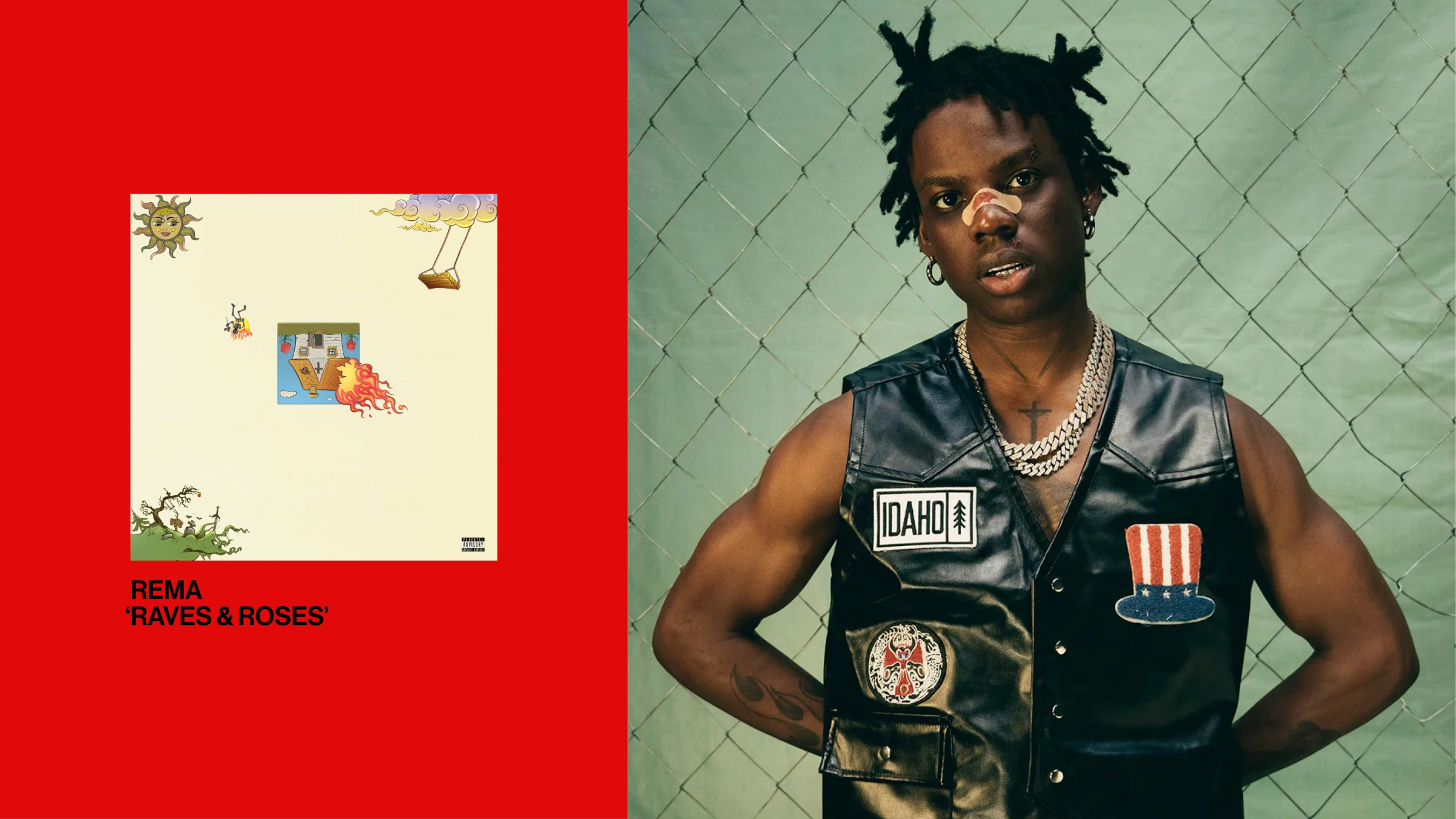
A newly reimagined and reinvigorated brand for Virgin Music to reflect the attitude and expression associated with their rich history as an avant-garde label.
Full case study available on WØRKS.
Listened to:
09 AIGA NY

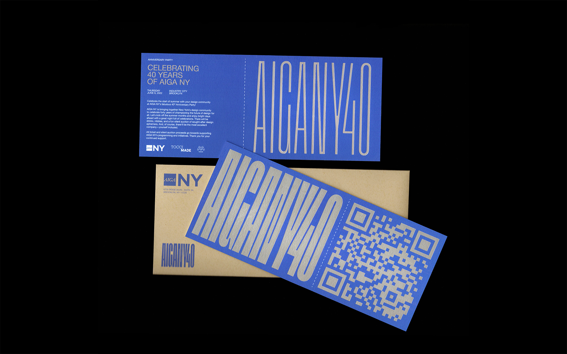

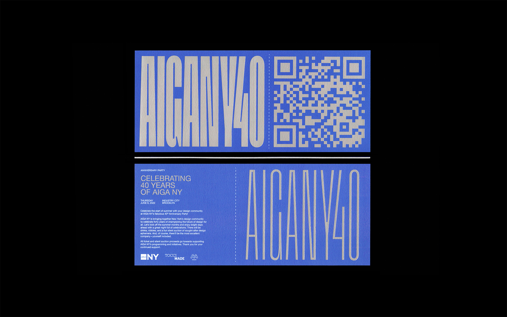


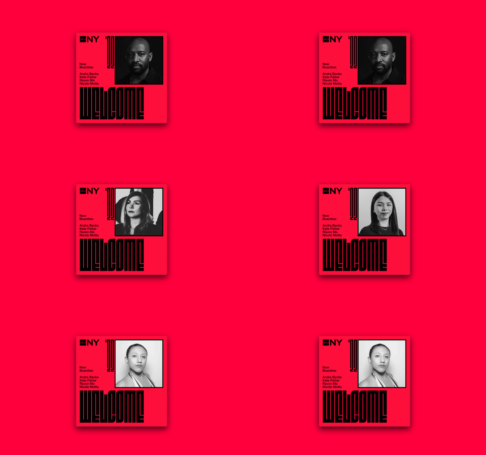
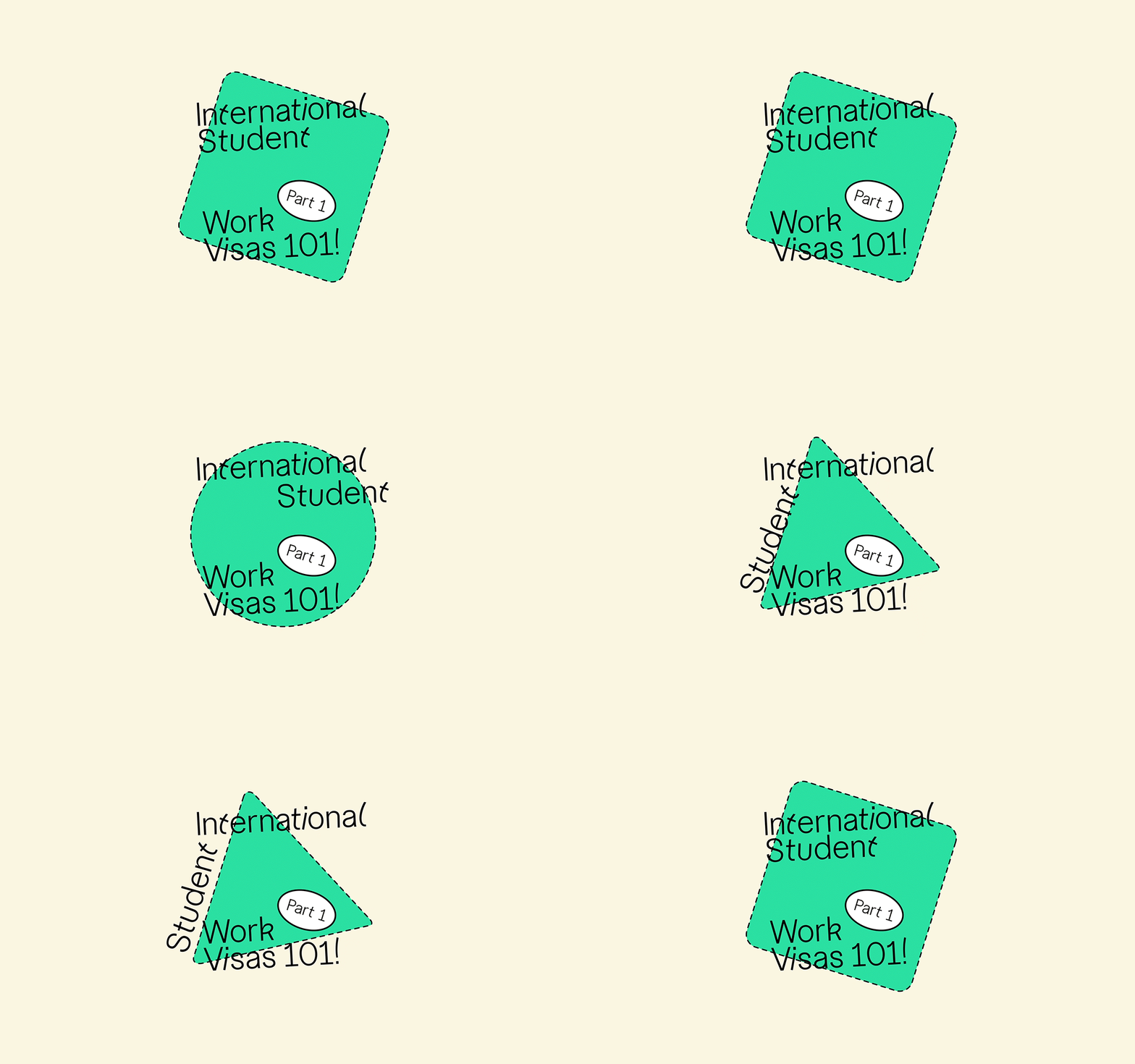
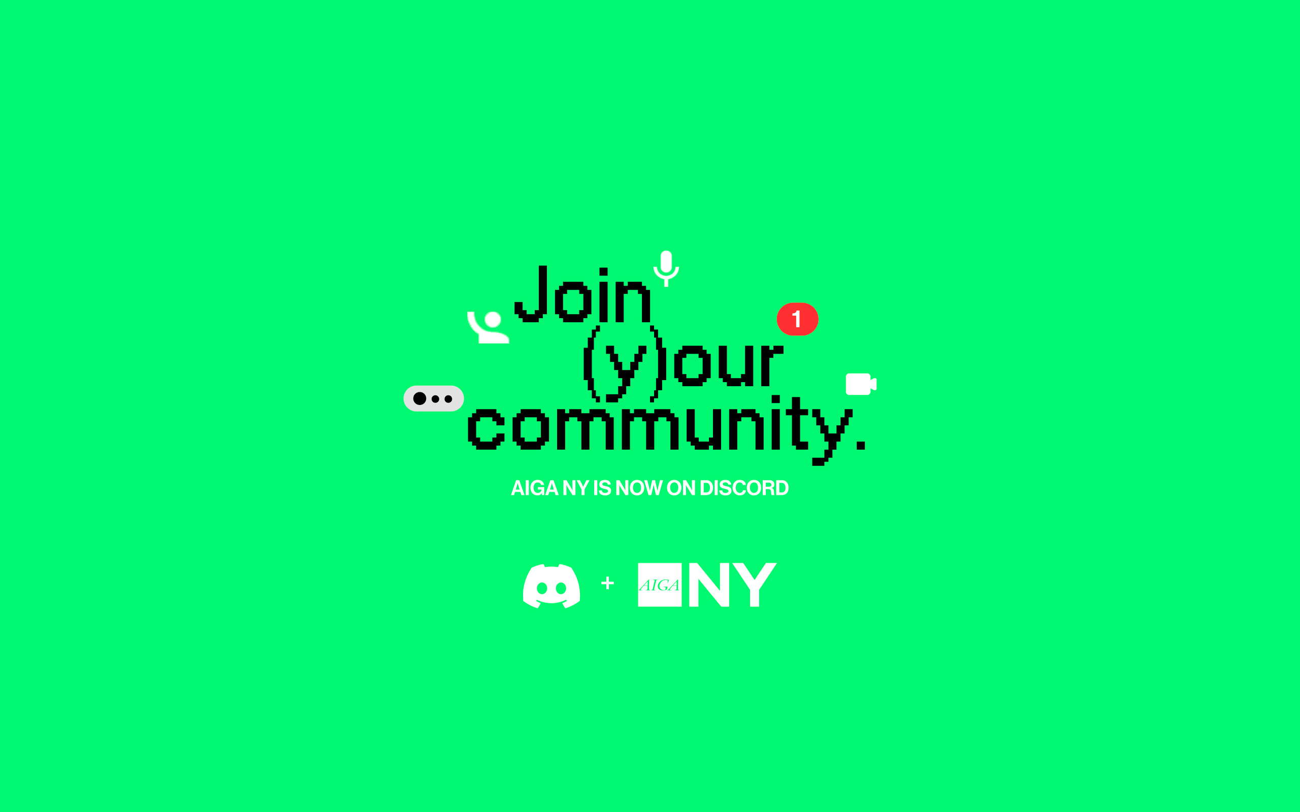

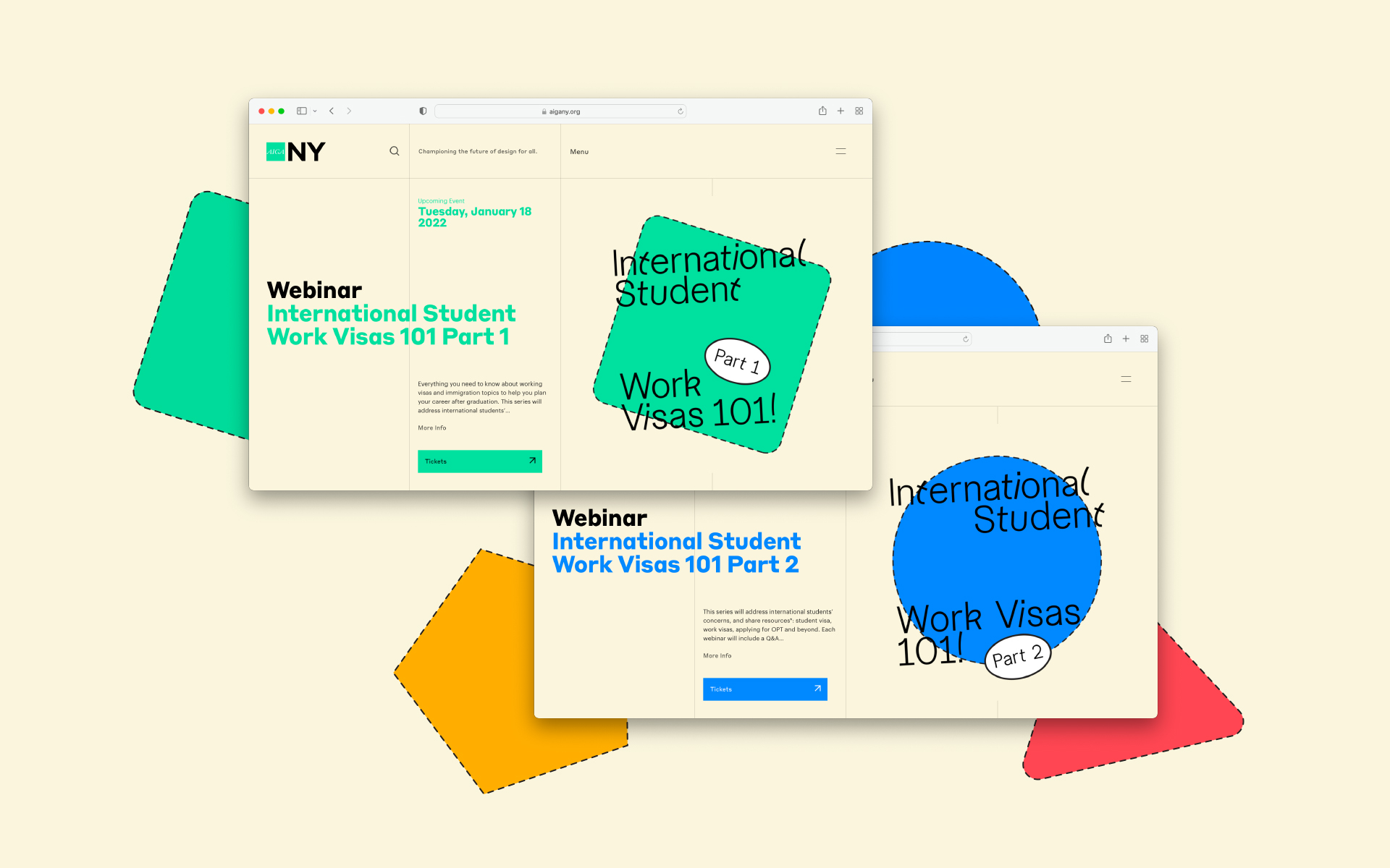
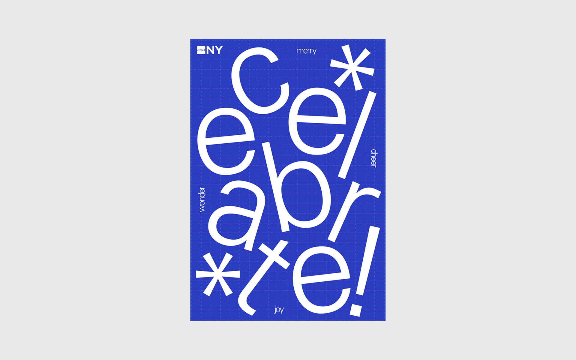
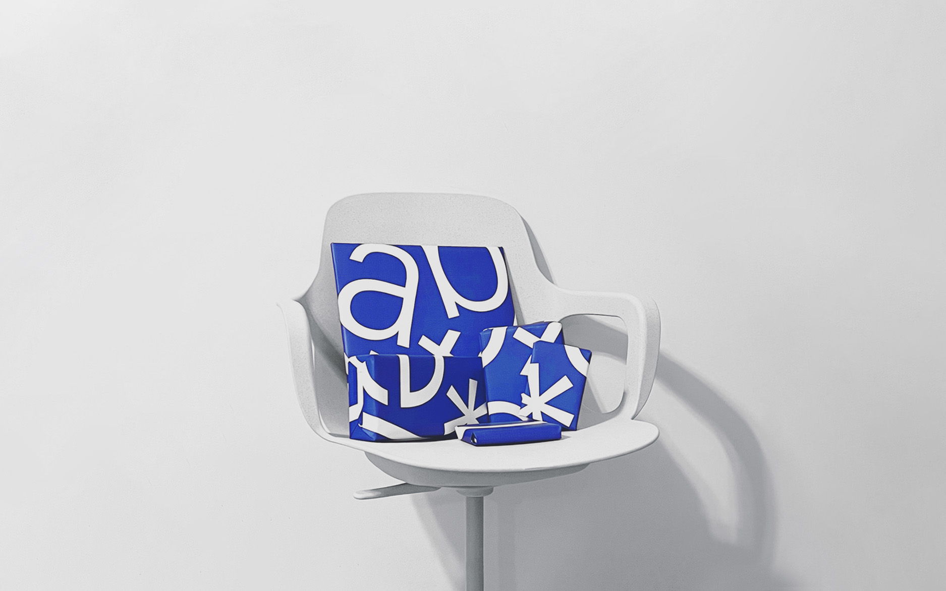
AIGA NY is powered by a volunteer Board of Directors, here to serve the community and working to fulfill our mission across everything we do. Championing the future of design for all.
AIGA NY 40th Anniversary – Event and theme created with Summer Fundraiser ‘22 team. Invite and poster design in collaboration with Laura Scofield.
Assorted – Collection of impromptu designs for a variety of events, announcements, and other initiatives.
Serving on the Education Board.
Assorted – Collection of impromptu designs for a variety of events, announcements, and other initiatives.
Serving on the Education Board.
Listened to:
10 This is not you.
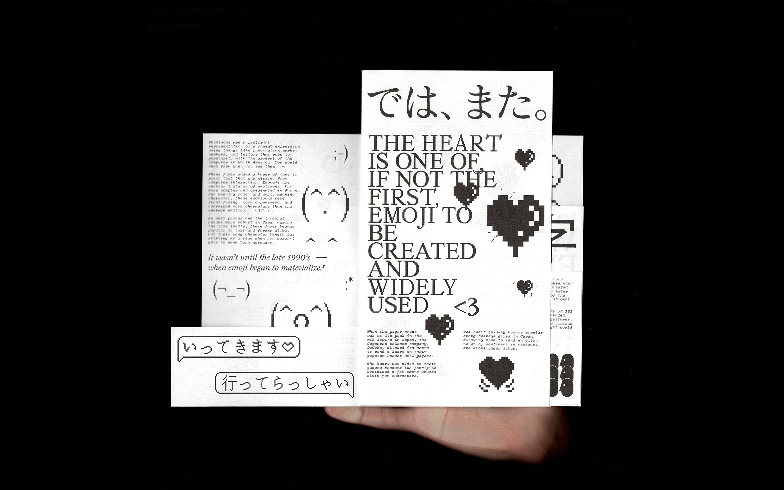
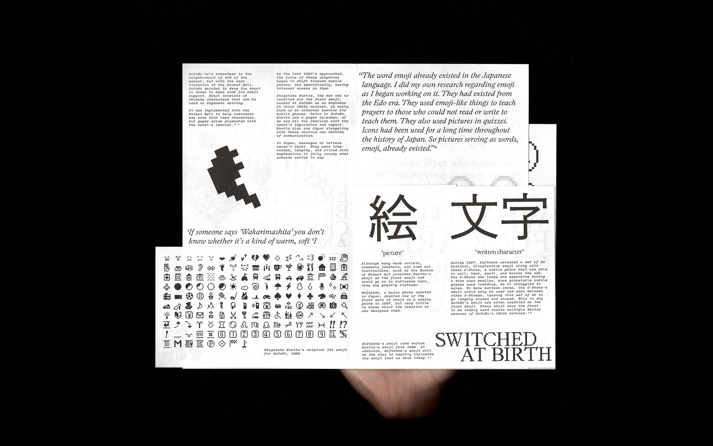
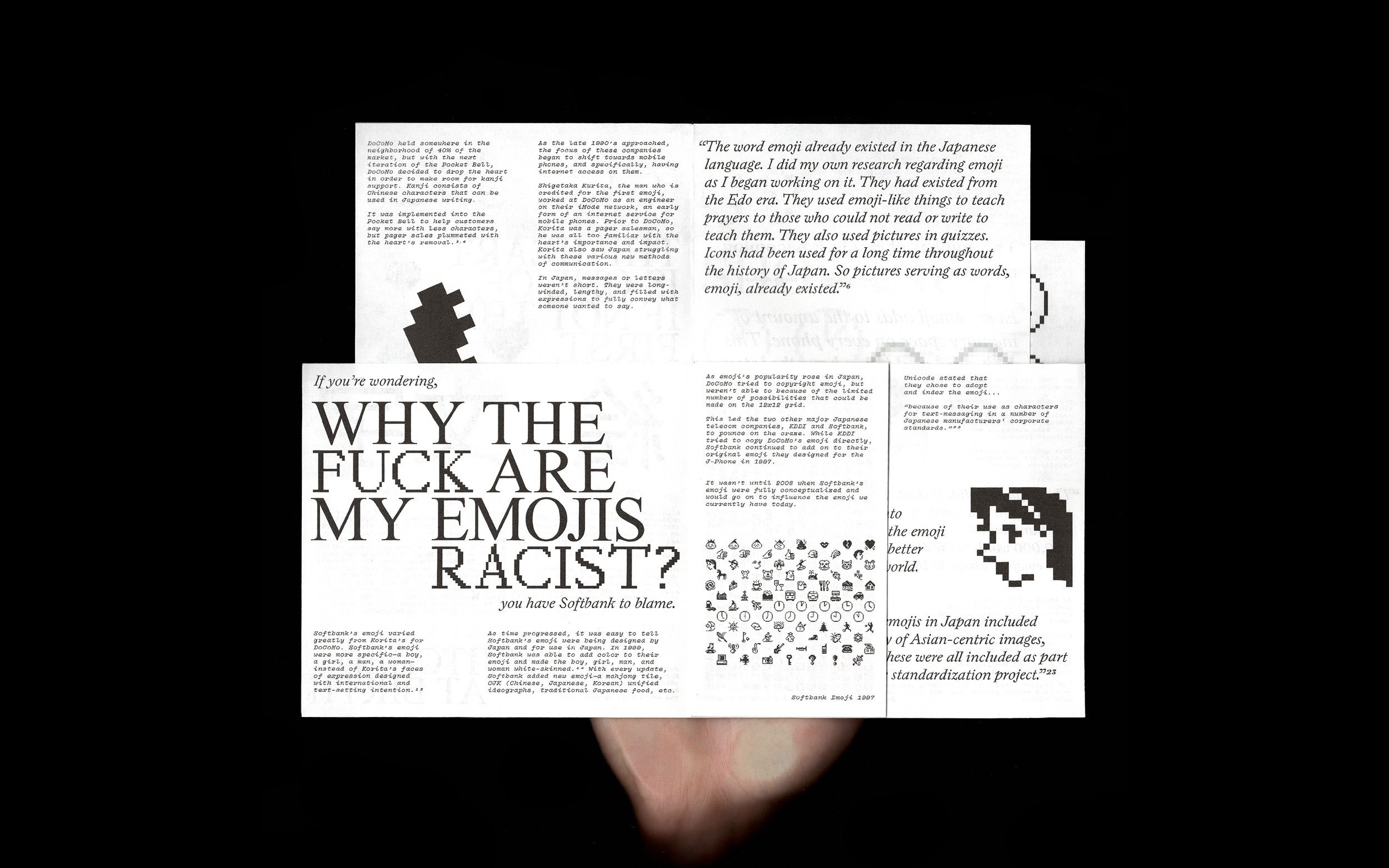
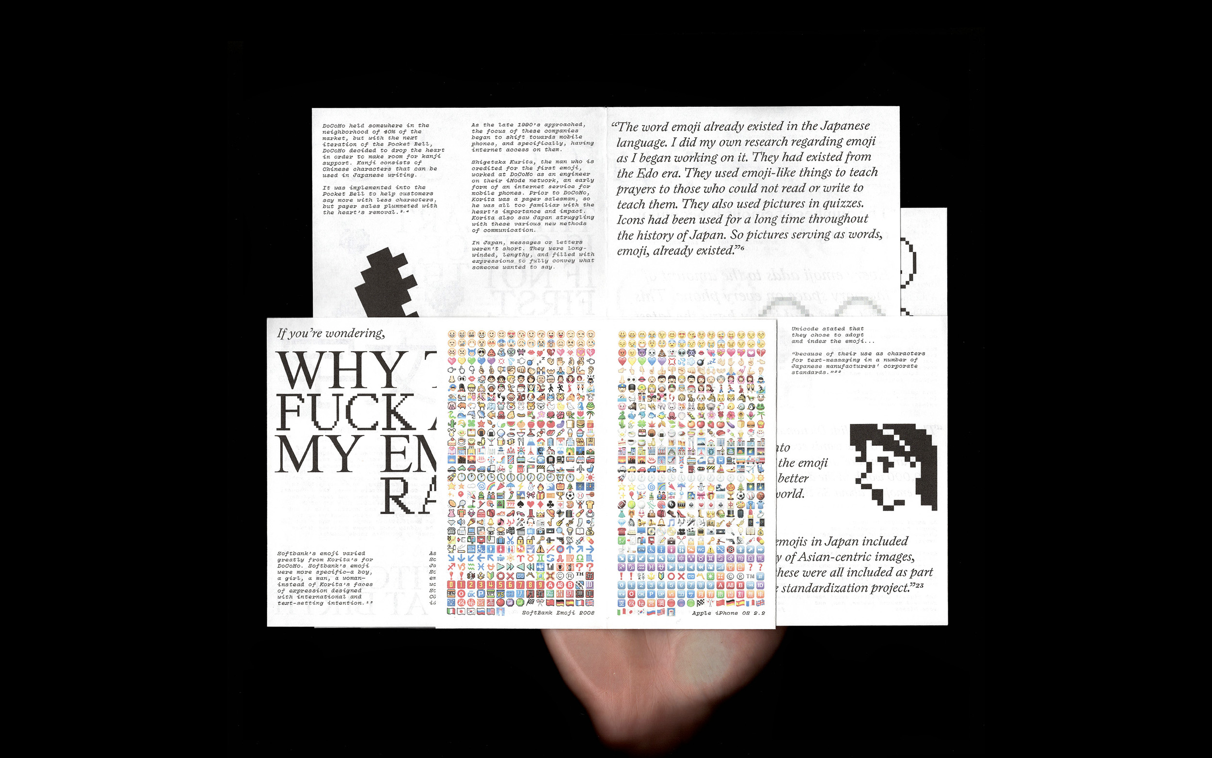
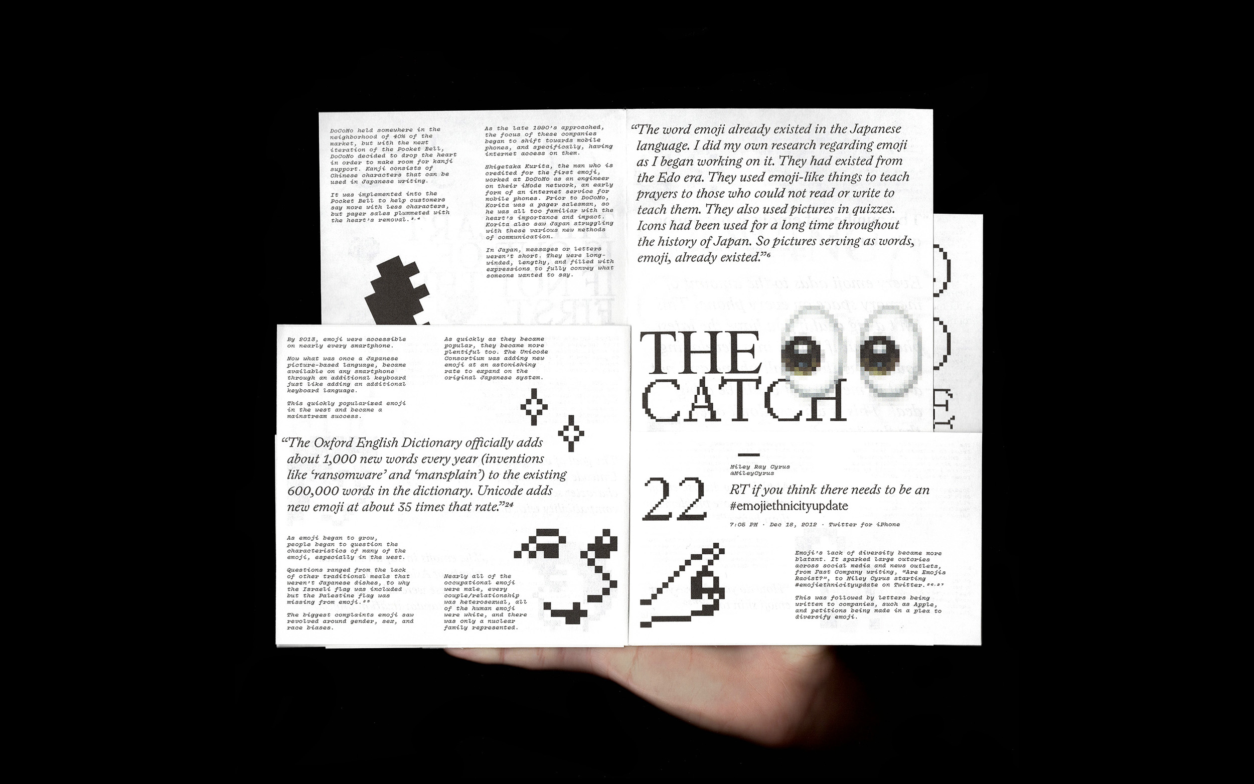
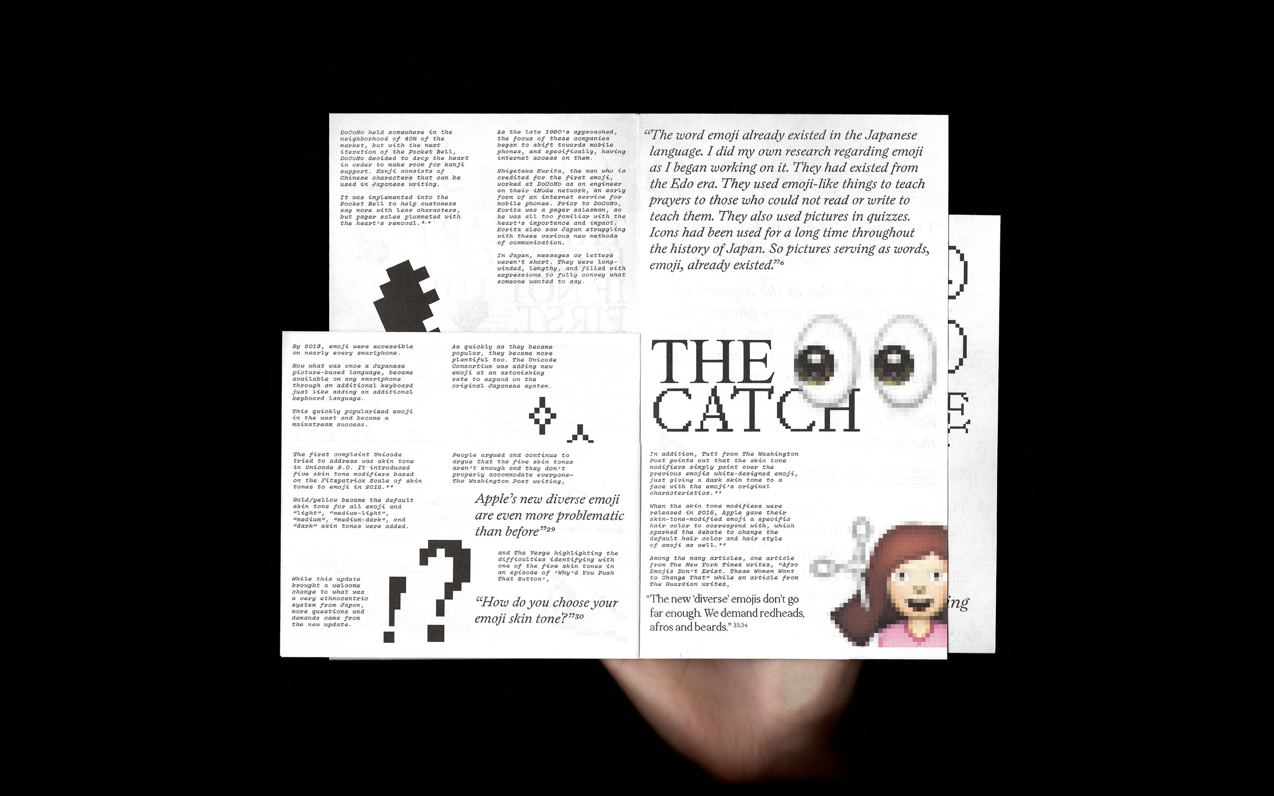
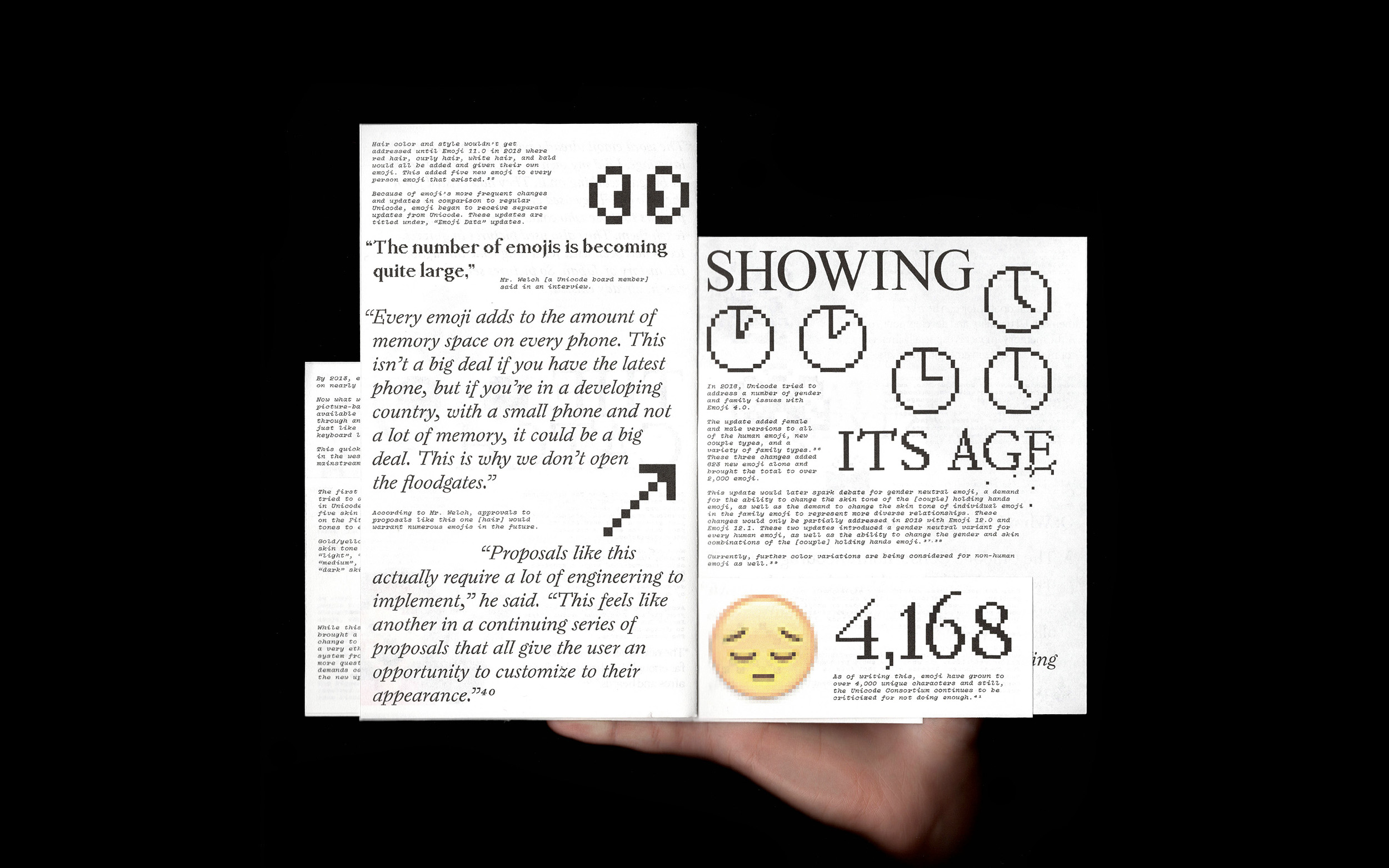
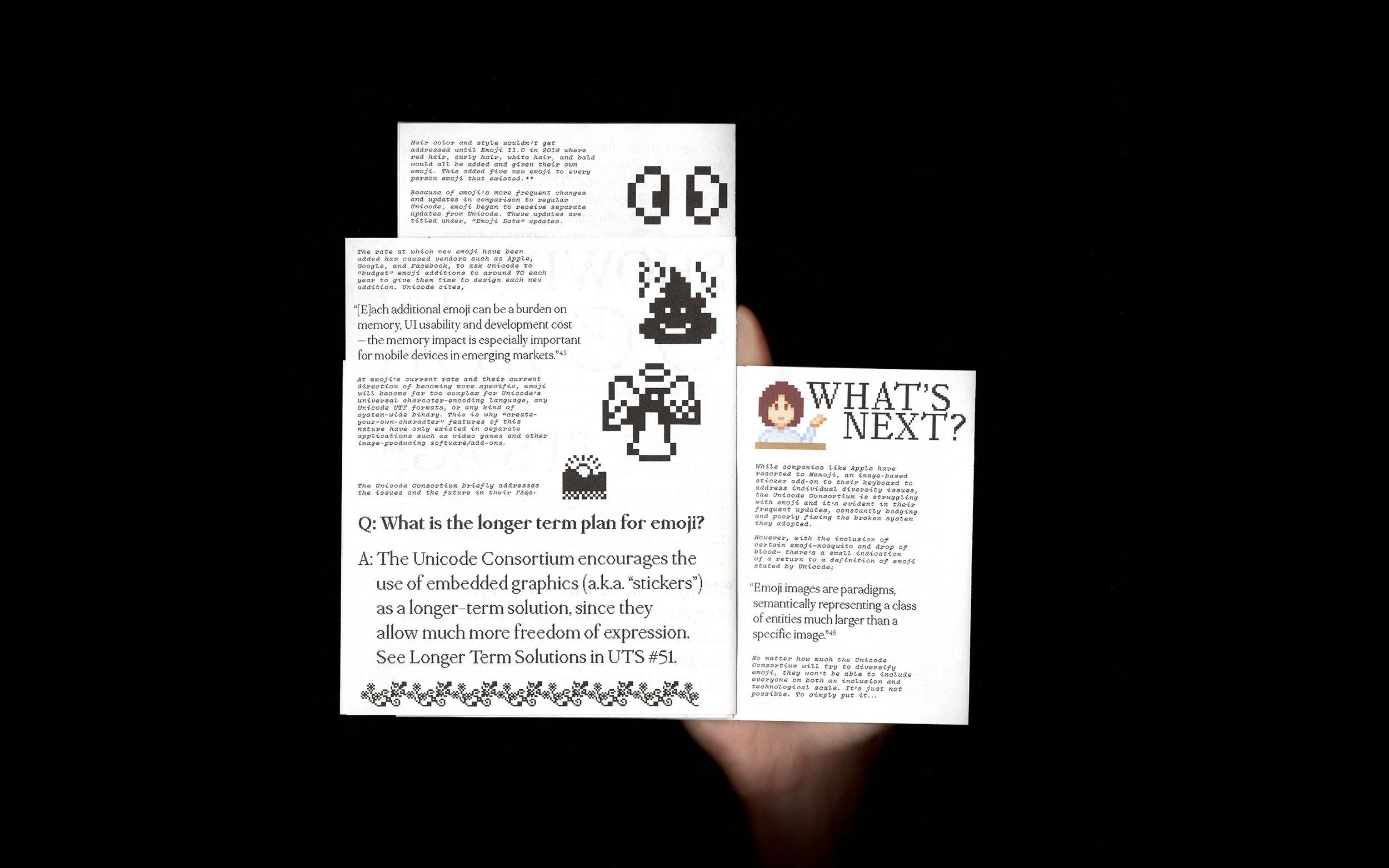
“A bodge is clumsy, it’s inelegant, it will fall apart, but it will work and it will keep working as long as there is someone around to bodge it again if it breaks.”
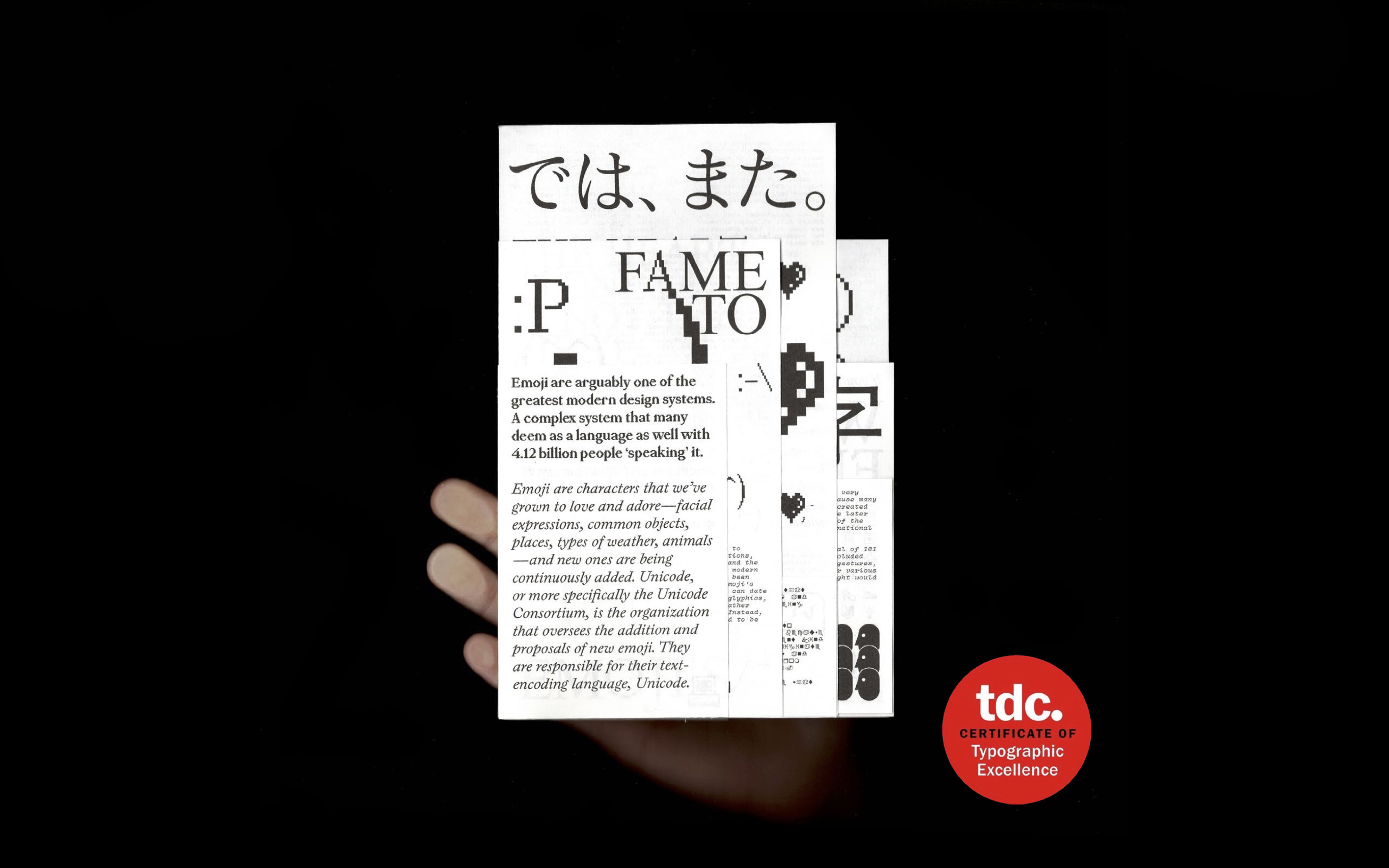
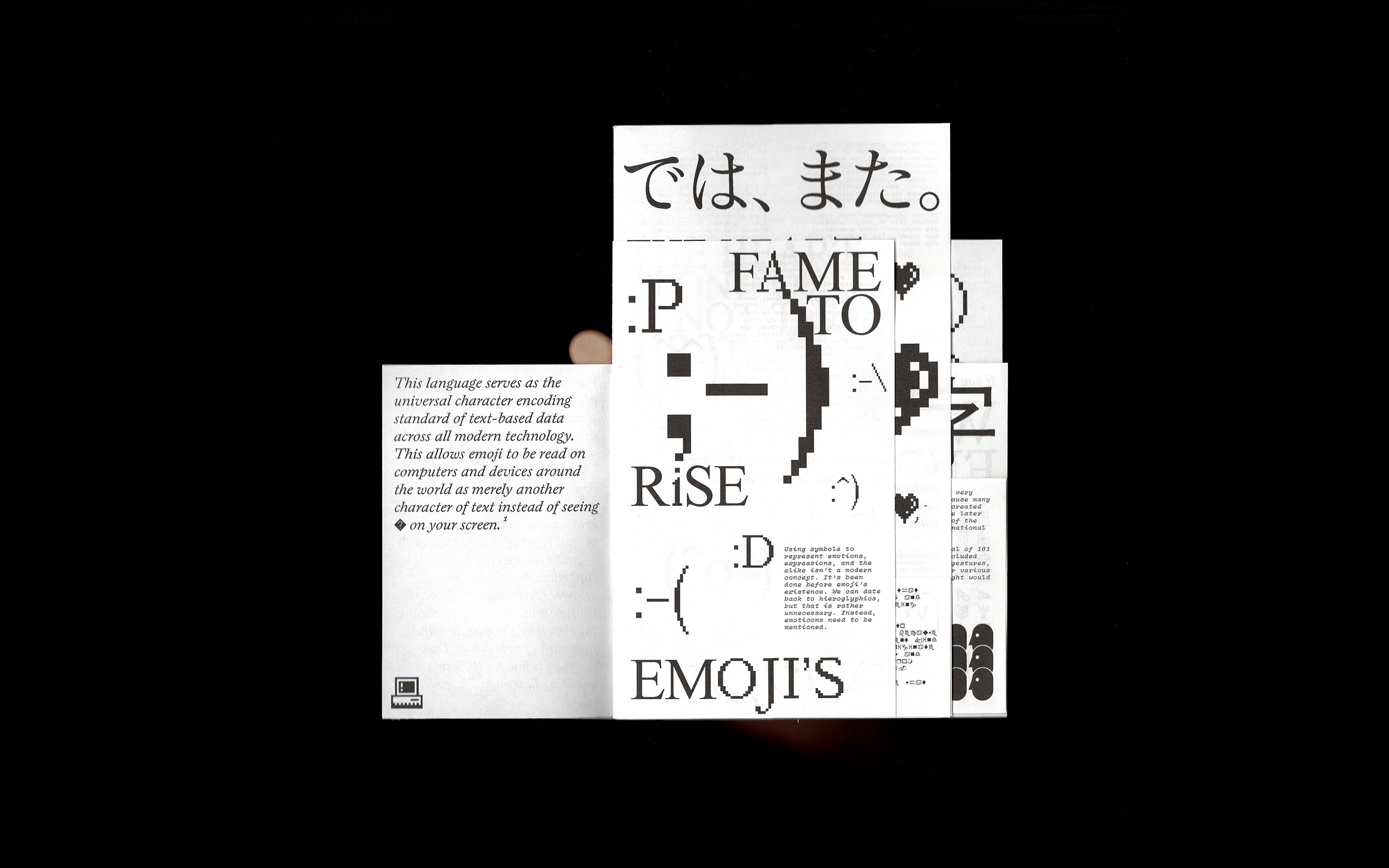
Reflecting on René Magritte’s The Treachery of Images, This is not you. is an undergraduate thesis that looks at emoji in the same light. Diving deep into the history of these little symbols of expression, it uncovers a complex, convoluted, and lengthy past that explains how emoji have become what they are today.
2020’s abrupt interruption forced the project to adapt to what was readily available. Wanting to create something physical, these new homebound limitations — thin, fading, legal-sized paper found in a garage, low levels of colored ink in the family printer, no proper way to bind — drove creative decisions and experimentation.
Type Directors Club – TDC 67, 1st Communications Design Student Competition + Certificate of Typographic Excellence
Graphis – Honorable Mention, New Talent Annual 2021
Listened to:
11 FUTUREVVORLD
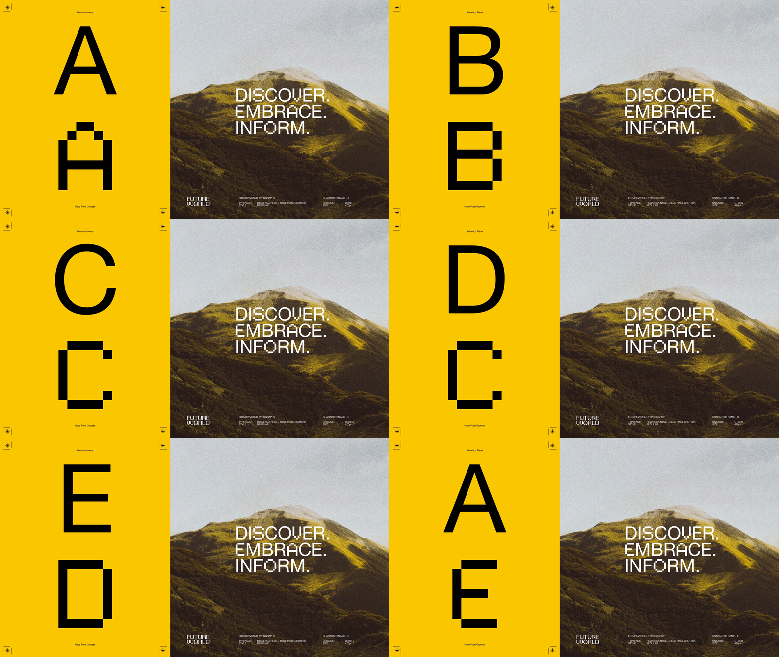
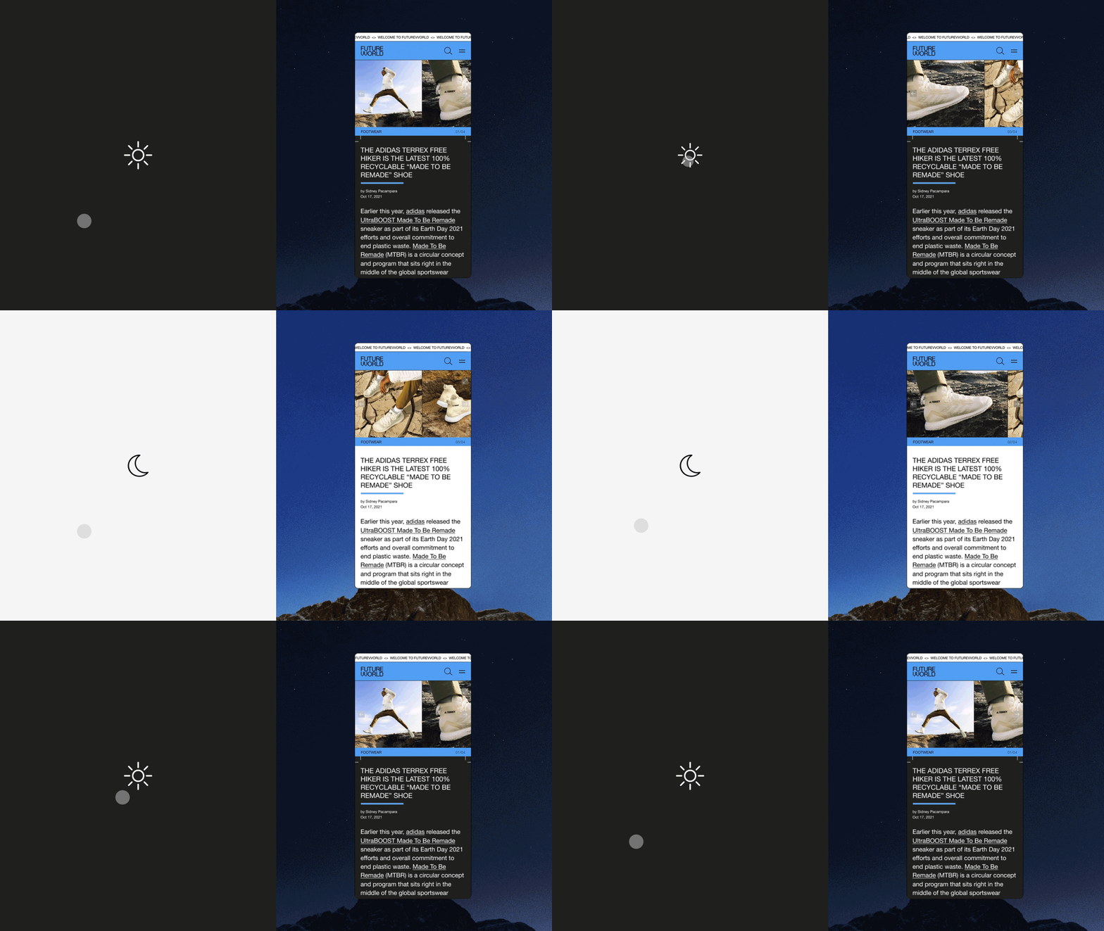
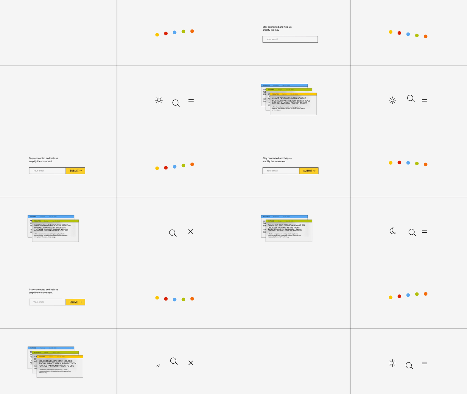
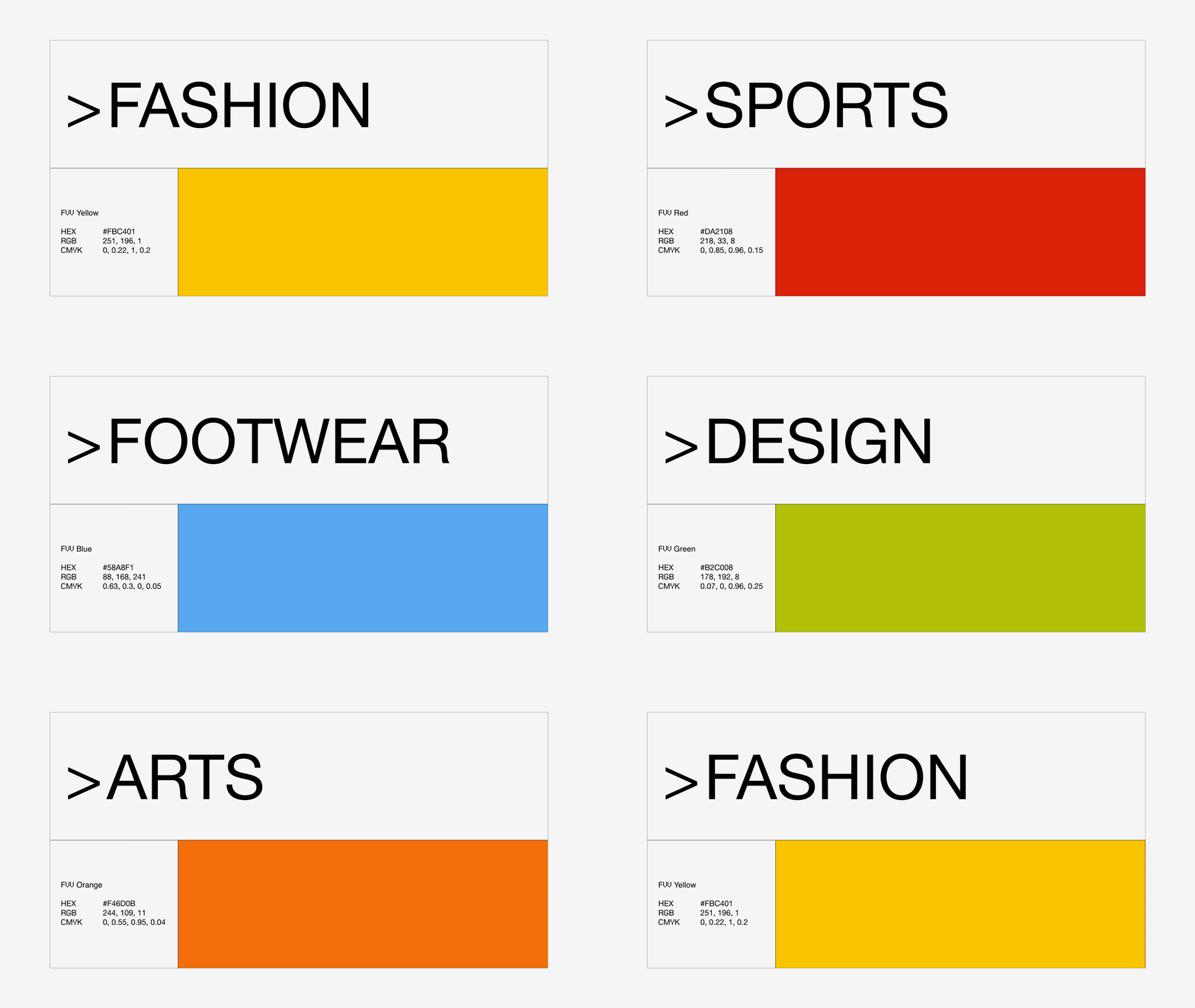
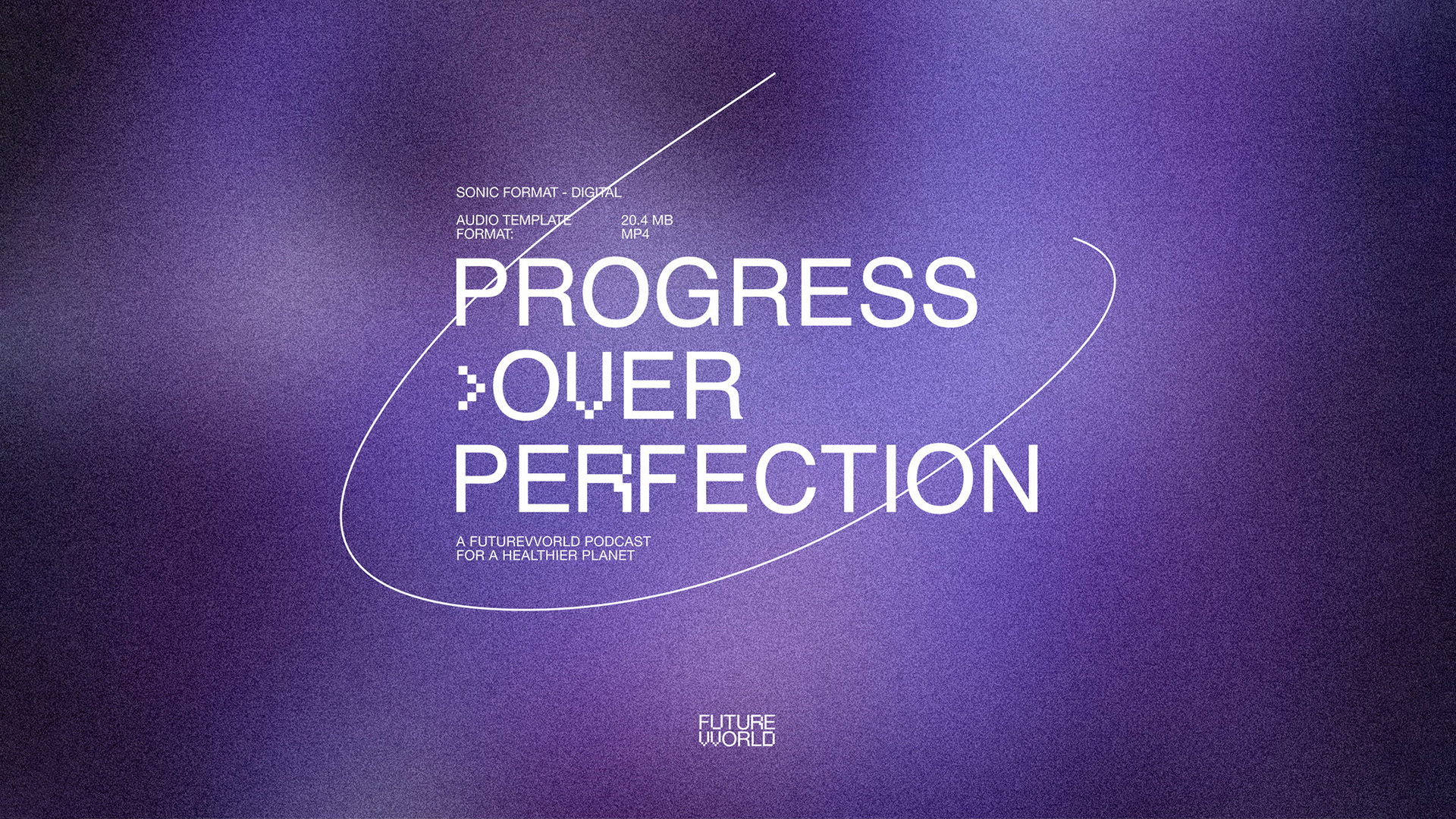
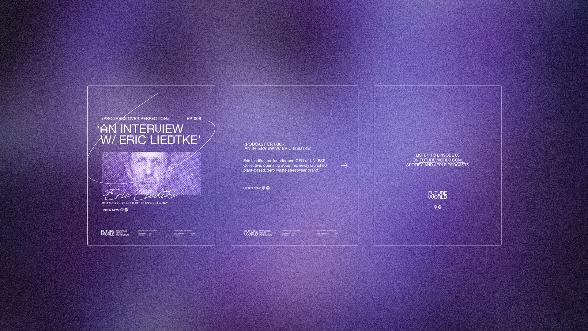
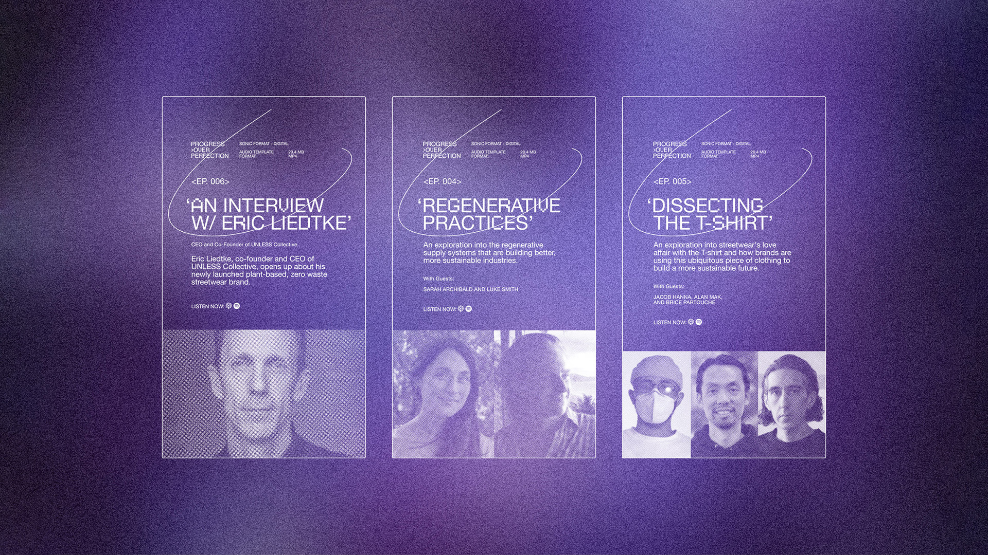
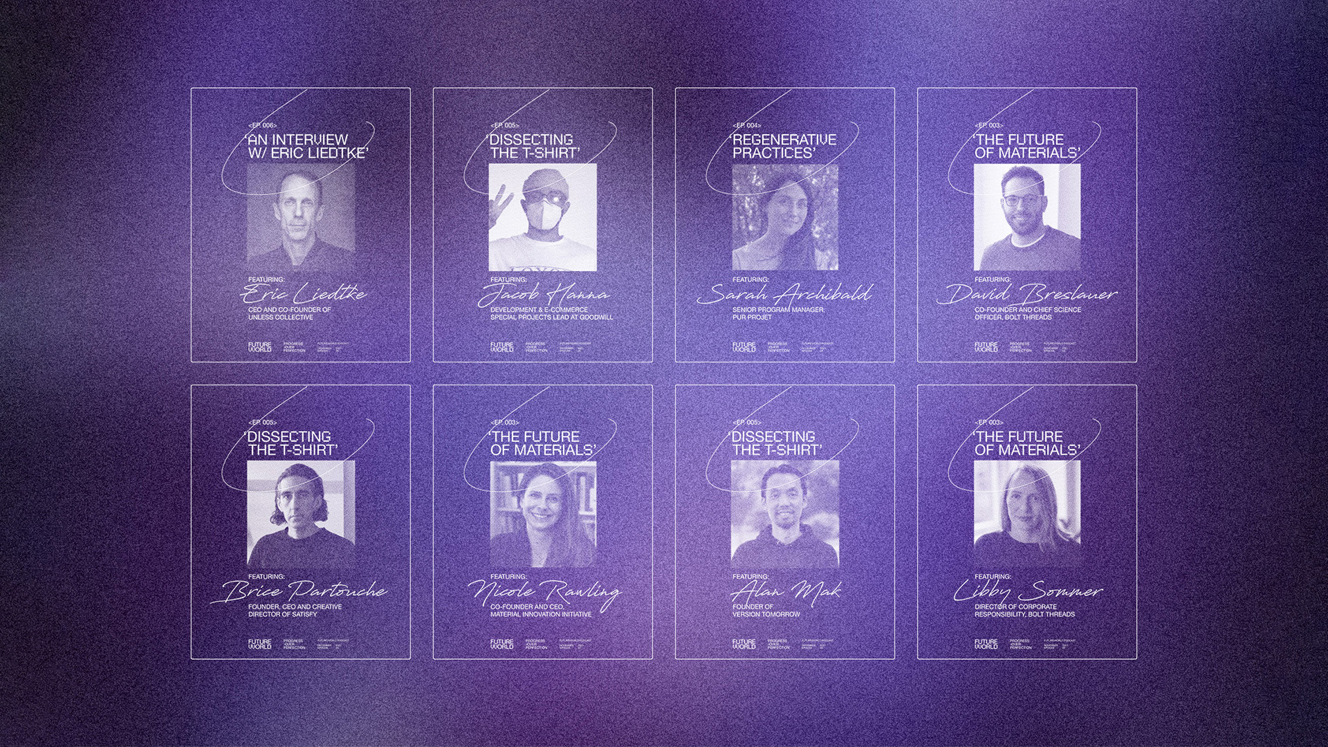
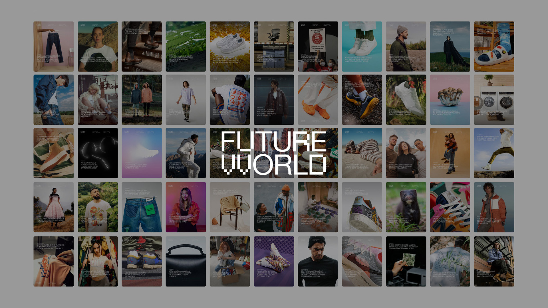
FUTUREVVORLD is a [refeshing] digital hub that puts planetary well-being at the forefront of its practices. Covering sustainability, ethics, and responsibility in fashion, footwear, and design.
Creating social posts, newsletters, and other side projects as FVV continues to grow — recently, the identity and social/marketing assets for their new podcast, Progress Over Progression.
The podcast was designed in collaboration with Roy Cranston and further assets were created with WØRKS.
The podcast was designed in collaboration with Roy Cranston and further assets were created with WØRKS.
Listened to:
12 Tibi
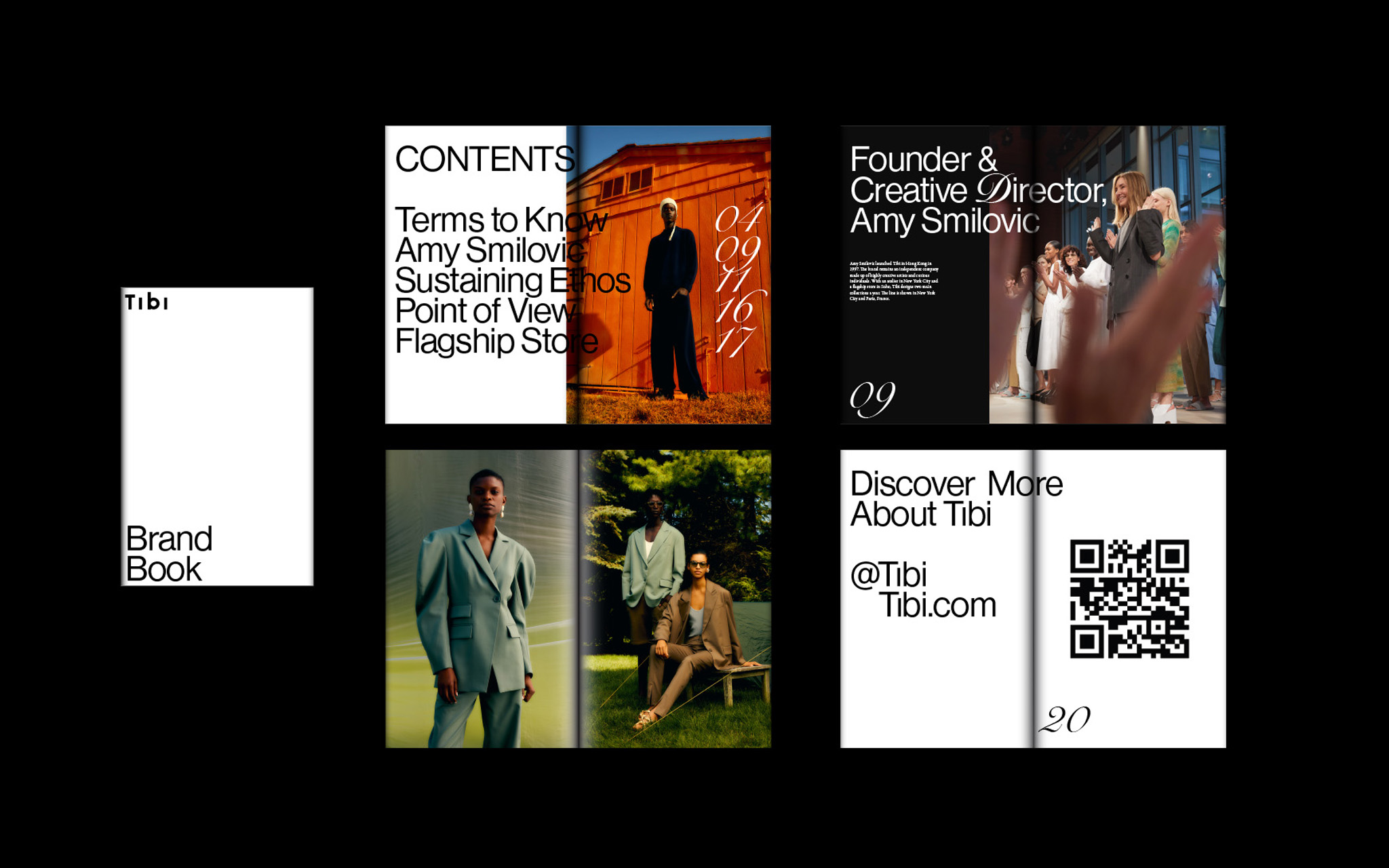
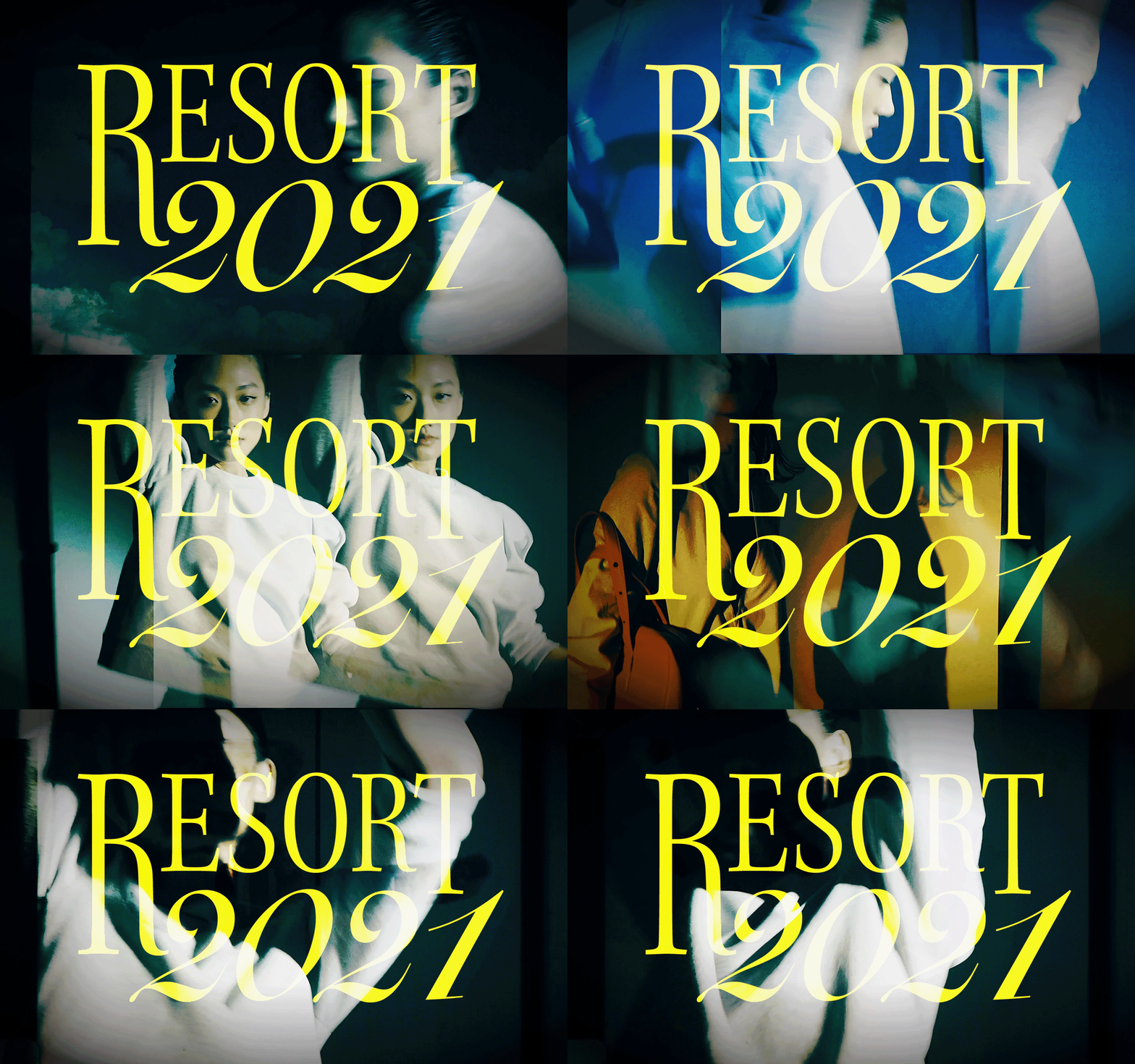

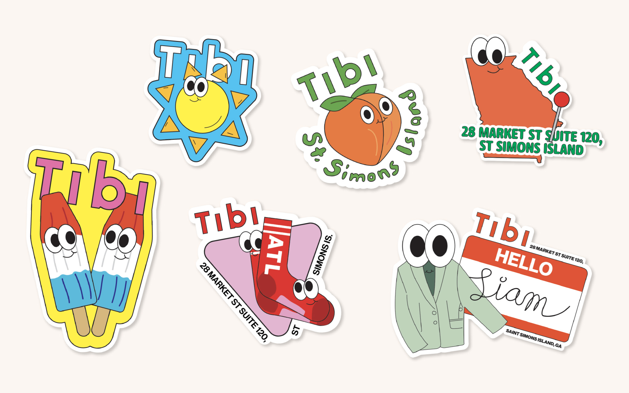
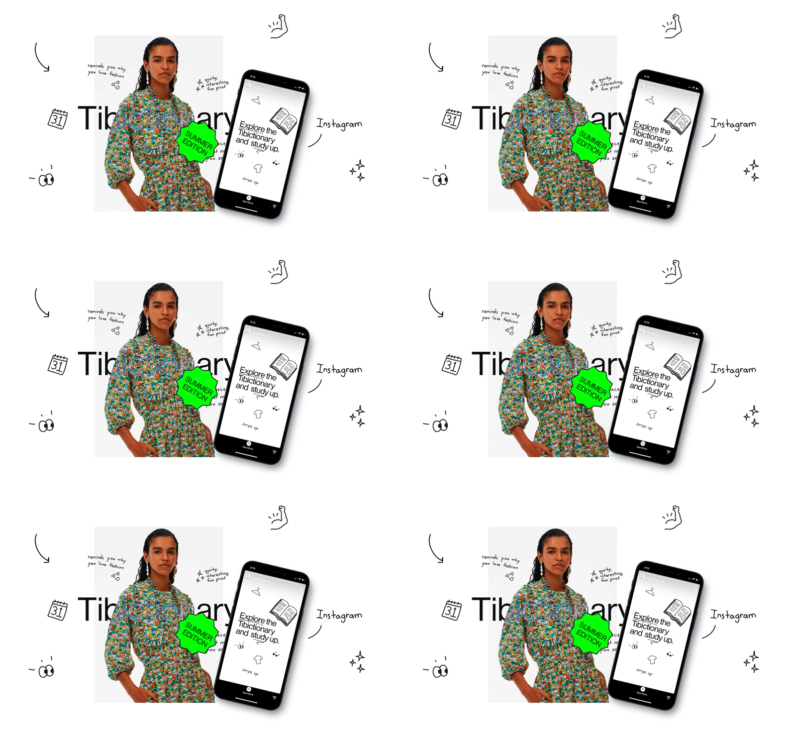
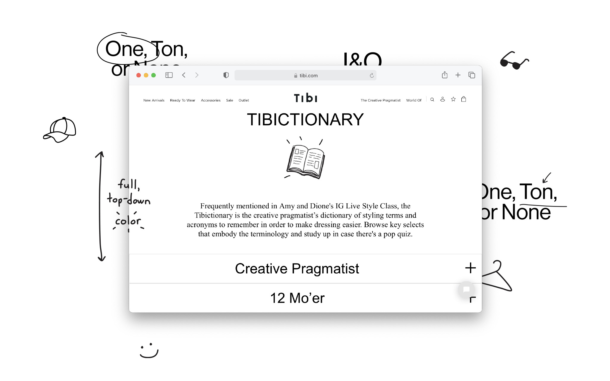
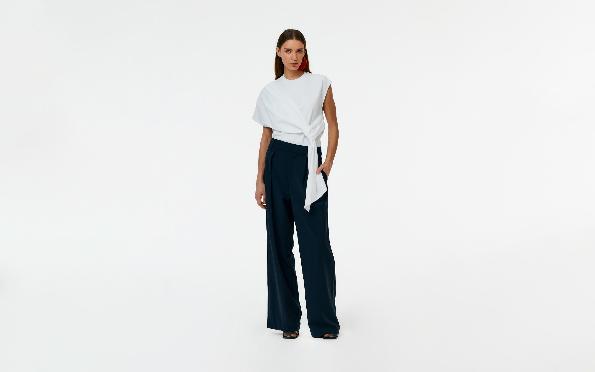
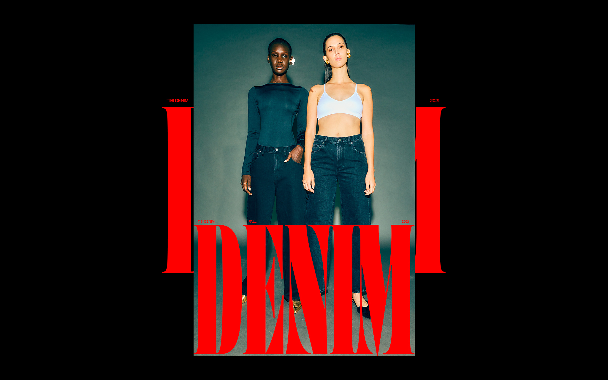

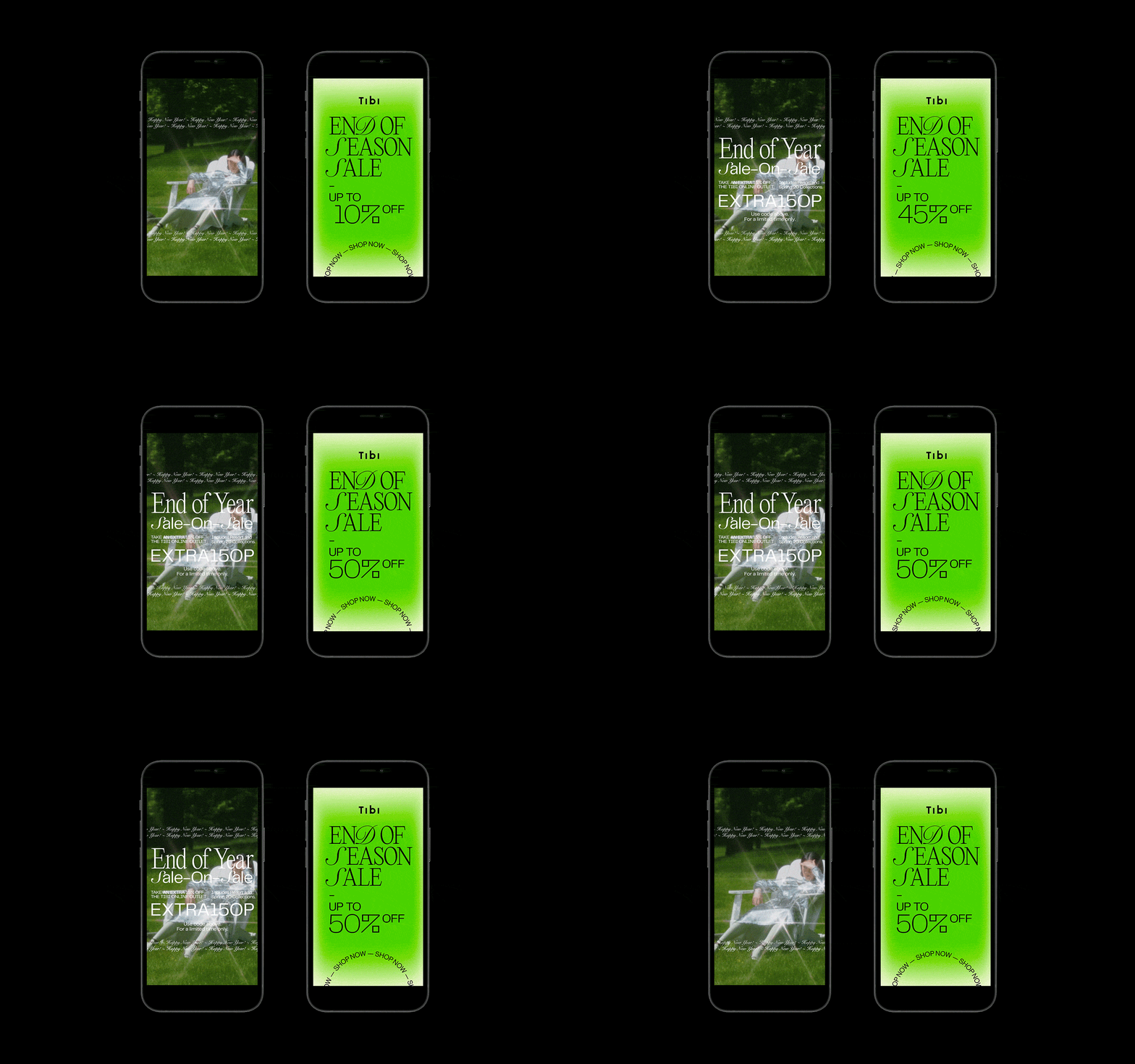
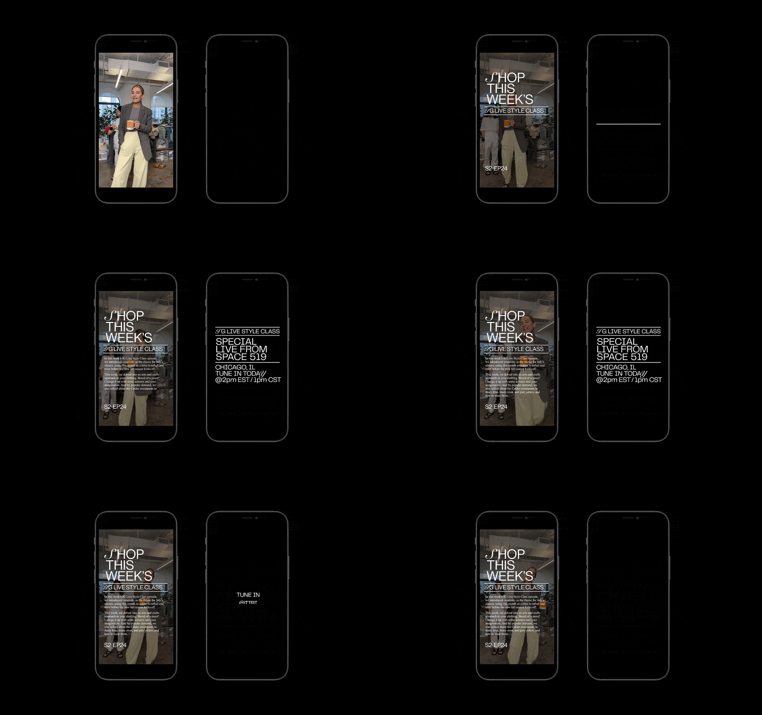

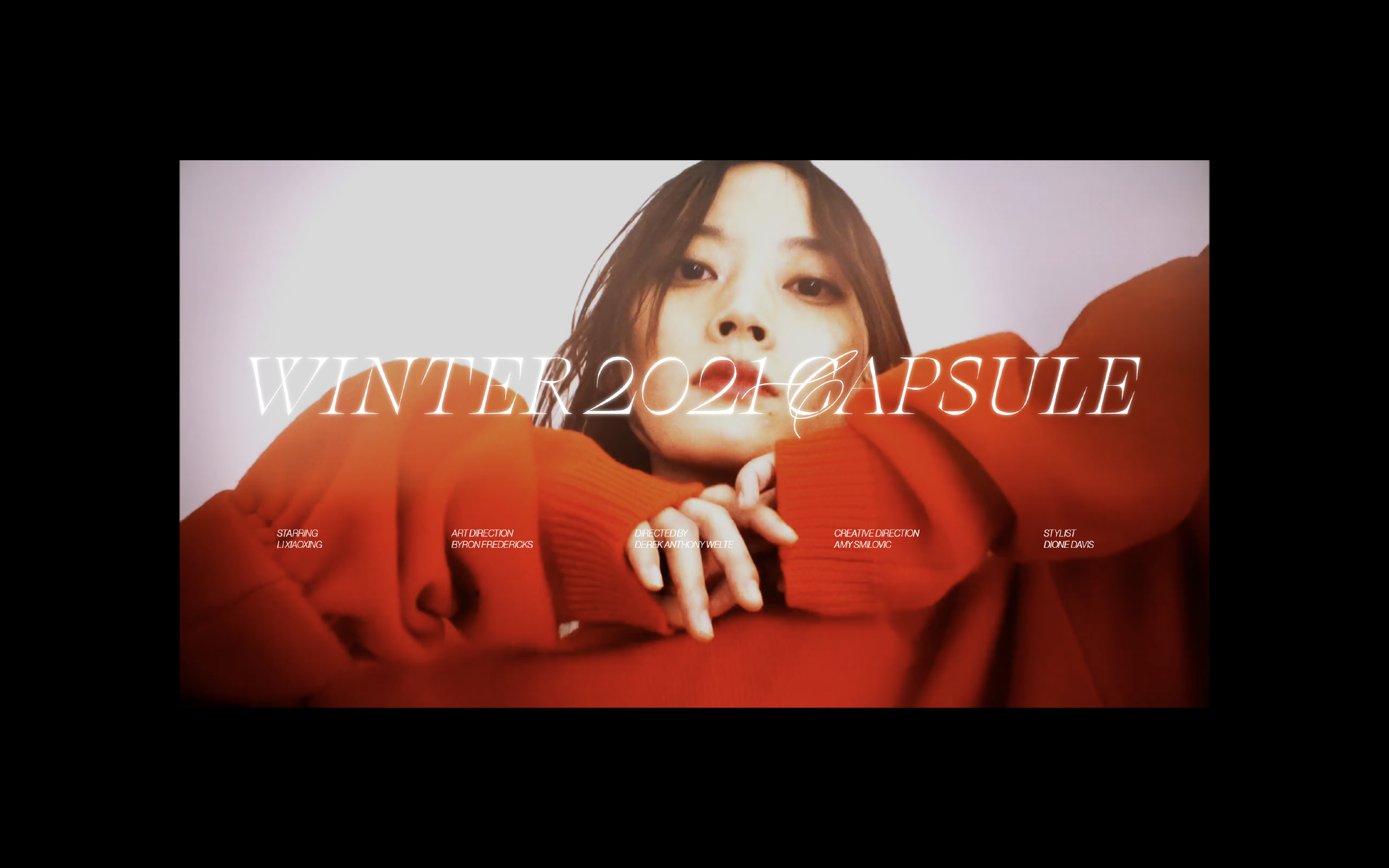
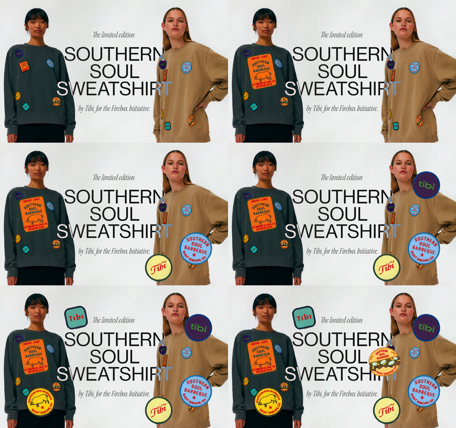
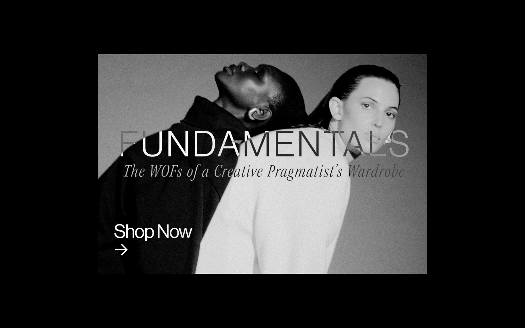

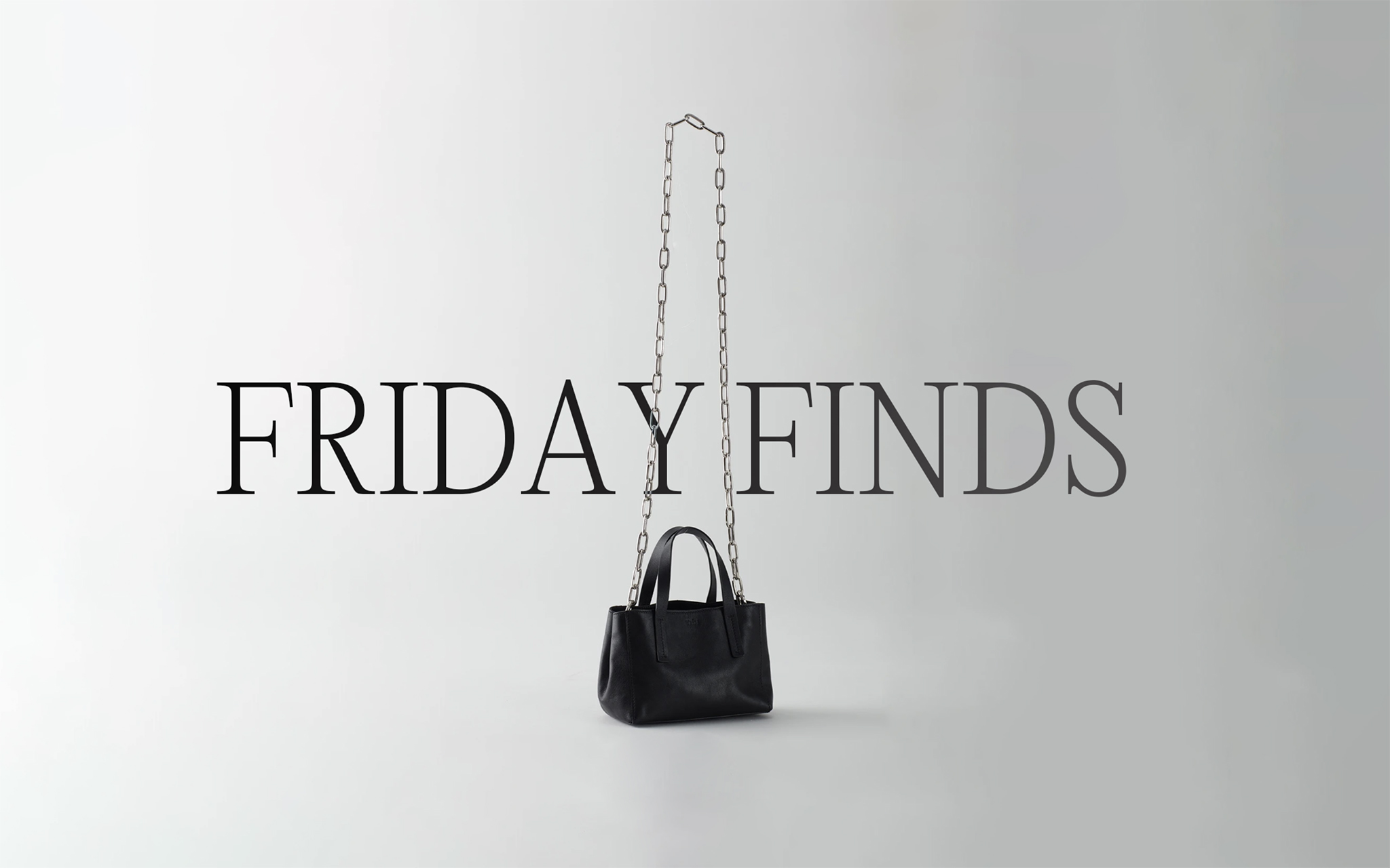
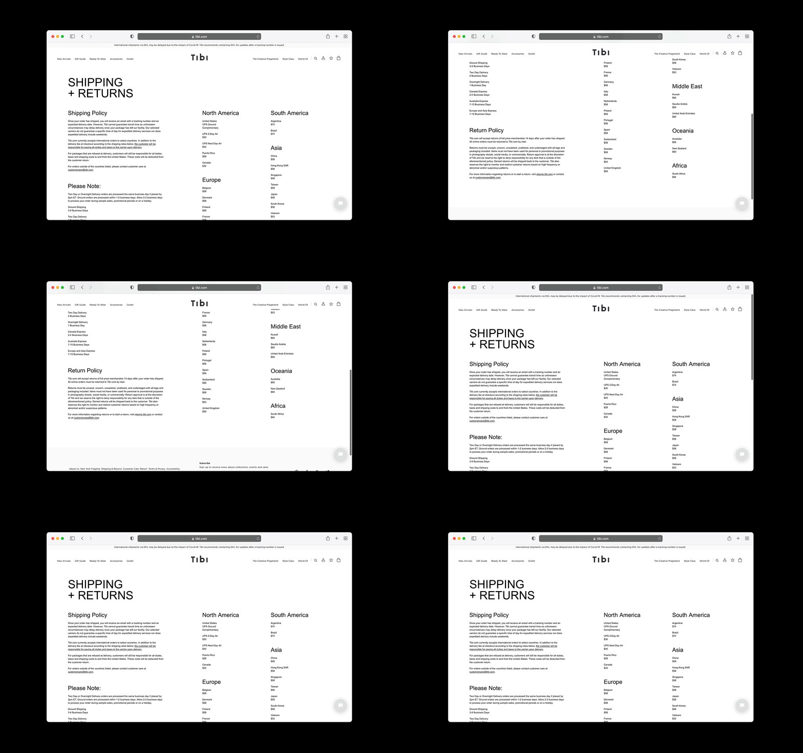
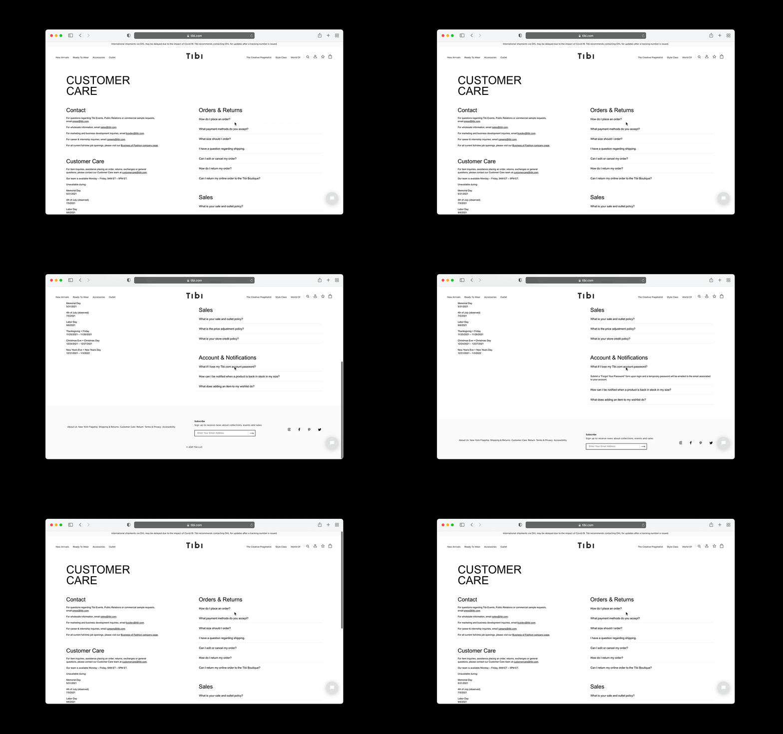
Founded by Amy Smilovic and based in New York City, Tibi is the home of the Creative Pragmatist.
Design, illustration, post production, motion, web development, and more.
Design, illustration, post production, motion, web development, and more.
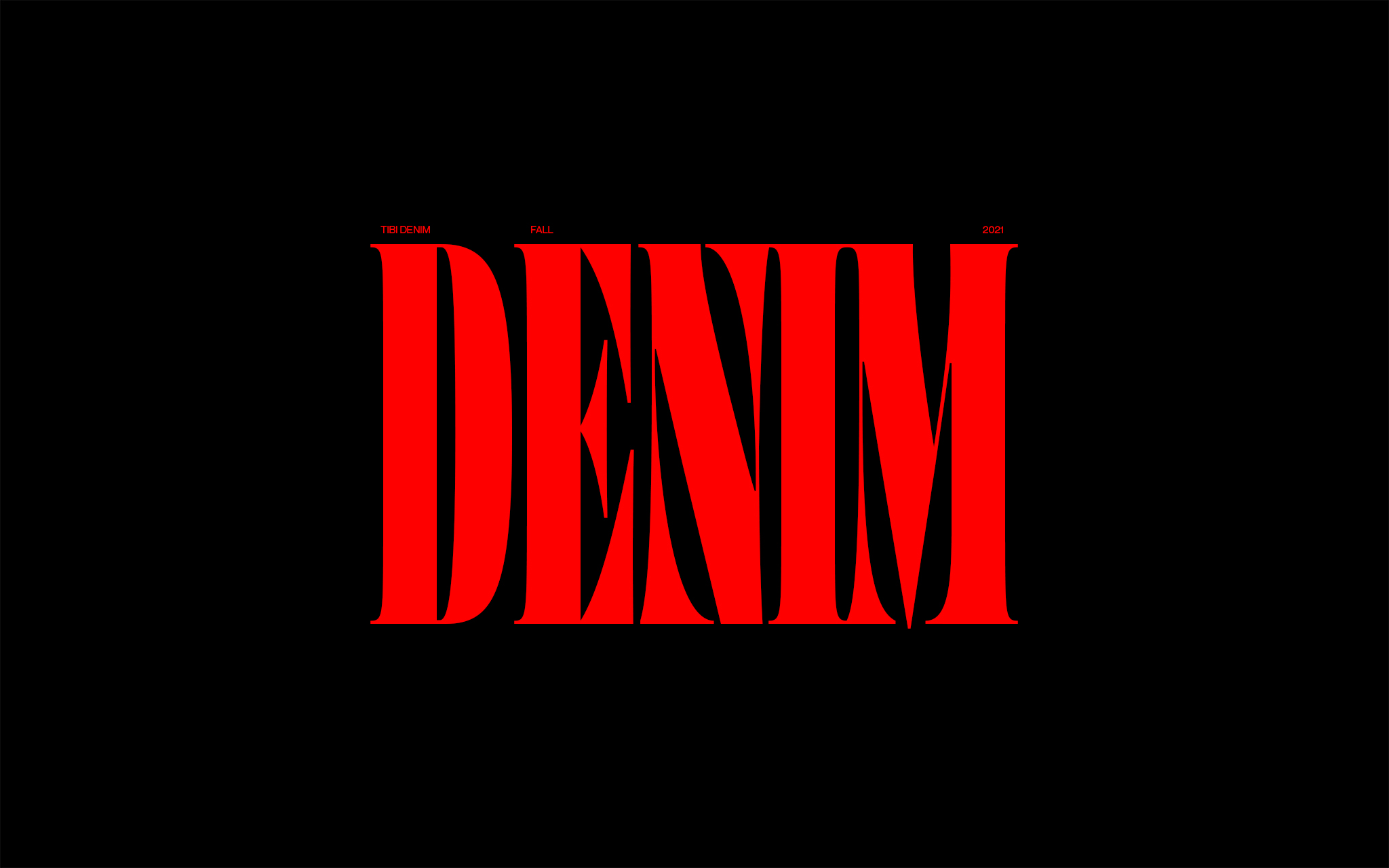
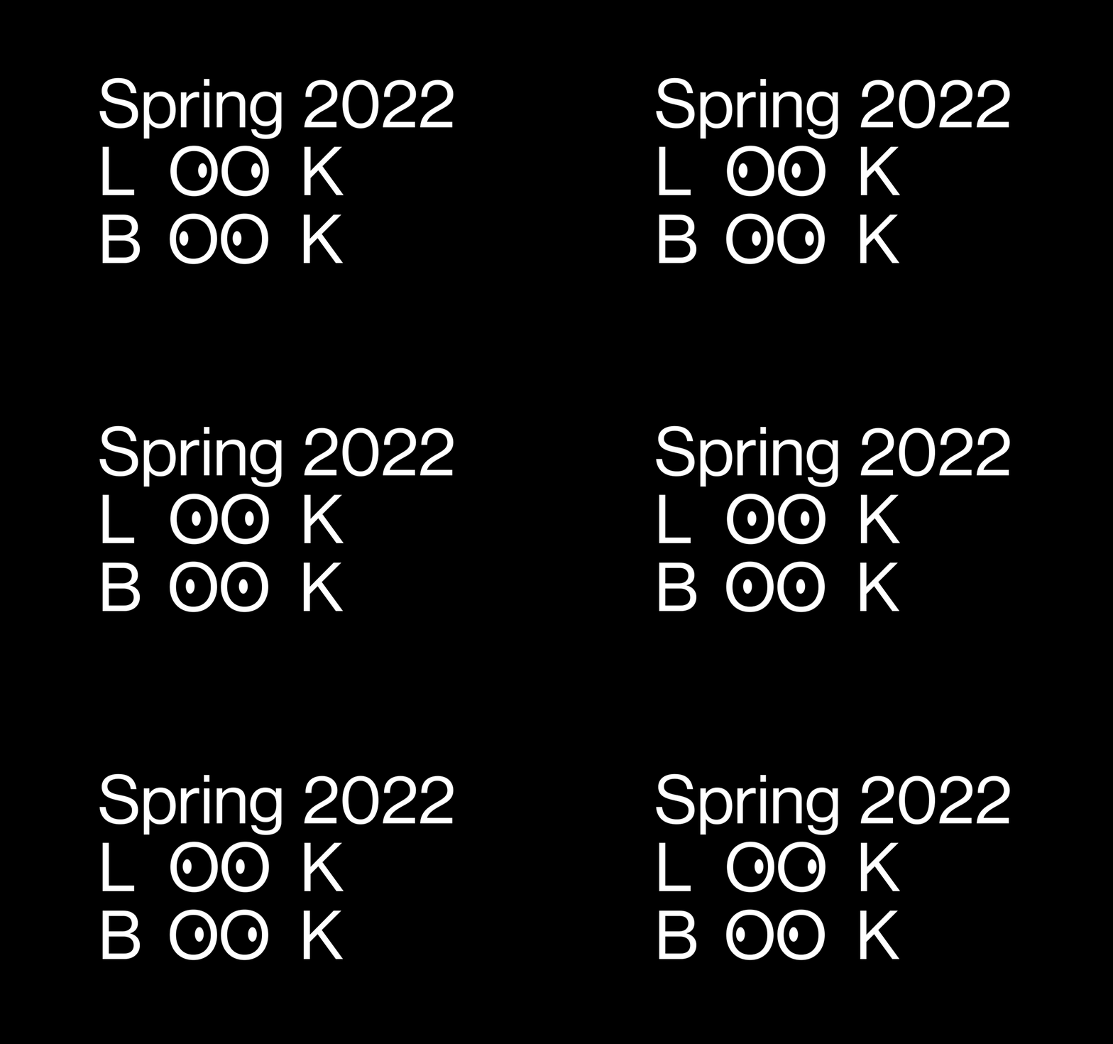
A range of work was produced as the sole graphic designer; seasonal lookbooks and Tibi's 'Brand Book', temporary campaigns, title cards, Instagram stories, emails, photo post-production and retouching work, stickers, patches, t-shirts, website redesigns and management, ads, promotional graphics, internal assets, and more.
Art Director: Byron Fredericks
Art Director: Byron Fredericks
Photography: Reed Young
Film + Video Editing: Derek Anthony White
Listened to:
13 @letfliesfly
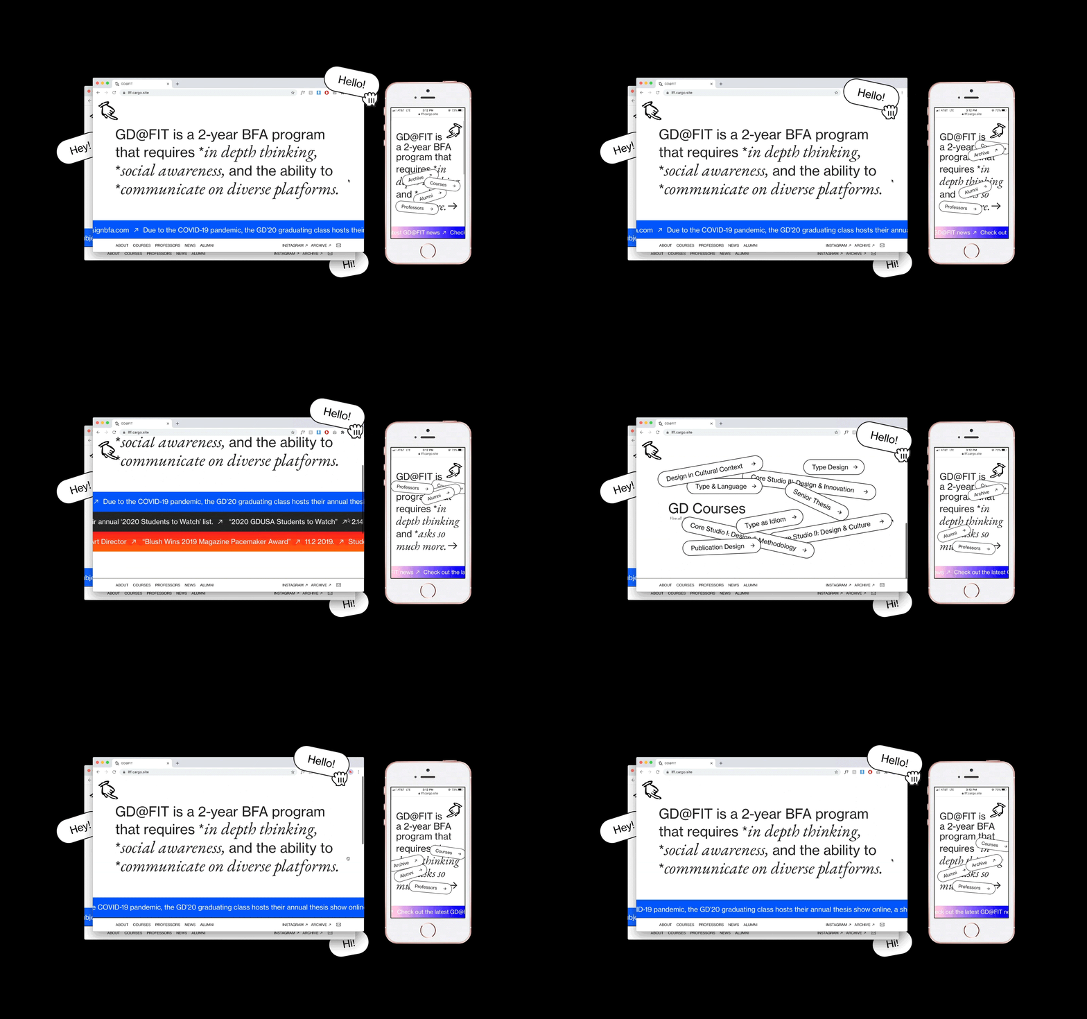
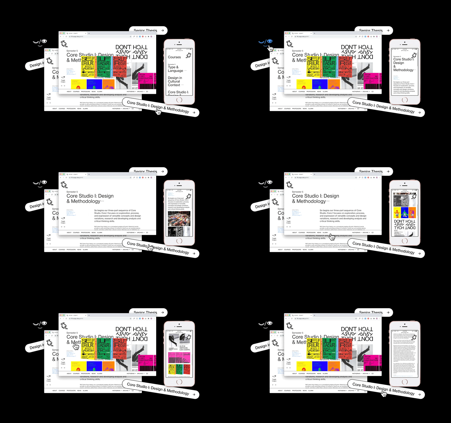
Establishing the first digital presence of FIT’s Graphic Design BFA program, @letfliesfly is a culmination of a reference/information-rich hub, an archive of student work, and much more.
“We don’t just do posters.”
“We don’t just do posters.”
“... A near perfect amalgamation of data, energy and navigation.”
Cargo Collective – ‘Sites in Use’, #163 Feature Showcase
Cargo Collective – ‘Sites in Use’, #163 Feature Showcase
Listened to:
14 Independent Projects
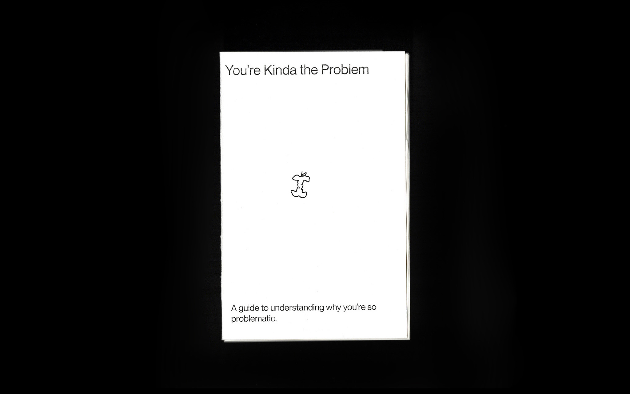
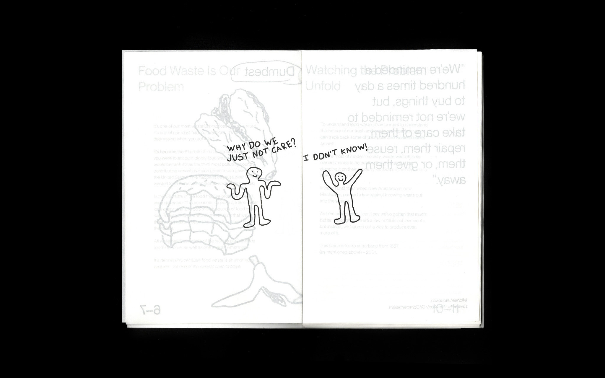
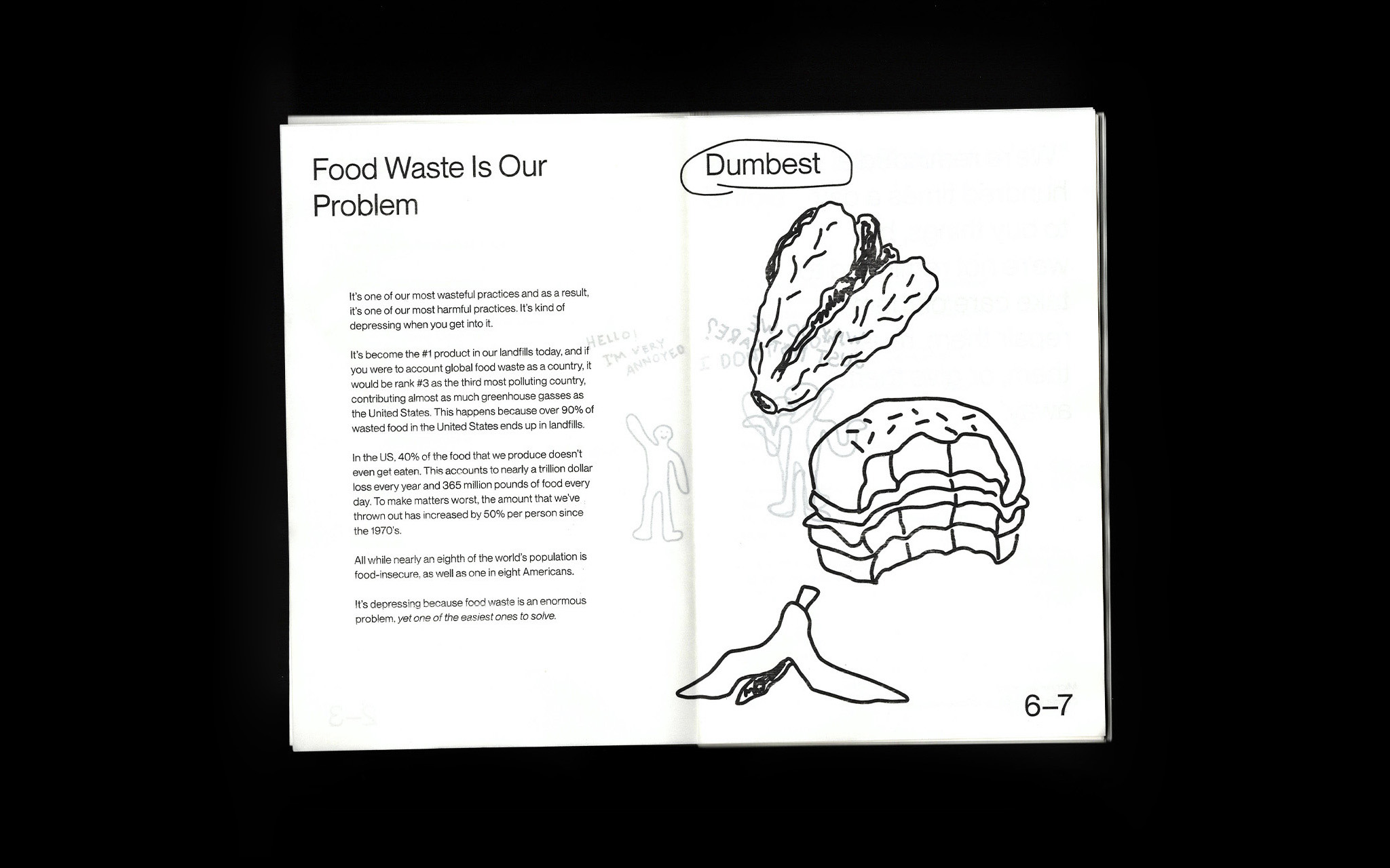
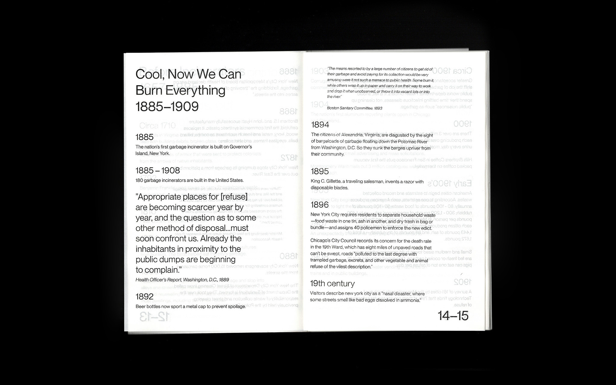
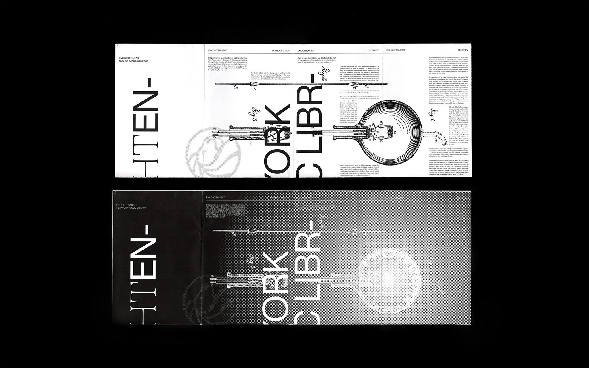
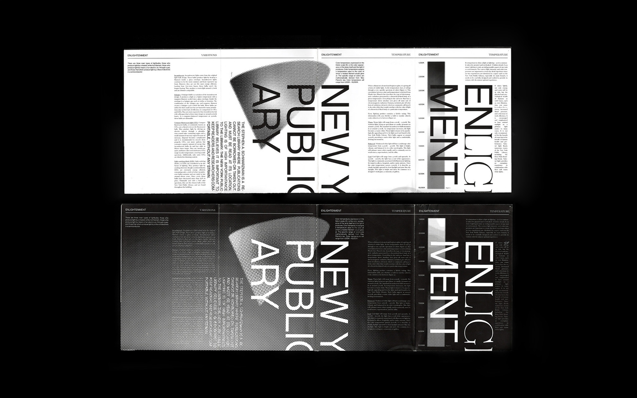
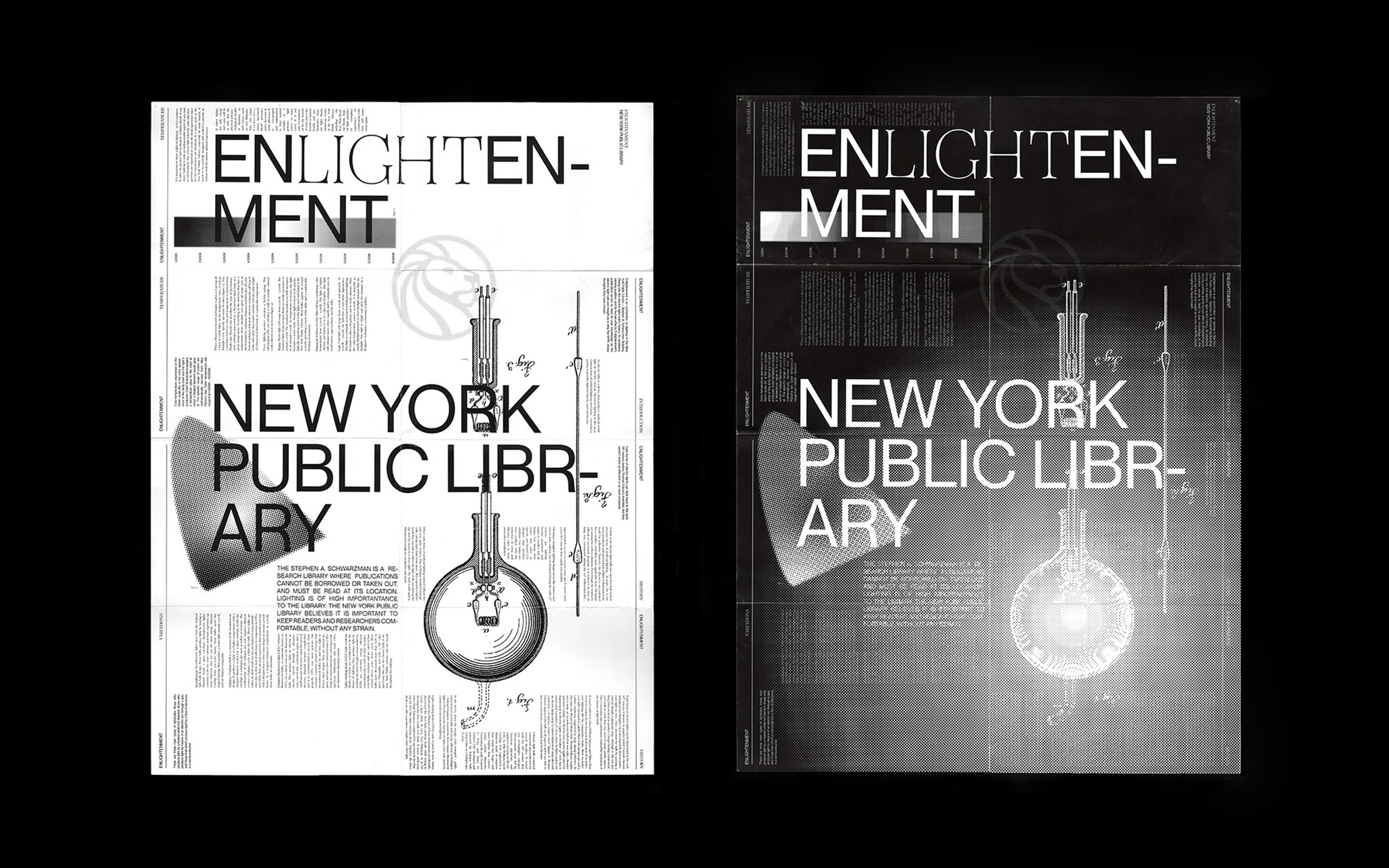
Currently a collection of unconventional studies. From the lighting of the New York Public Library’s Stephen A. Schwarzman Building to a dissolvable book about your food waste.
Enlightenment is a book designed as a double-sided, fold-out poster of the NYPL's lighting. Turning from page to page and opening up to a larger composition. The book acts as a guide to everything-lighting and gives an inside look into what the NYPL uses in its reading rooms.
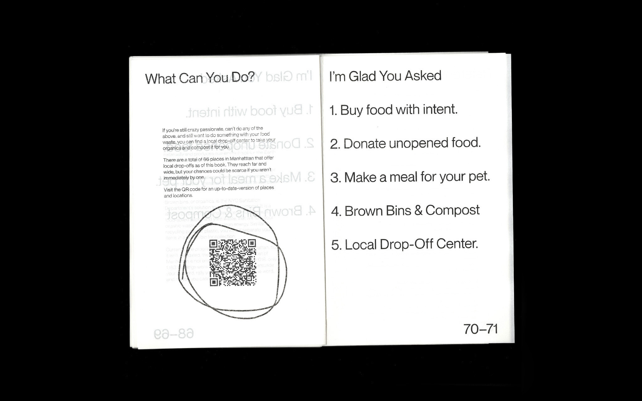
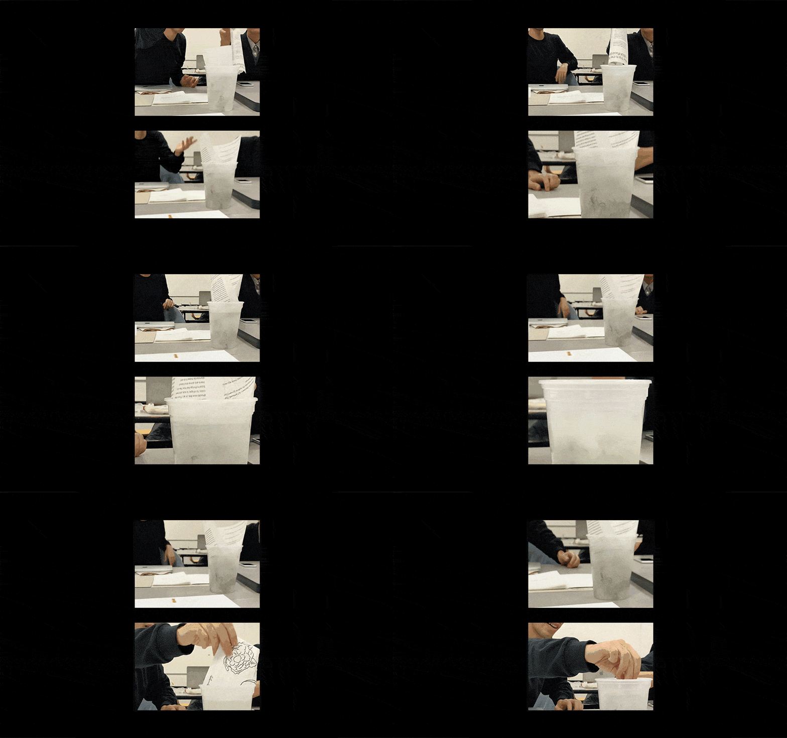
You’re Kinda The Problem is about (y)our food waste, (y)our dismissive habits, and (y)our past history of waste management. Printed once, on water soluble text and cardstock paper — its a depressing read. Briefing on the United States' history of consumerism, waste, shopping habits, eating habits, USDA color grades, plate sizes, and more absurd findings.
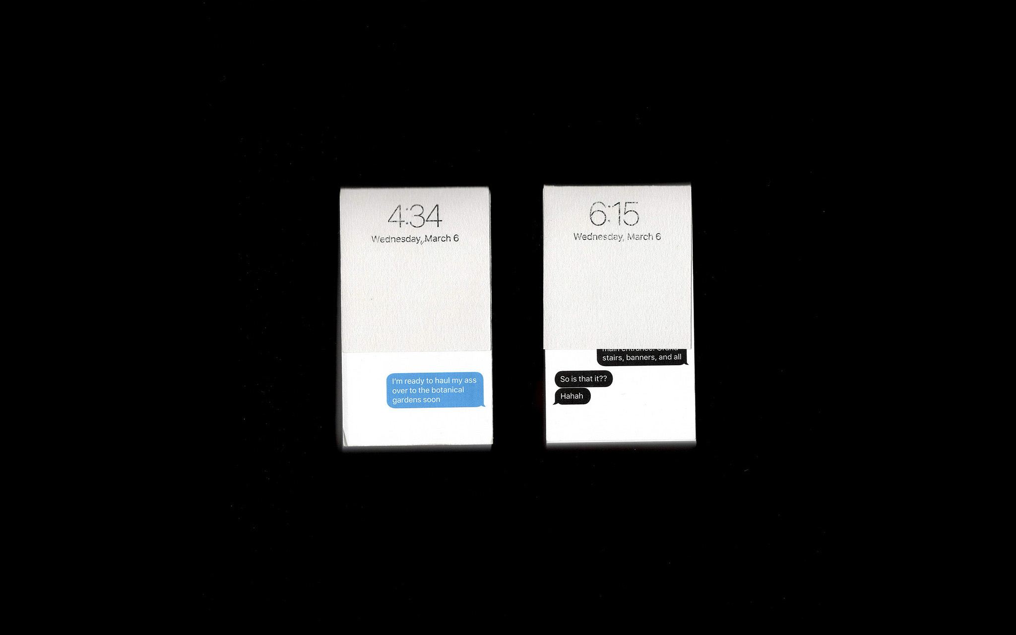
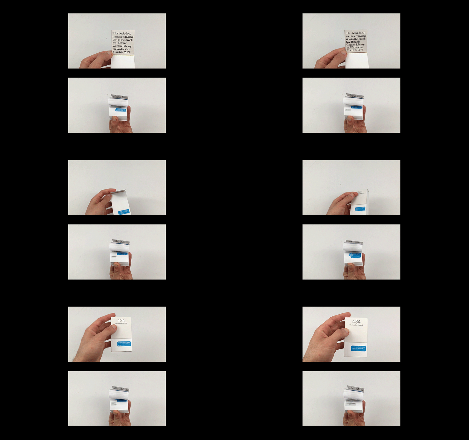
4:34 and 6:15 are two flip books retelling a conversation about struggling to visit the Brooklyn Botanic Garden’s library during Wednesday’s extended hours. The flip books mimick the conversation on-screen. One page represents one minute of passing time.
Listened to:
00 Coming Soon
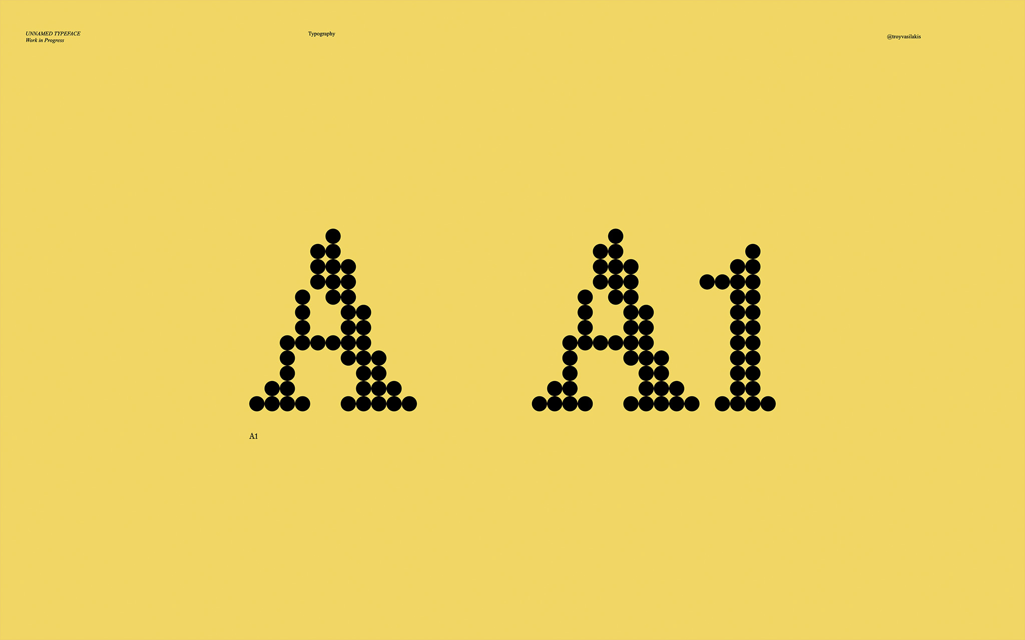
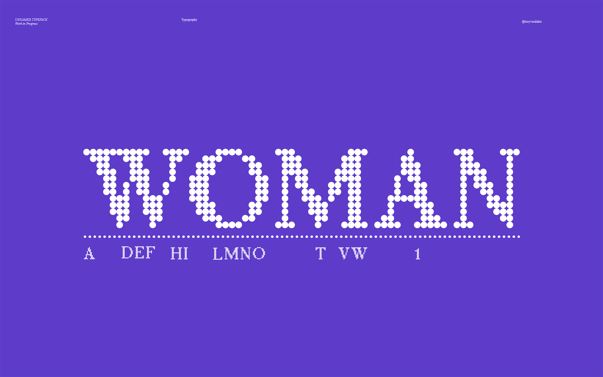
An early look at a variety of projects that are in the works.
A1 Dot is a semi-condensed bitmap serif typeface. Heavily inspired by a love for video game sprites in the late 90’s and early 2000’s and the magic of Teenage Engineering. Characters are being fit into a 16x16 rounded pixel grid.